Case Study
DMS Solars — Brand Identity for a Renewable Energy Devices Company
A full brand identity and 8-section brand guide for a renewable energy devices company. One mark compressing three category cues — solar panel, sun, lightning bolt — into a single geometric form. Two-colour discipline, Montserrat throughout, six lockups, ten don'ts.
Client
Role
Timeline
Industry
DMS Solars sells solar energy devices. Panels, inverters, batteries — physical equipment that goes on a roof and stays there for fifteen years. The brief came in plain: a fresh visual identity that felt as forward-thinking as the company's mission, but built to live on the side of a delivery truck and inside a 32-pixel app icon. Three weeks. End-to-end. From mark to mockups to the eight-section brand guide that left with the client.
3
weeks
6
logo lockups
8
sections in the final brand guide
Vision
DMS Solars is more than a solar energy provider — it's a visionary company for a cleaner, brighter future.
When I joined the journey, my challenge was to translate three things — innovation, reliability, and the eco-friendly promise — into a visual identity that felt as forward-thinking as the mission itself. Not a campaign. A system. Something that could survive being applied by a regional sales partner without me in the room.
The Branding Challenge
Three real constraints sat on top of every decision. Expressing a clear mission and vision — the brand had to say sustainability and innovation without putting either word on a poster. Standing out in a competitive market — every renewable-energy brand was already reaching for the same iconography: a sun, a leaf, a gradient. Ensuring consistency across platforms — the mark had to read on a polo embroidery, a 32-pixel favicon, a vehicle wrap, and a printed brochure with no follow-up call to the designer.
Professionalism. Highlight Innovation. Embed Sustainability.
Brand Core Values
Sustainability — encoded in colour and form before it was named anywhere. The blue is earth-stable. The yellow is sun-source. No leaves, no globes, no recycle arrows.
Innovation — carried by the geometry. Forward-leaning panel grid, clean angles, no decorative flourish. The mark looks like a piece of equipment, not a campaign.
Trust & Professionalism — carried by restraint. Two colours, one typeface, one mark. The brand never raises its voice, because the product it sells stays on a roof for fifteen years and has to look like it knows what it's doing.
One Mark, Three Category Cues
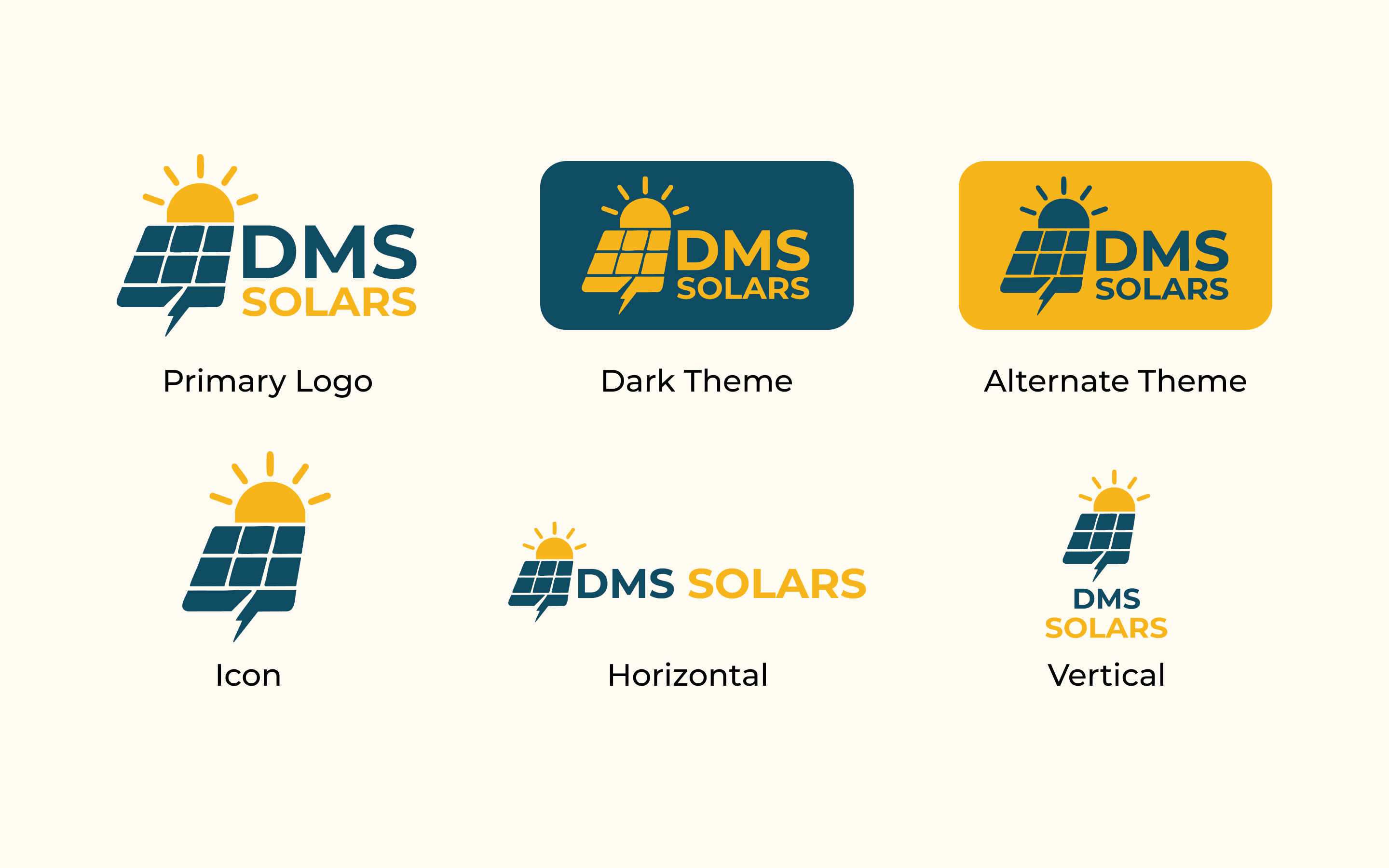
The DMS Solars mark compresses three category cues into a single geometric form. A solar panel — the rectangular grid of cells, drawn at the same forward tilt every panel takes on a roof. A sun — the half-disc with rays rising over the panel's top edge. A lightning bolt — cut into the panel's lower-left corner as negative space, the energy the panel actually produces. Three references, one shape, no gradient required to make any of them legible.
The wordmark sits flush right of the icon. DMS in deep teal — the company. SOLARS in sun-yellow, set below — the category. The colour split is the only hierarchy the lockup needs.
Six lockups for six surfaces. The primary lockup for marketing and pitch decks. A dark-theme variant in a navy panel for night and dark-mode contexts. An alternate theme on the yellow ground for moments the brand wants warmth. An icon-only mark for app icons, favicons, and embroidery patches. A horizontal lockup for narrow letterhead and email signatures. A vertical lockup for tall surfaces — banner stands, packaging side panels, social profile crops. Every variant tested at 32 pixels before it shipped.
What Not to Do
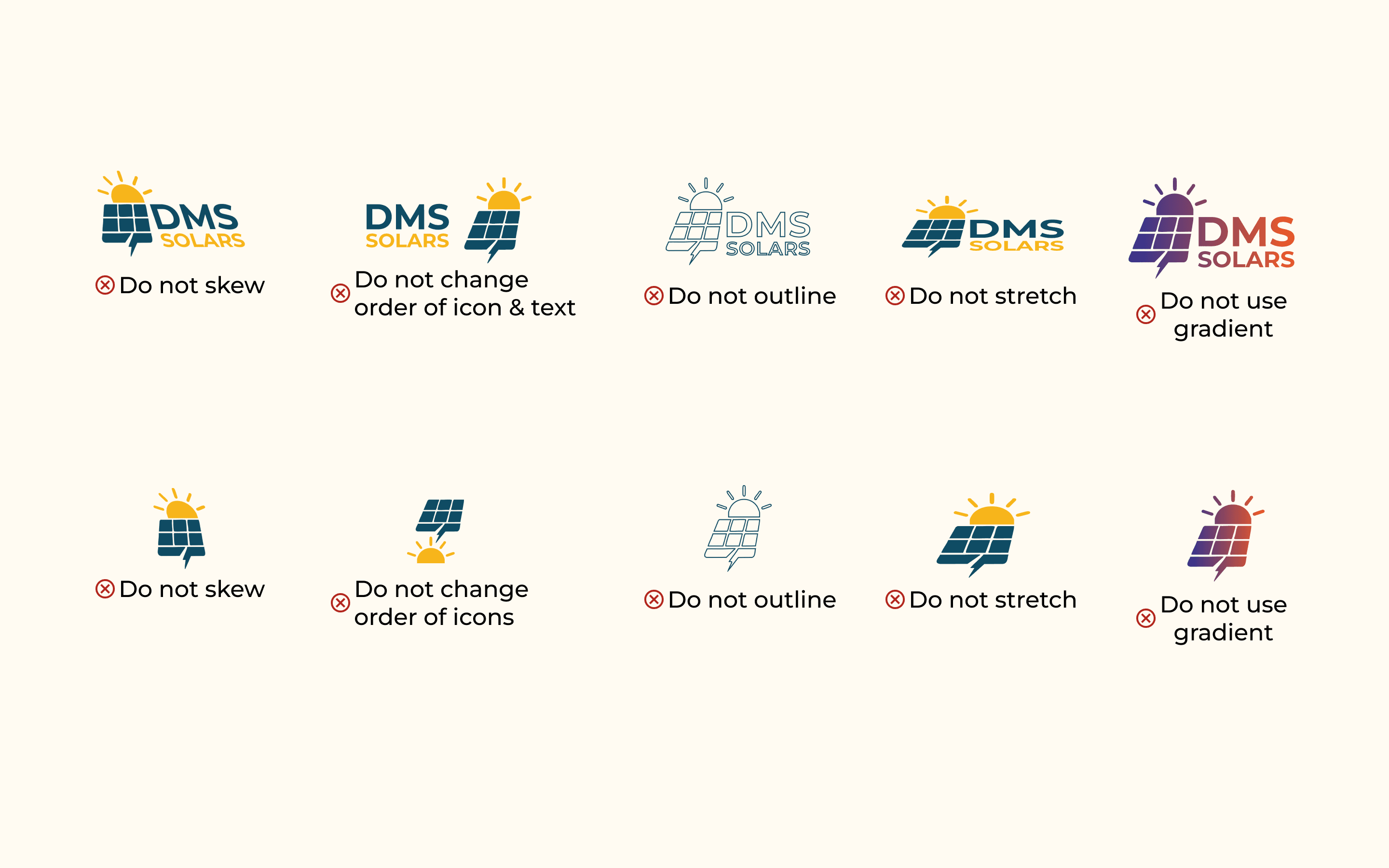
The most useful page in any brand guide isn't the colour palette. It's the don'ts page. This one runs ten violations across two rows — covering both the lockup and the icon-only mark. Do not skew. Do not change the order of icon and text. Do not outline. Do not stretch. Do not use gradient. Each rule has a visual example of the violation, sitting right next to the rule.
The reason the don'ts page matters is that the brand will be applied by people who weren't in the meeting. A regional partner ordering tee shirts. A printer recreating the logo because the file lost its embedded fonts. A junior marketing hire making a deck the night before a pitch. The don'ts are the part of the brand that protects itself when the designer isn't in the room.
The don'ts are the part of the brand guide that does the most work after handover.
Two Colours, Five Shades Each
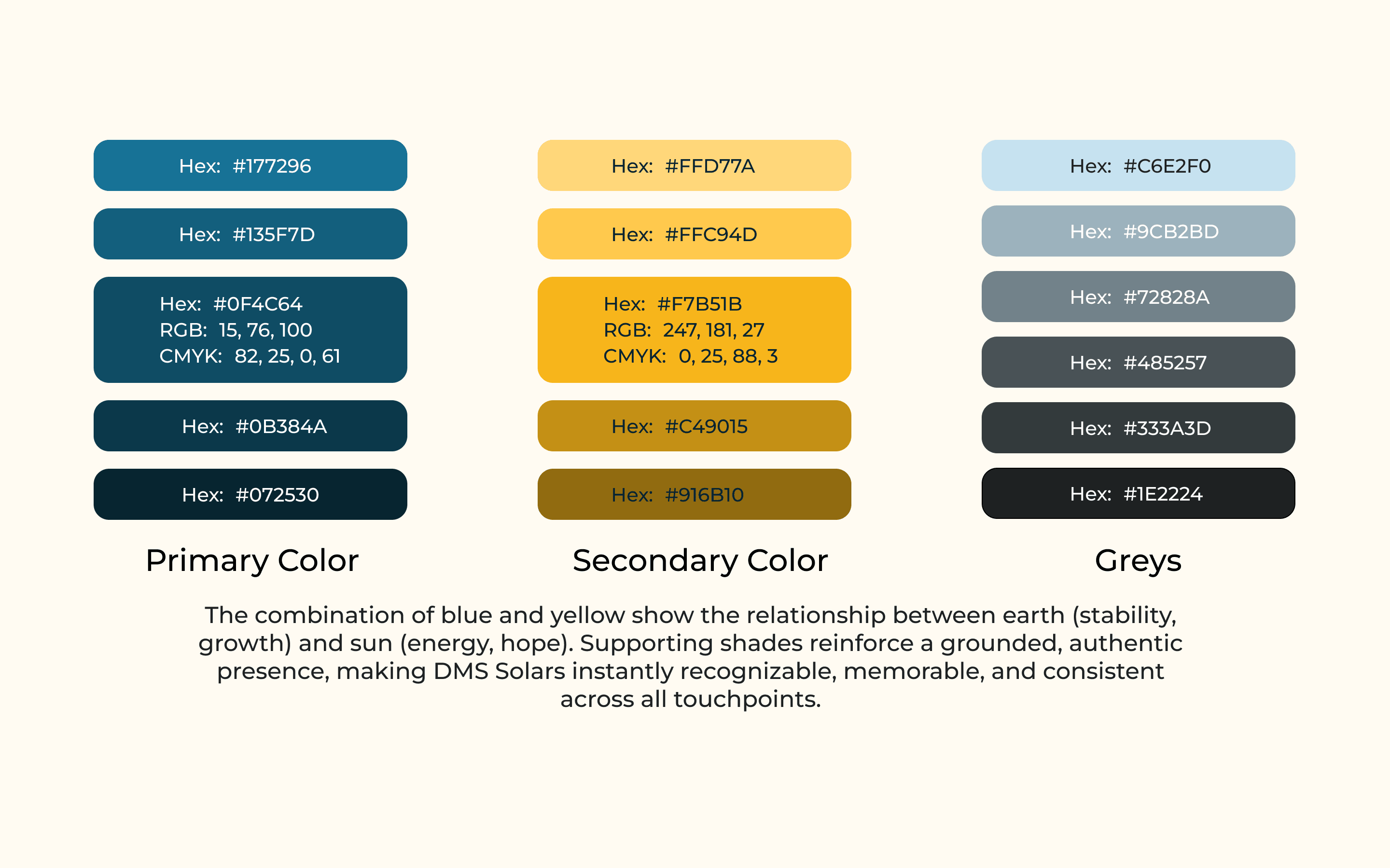
The palette is two families and a neutral. A primary blue range — five shades, from a mid teal (#177296) down through the ocean tones to a near-black navy (#072530). A secondary yellow range — five warmer shades, from a soft cream-yellow (#FFD77A) through marigold to a burnished bronze (#916B10). Plus a six-stop grey scale for typography, surfaces, and neutral UI.
Two colours would have been austere; gradients would have undone the discipline. The five-shade ranges give the brand depth without breaking its rules. The teal range carries every dark surface and every paragraph of body text. The yellow range carries every accent and every moment the brand wants to feel warm. Greys carry everything else.
Blue and yellow show the relationship between earth (stability, growth) and sun (energy, hope). Supporting shades reinforce a grounded, authentic presence.
Montserrat, on Purpose
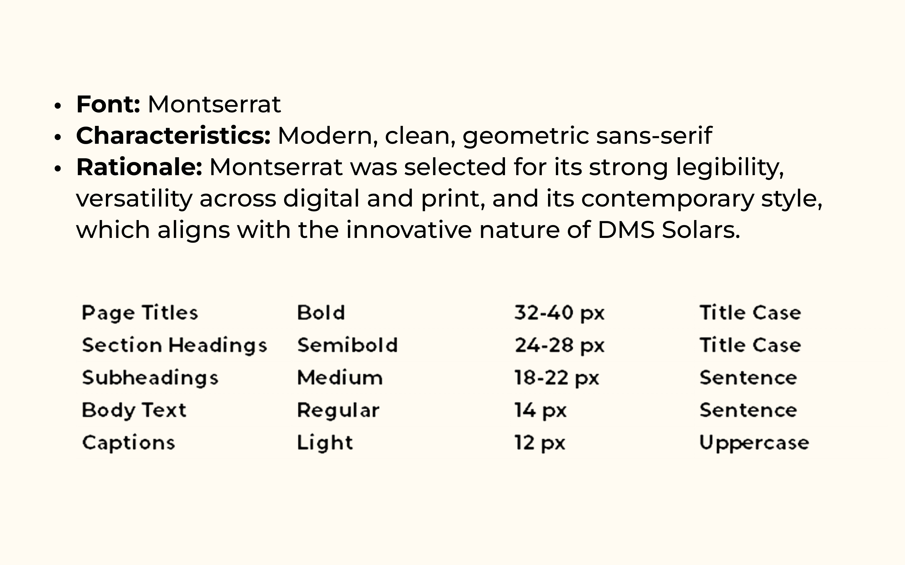
The brand uses Montserrat — and only Montserrat. Modern, clean, geometric sans-serif. Open-source, ubiquitous, available on every operating system, every printer driver, every CMS template. The choice was about reproducibility, not novelty. A brand that lives in tier-2 cities and gets applied by regional partners can't depend on a font foundry licence or a custom typeface that only one designer can install.
Five sizes, five weights. Page titles at 32–40px in Bold, title case. Section headings at 24–28px in Semibold, title case. Subheadings at 18–22px in Medium, sentence case. Body at 14px in Regular, sentence case. Captions at 12px in Light, uppercase. The hierarchy is encoded into the size and the case — so a non-designer setting up a slide already knows which level a piece of text belongs to.
Built to Be Applied
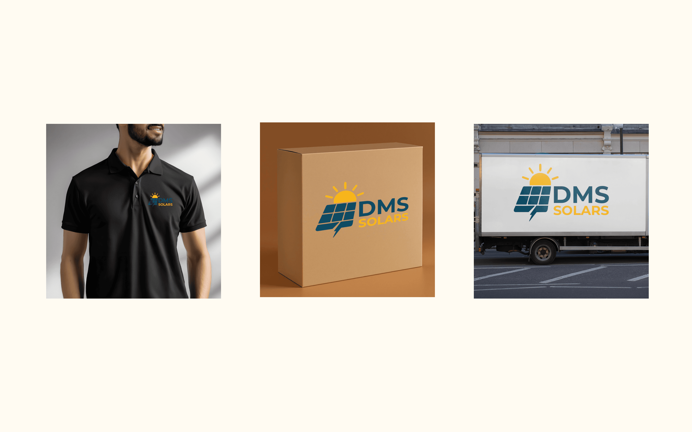
Apparel and logistics first. Polo embroidery for the field installation team — the icon-only mark, single-colour stitching, designed to survive every wash for three years. Packaging cartons in the brand's warm yellow ground — the lockup centred and legible across a warehouse. Delivery truck wraps in the dominant cream — high-contrast, large-scale, readable from a city block.
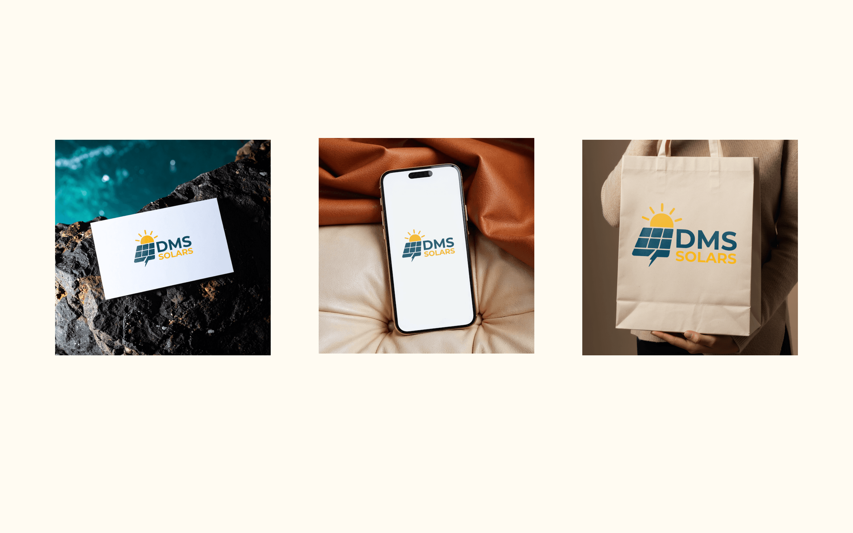
Then the surfaces customers actually touch. A business card sized for a salesperson's wallet, the icon and lockup balanced for one-second recognition. The mobile lockup centred on a phone screen — the brand's first impression for anyone landing on the site. A retail tote bag in cream canvas — the brand carrying the customer's purchase home. The mockups aren't decoration; they're the proof the system holds.
Brand Personality
Five traits the system is engineered to express, every time it's used.
Professionalism — the structured logo system, the disciplined colour use, the refined typography. Authority without volume. Empowerment — bold colour, open layouts, the sense that customers are joining a forward movement. Innovation — geometric forms, modern type, a forward-leaning palette. Reliability — consistency across every asset, achieved by the don'ts page as much as the dos. Eco-Friendliness — earth-inspired hues, sun-and-environment motifs that make sustainability visible without printing the word.
From sunrise to sunset, we keep your world running on clean, powerful energy.