Case Study
Master App Thumbnails
Improving thumbnail CTR through craft on Eloelo's Master app — median CTR doubled (0.81% → 2.41%) and miss rate halved (56.5% → 23.3%) across 833 live thumbnails over 4.5 months. A four-shift transformation across text, layout, colour, and AI.
Client
Role
Timeline
Industry
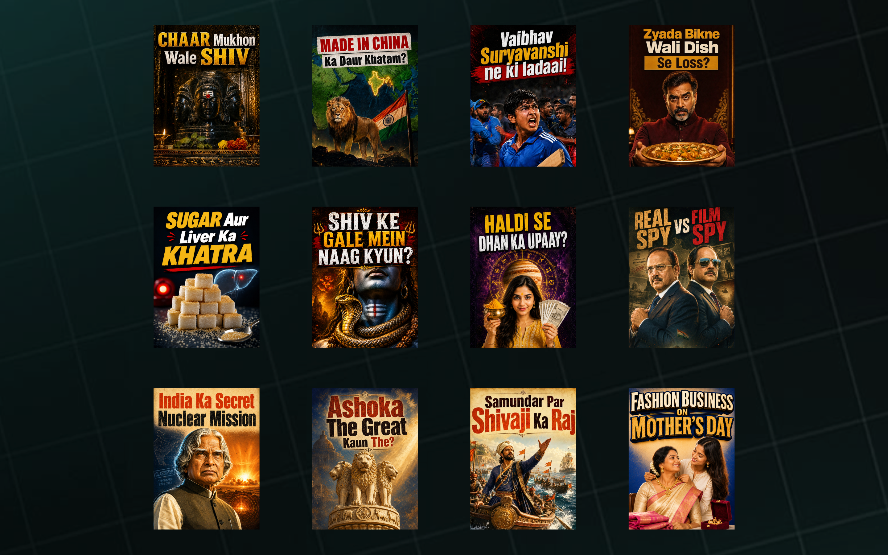
In four months I shipped 833 thumbnails. This one clicked twice as much as the other. Here's how I learned to tell the difference.
The Job
The Master app is a high-volume vernacular short-form content platform. As a thumbnail designer, I produce work across 16+ content categories — Devotion & Dharma, Banking & Finance, New Business Ideas, Sports, Astrology, Trending news, Phone & Internet Tips, government schemes, and more.
The role has three constraints that shape every decision:
- Volume. Roughly 50+ thumbnails shipped per week.
- Variety. No two days look alike — I move between scams, scriptural stories, cricket, AI tutorials, festival explainers.
- Hindi-first audience reading fast. Type weight, colour contrast, and emotional framing all carry the click. There is no second chance on a scrolling feed.
My metric is the click. The video earns the watch — that's not mine to claim.
The Honest Mirror
When I pulled my own performance data in early 2026, the picture was honest: the median Shashi thumbnail clicked at under 1%, and roughly two-thirds of my work fell into the “missed” bucket. I had occasional spikes, but the floor was not moving.
56.5%
Five months of plateau. The ceiling wasn't the problem.
I had taste. I didn't have a craft.
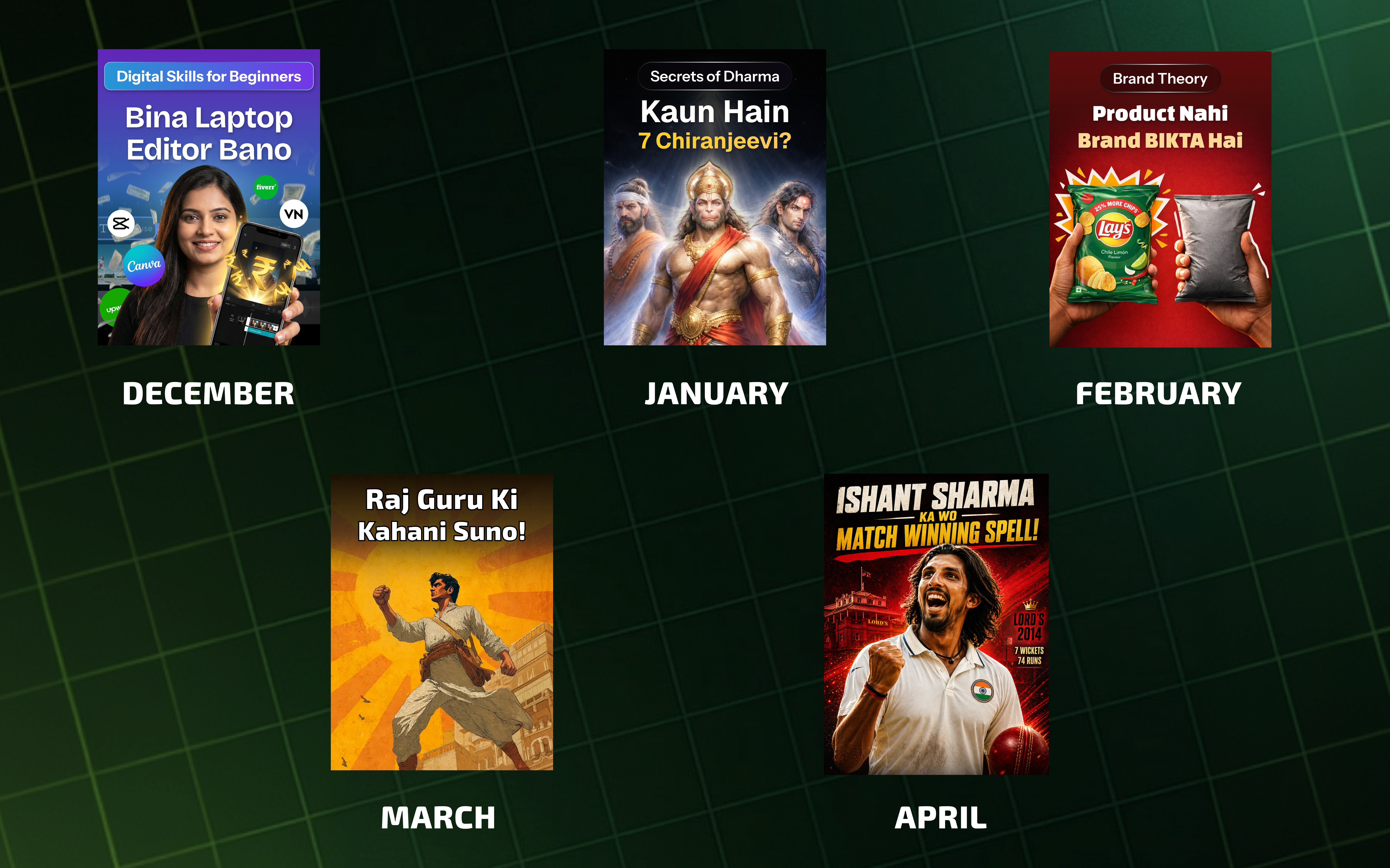
The task wasn't to make a great thumbnail. It was to stop making weak ones.
The Turn
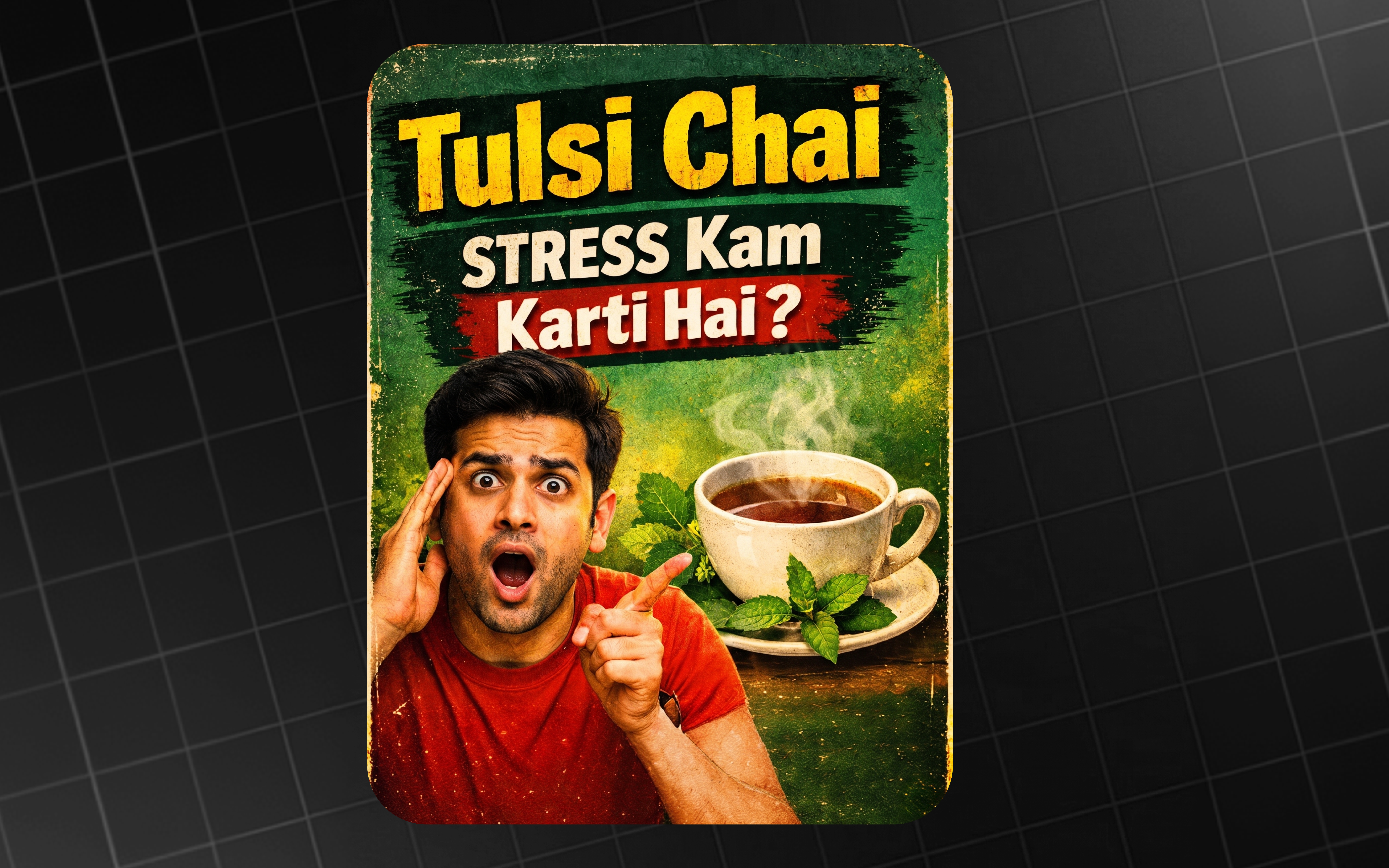
For weeks I was iterating fast — pushing AI hard to give me as many variations on an idea as I could ship in a day. Then one iteration came back, and I stopped.
This isn't a fluke.
That was the turn. Not a tool. A way of looking.
What followed was a system: custom AI agents for researching styles, reusable text-style references, and an automation that takes an idea and returns well-shaped options instead of random shots. The agents didn't make the work better — they made repeatable what used to be lucky.
The Journey, in Four Shifts
The four shifts didn't happen on one day. They emerged once I started looking at my own work the way I'd look at someone else's — honestly, and one decision at a time.
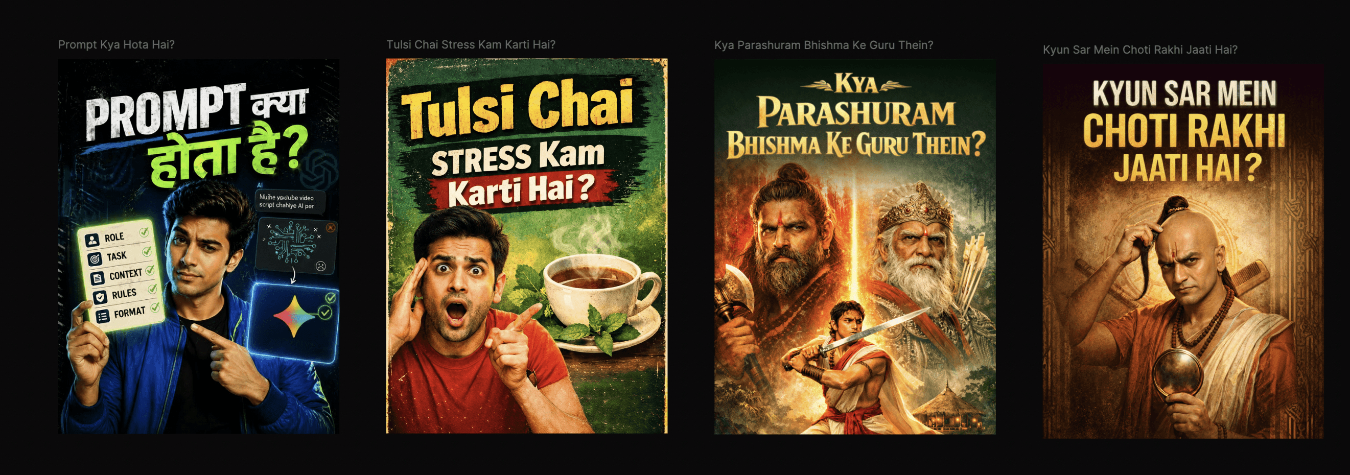
Shift 01 — Text: from decoration to delivery
Principle
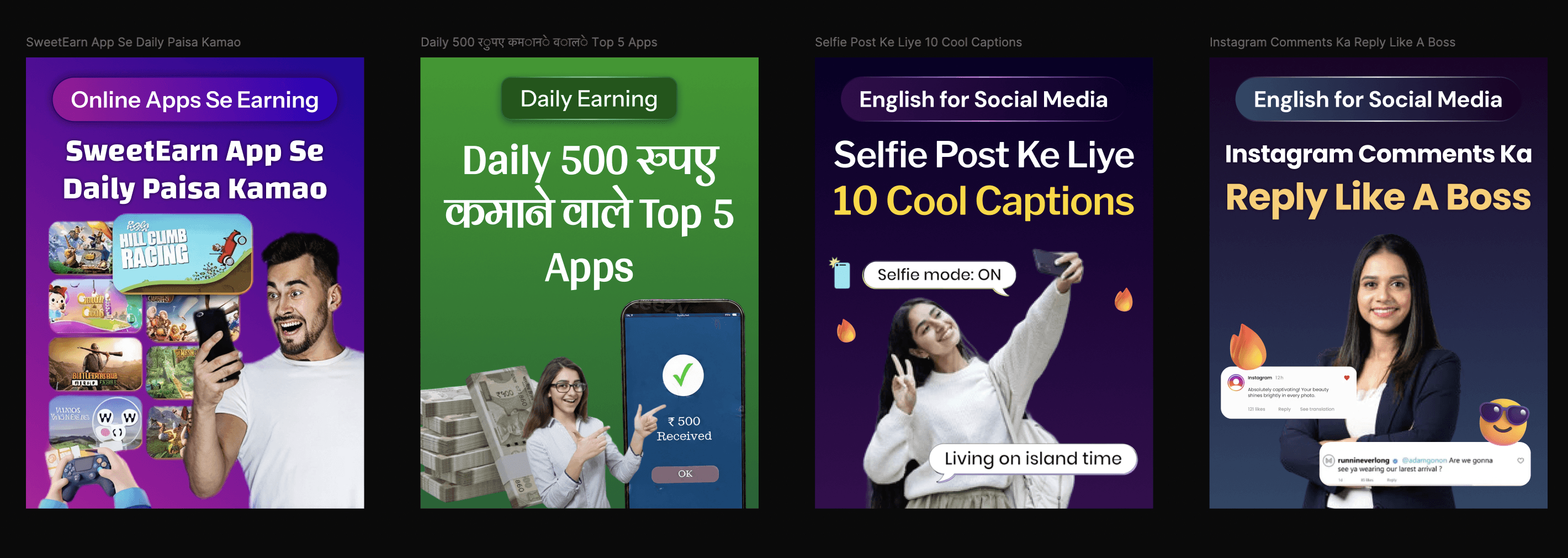
Before. Unorganised text. Too many words. No hierarchy, no readability check, no thought about minimum size or accessibility. Type was decoration on top of an image.
After. First, I cut elements. The thumbnail has one job in one second of scroll — everything beyond that is cognitive tax. Then I changed how the words look: stylised type built in Illustrator (or shaped with AI), tuned for contrast against the background, sized for legibility on a 4-inch phone. The text stopped being pasted on top of the composition and became part of it.
Shift 02 — Layout: from arranging to directing
Principle
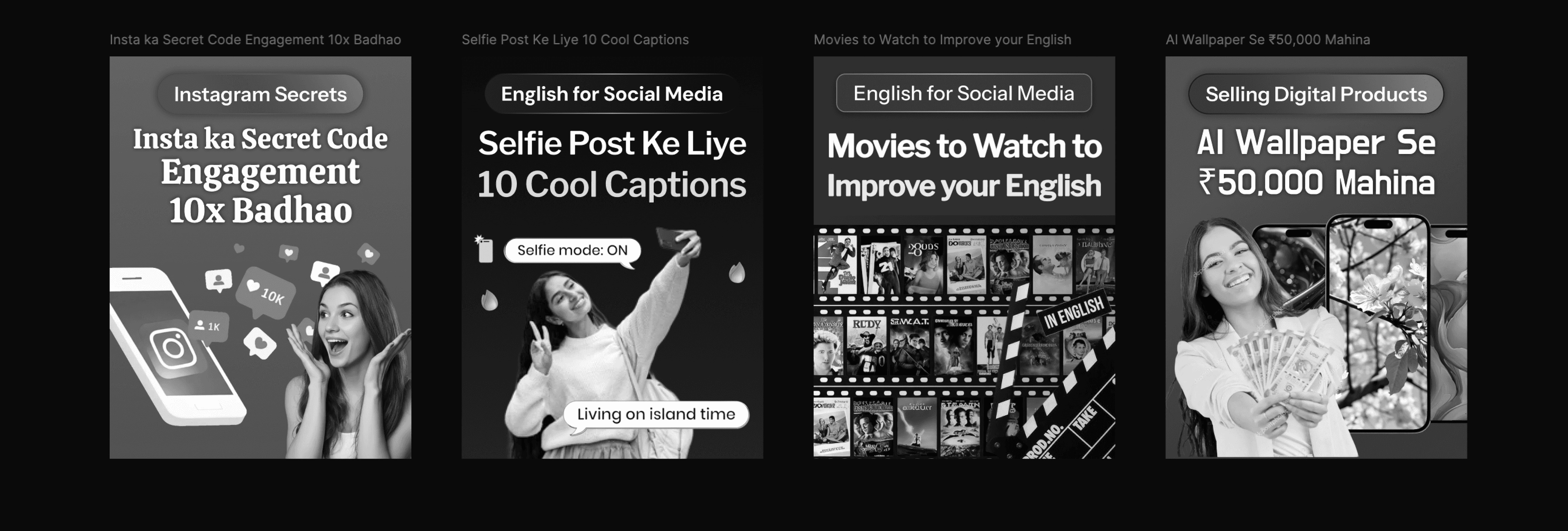
Before. Every thumbnail was a fight — three elements competing for the eye, no visual hierarchy.
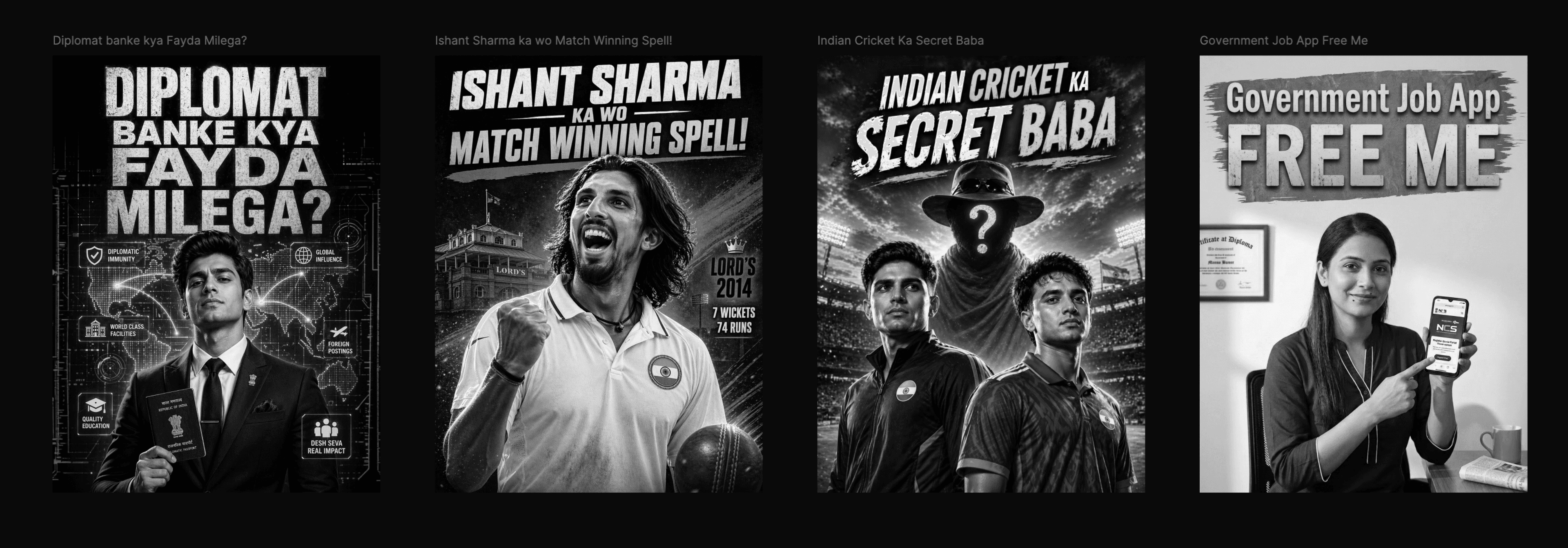
After. I designed around a single focal point: the subject lives in the centre, peripheral elements give just enough context for the topic, nothing more. The harder call was knowing when the graphic shouldn't be the hero — when the topic can't be said in an image and the headline has to lead. Learning to make that call thumbnail by thumbnail was the real layout shift.
Craft tactic — to stress-test contrast, I desaturate the image. If it still reads in greyscale, it works in the feed.
Shift 03 — Colour: from palette to hierarchy
Principle
Before. Five colours per thumbnail. White text on top by default. No thought to how the colours interacted.
After. A three-step hierarchy I run on every brief:
- Context first. If the topic has a recognisable colour — Indian flag, a brand, a sport — start there.
- Psychology second. If not, lean on colour psychology — what should the user feel before they read a word?
- Text last. The text colour is chosen to contrast the background — not defaulted to white.

Shift 04 — AI: from button to system
Principle
Before. AI was a button I pressed when I was stuck — unstructured, single-shot, used just enough to get the work out.
After. A system. Custom AI agents do the legwork — researching reference styles per topic, generating prompt templates I reuse. A library of predefined text styles lives alongside them, so the agents have grammar to work from. (I built that agent system as a standalone project — see Gamma.)
What changed isn't that I use AI more. It's that I no longer ask it to do the design. I ask it to widen the search.
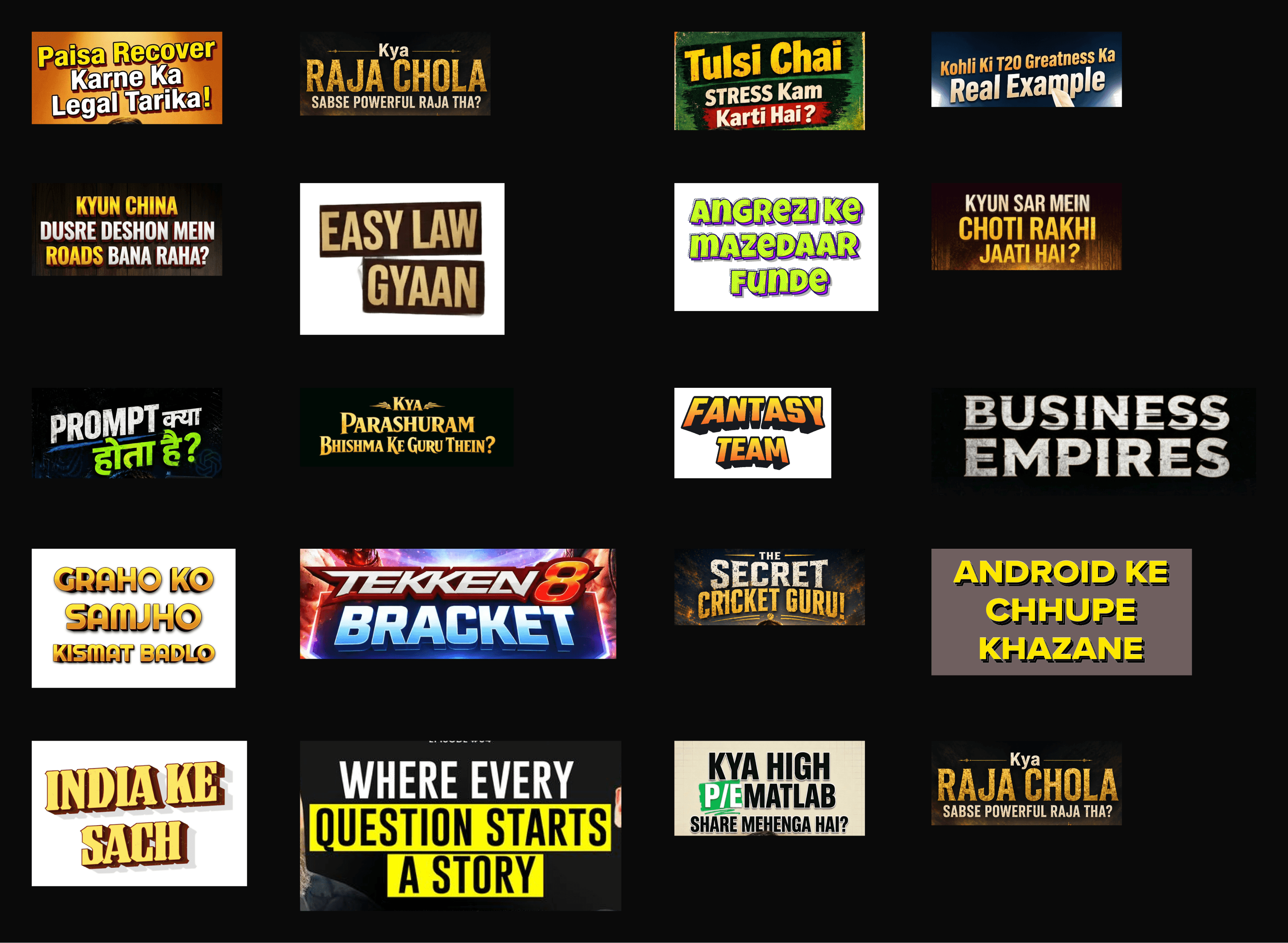
The four shifts compounded. None of them alone would have moved the floor. Together — and once they were habits, not decisions I had to make every time — the median CTR doubled and the miss rate fell from 56.5% to 23.3%.
The Proof
Across four and a half months and 833 live thumbnails, the floor moved. The ceiling didn't change much — what changed is how often I missed.
0.81% → 2.41%
Median CTR (Dec → Apr)
56.5% → 23.3%
Miss rate (CTR < 1%)
8.7% → 14.0%
Hit rate (CTR ≥ 3%)
121.0M
Total impressions
3.0 M
Clicks
Monthly evolution
December through March, my median CTR sat between 0.60% and 0.81% — a five-month plateau. April broke that pattern. Average CTR rose from 0.90% to 2.00% in the same month, and the share of work clicking above 3% nearly quadrupled — from 3.7% in March to 14.0% in April.
The fortnight inflection
At a 2-week resolution the inflection becomes precise. From 09–22 Mar (median 0.47%, miss rate 74.2%) to 23 Mar–05 Apr (median 1.08%, miss rate 47.5%) to 06–19 Apr (median 1.50%, miss rate 21.2%). In one fortnight the median more than doubled and the miss rate dropped almost 27 points. The improvement held.
Every category lifted
Every major category moved up in April. AI Se Editing — historically my weakest — went from 0.40% in March to 1.99% in April. The improvement wasn't isolated to a category I happened to be lucky in. It applied to everything I touched.
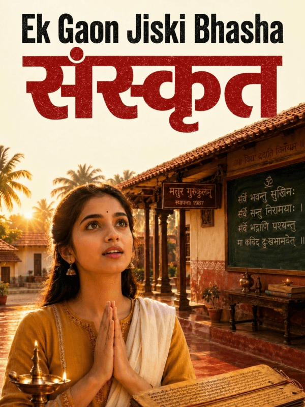
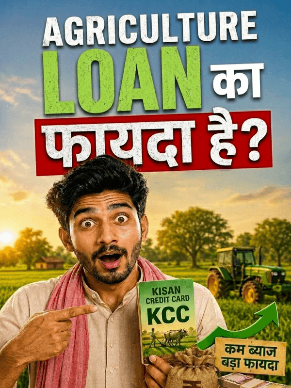
Range
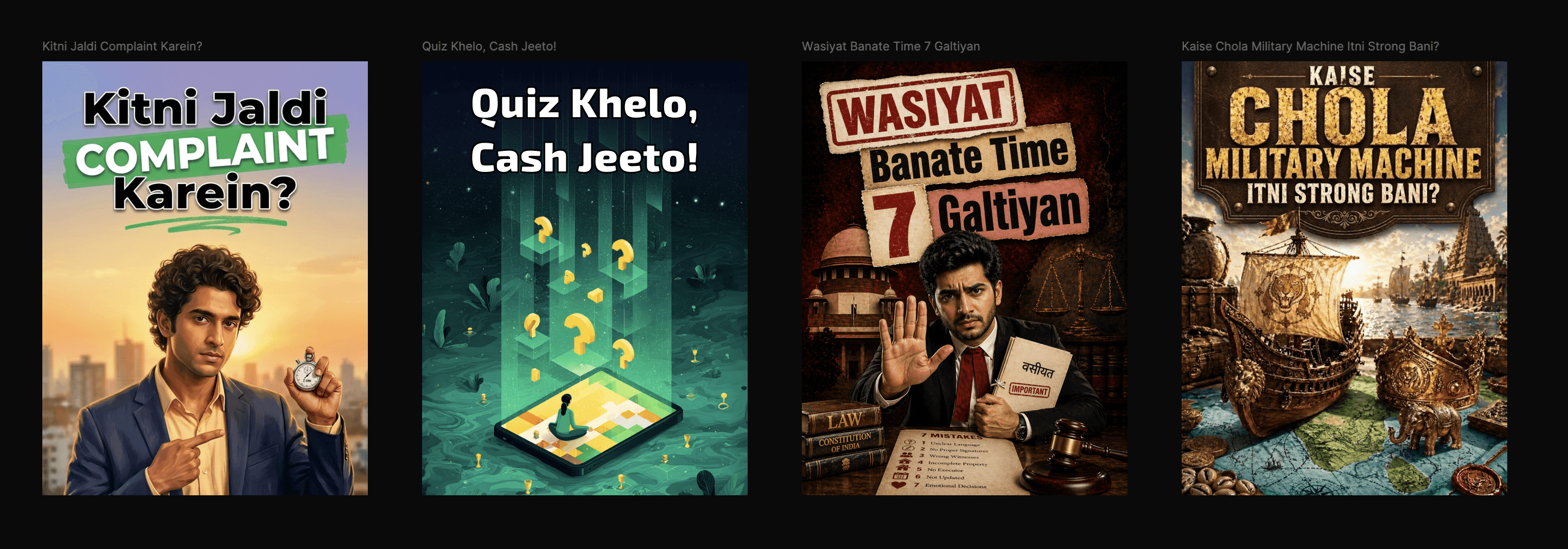
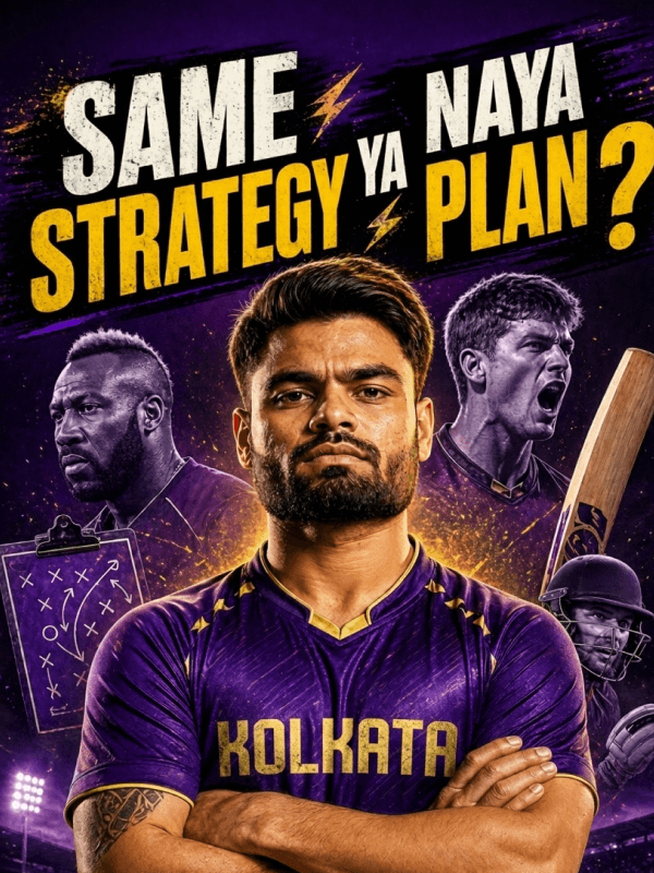
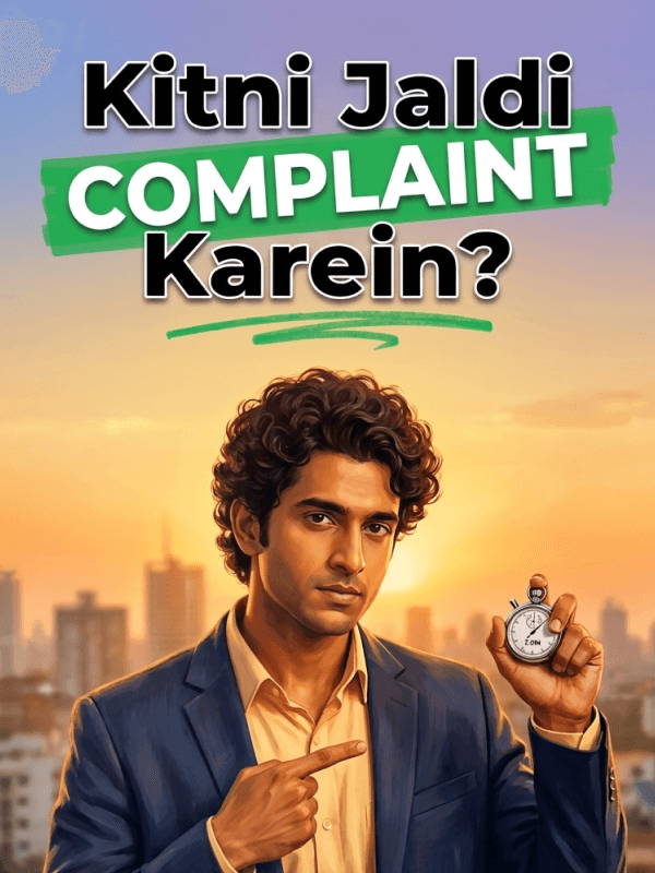
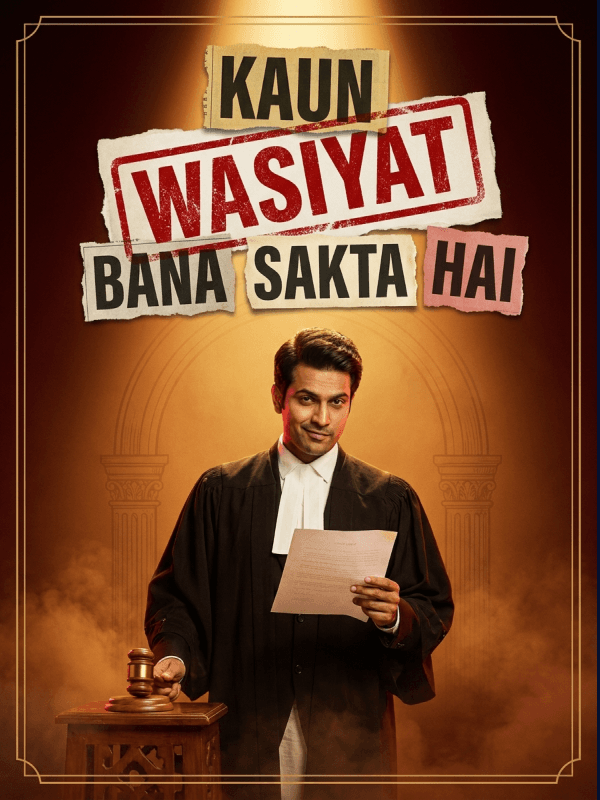
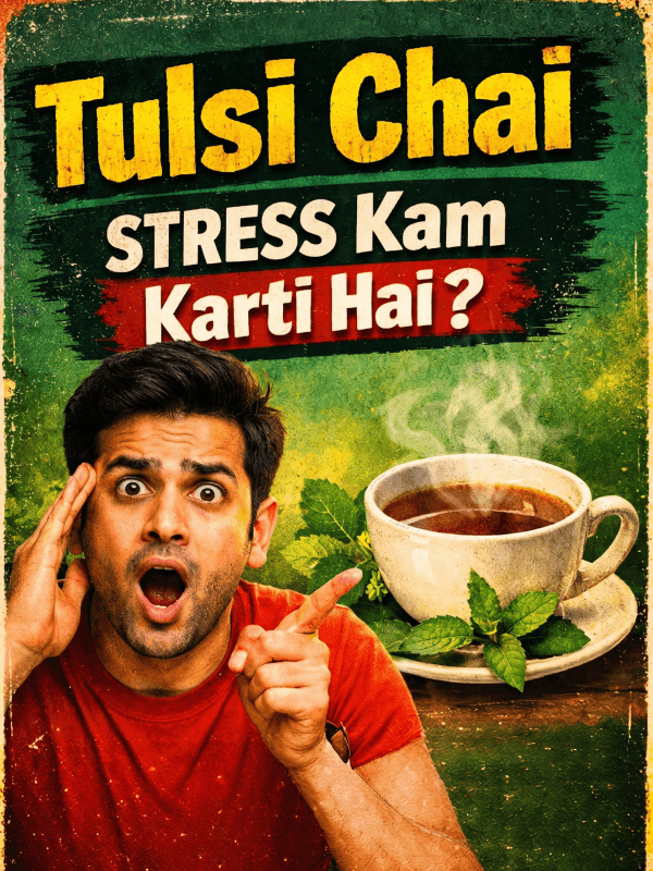
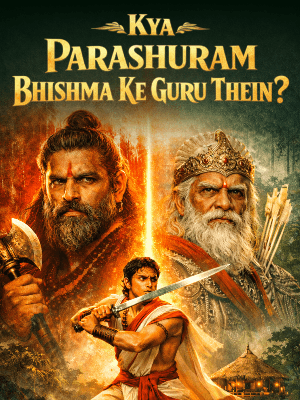
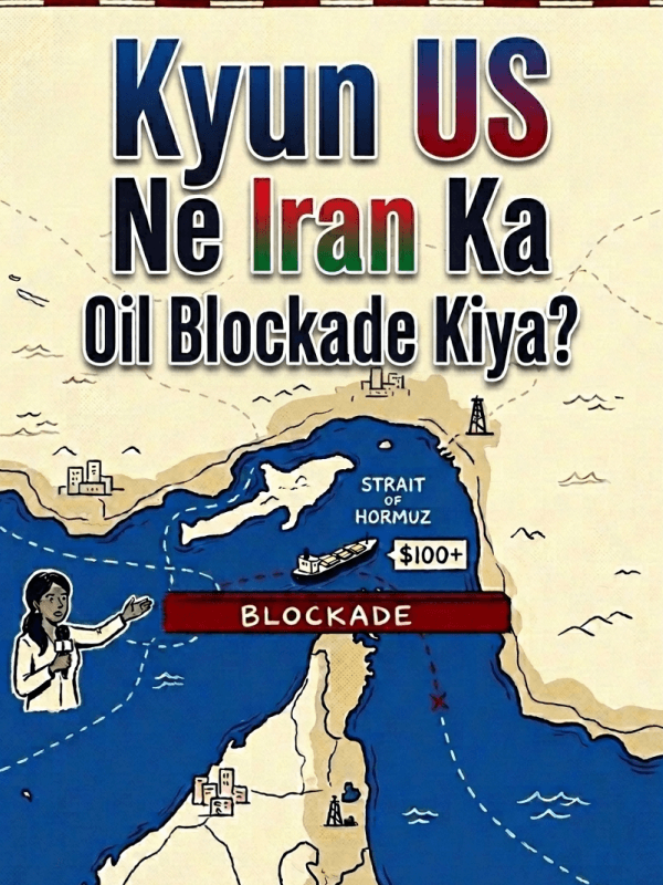
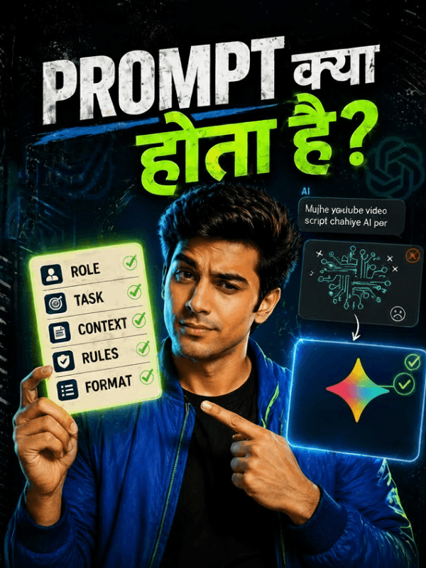
A small selection across categories — chosen for breadth, not for top CTR. The point is the work, not the metric.
Reflection
833 thumbnails. 16+ categories. One scrolling feed that doesn't slow down.
The improvement curve is the case study. One good thumbnail is taste; lifting 800 of them is craft.
The task wasn't to make a great thumbnail. It was to stop making weak ones.
A note on methodology
- Data source: the platform's internal performance dashboard. CTR is the platform-reported ctr_real value.
- Designer attribution: cross-referenced via the Master app's Topics Tracker so the analysis only includes thumbnails actually designed by me.
- Median over average: average CTR is sensitive to outliers; median better reflects the typical thumbnail. Both improved; I lead with median because it's the more honest number.
- Aaj Ka Rashifal is platform-promoted, which inflates its CTR. The numbers above include Rashifal for completeness; the non-Rashifal April median (1.46%) tells the same story.
- Completion rate is excluded. It's determined by video content, pacing, and creator delivery — not thumbnail design. Reporting it as my result would be overstating my contribution.
- Window: 8 December 2025 → 22 April 2026.