Case Study
Ritam — Redesigning a News Ecosystem
Designed the complete digital product for an Indian news company — consumer app, admin panel, and content tools. From information architecture to design system, end to end.
Client
Role
Timeline
Industry
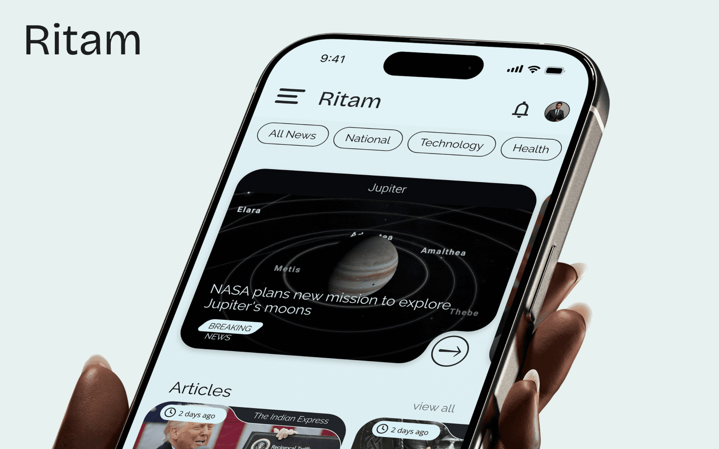
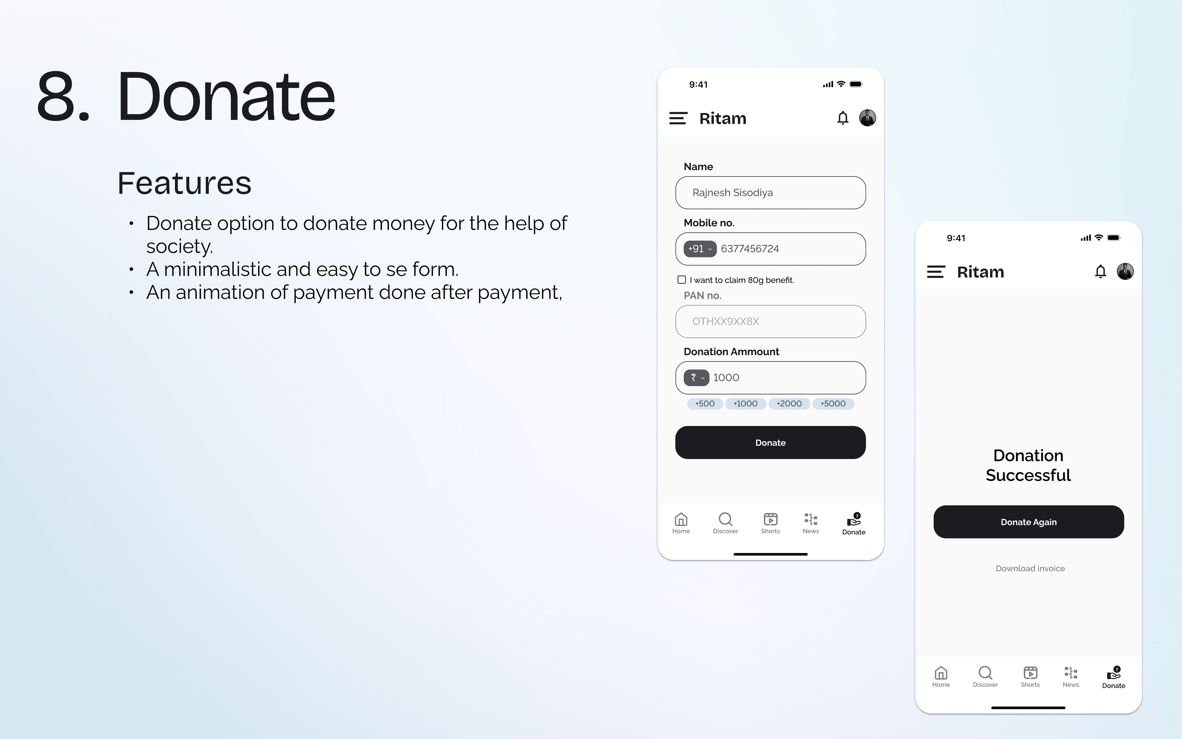
Ritam is an established Indian news organization transitioning to digital-first. They needed more than just an app redesign — they needed a complete product ecosystem: a consumer-facing mobile app for readers, and an admin panel for their editorial team to manage content, users, and engagement. I designed both sides of this product in 4 weeks.
40+
Screens Designed
4 weeks
Timeline
12+
Languages Supported
Understanding the Challenge
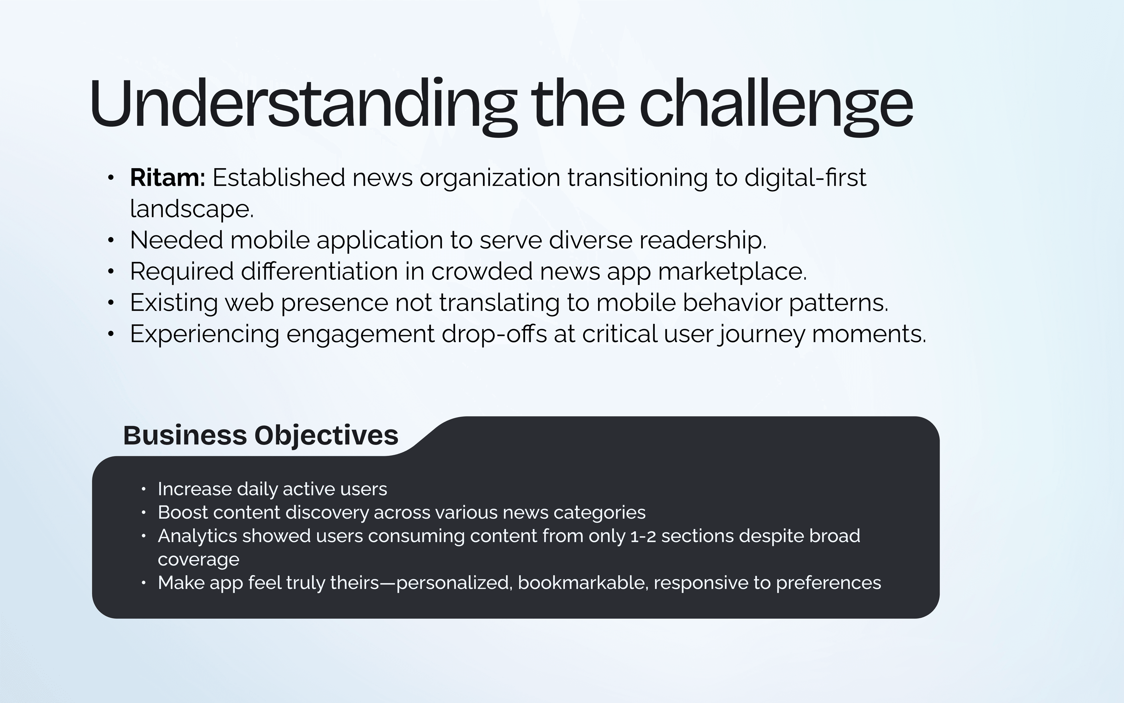
Ritam's existing web presence wasn't translating to mobile behavior patterns. Users were dropping off at critical moments in their journey. Analytics showed people consuming content from only 1-2 sections despite broad coverage across politics, business, technology, sports, and entertainment. The business needed to increase daily active users, boost content discovery, and make the app feel truly personal.
- Navigate vast content across multiple categories without overwhelming users
- Accommodate both quick headline scanning and deep reading in one interface
- Provide personalized curation without creating echo chambers
- Enable navigation that balances directed seeking with serendipitous discovery
- Build a scalable design foundation supporting future expansion and localization
- Maintain visual consistency as the product evolves without requiring complete redesigns
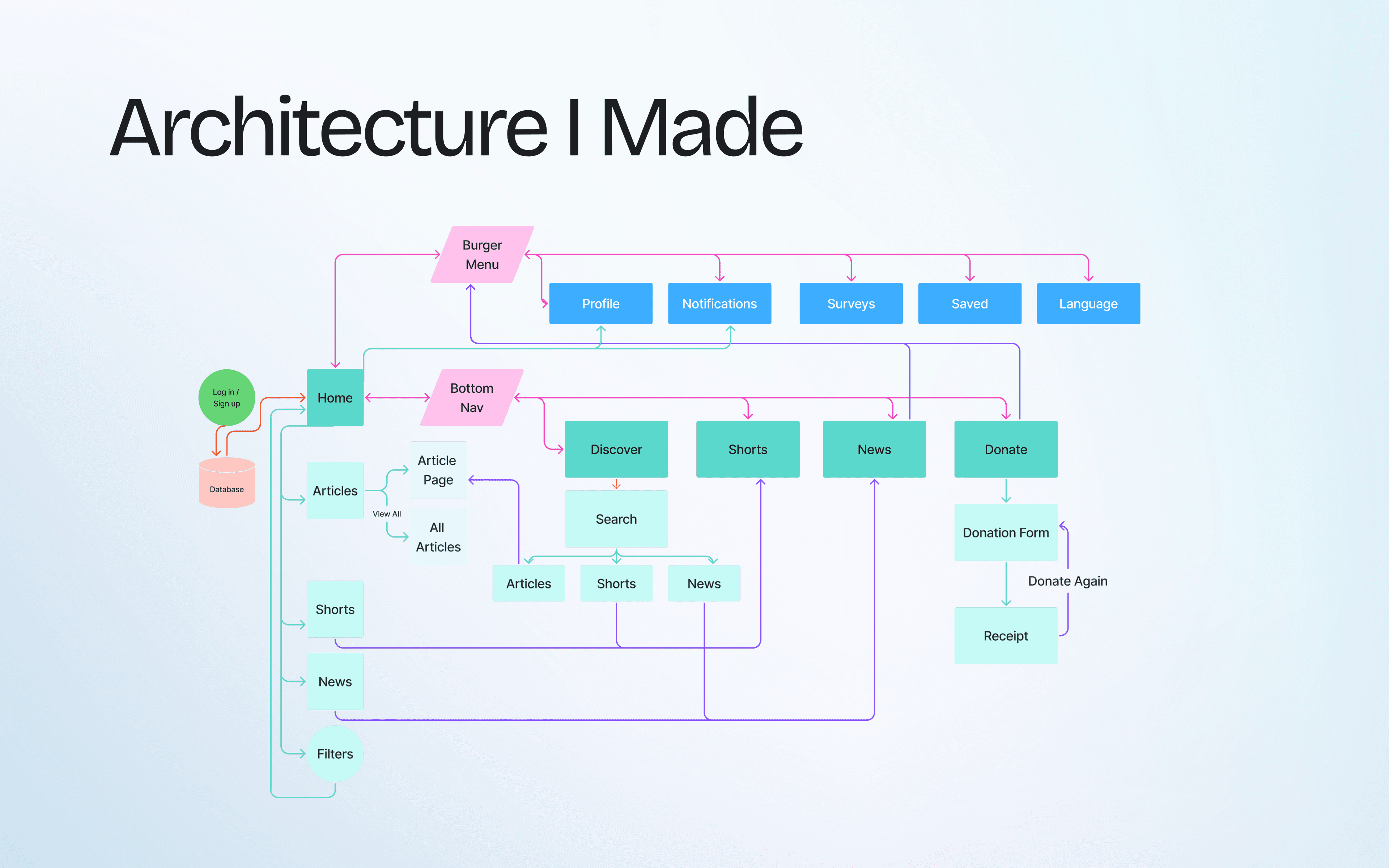
Architecture I Built
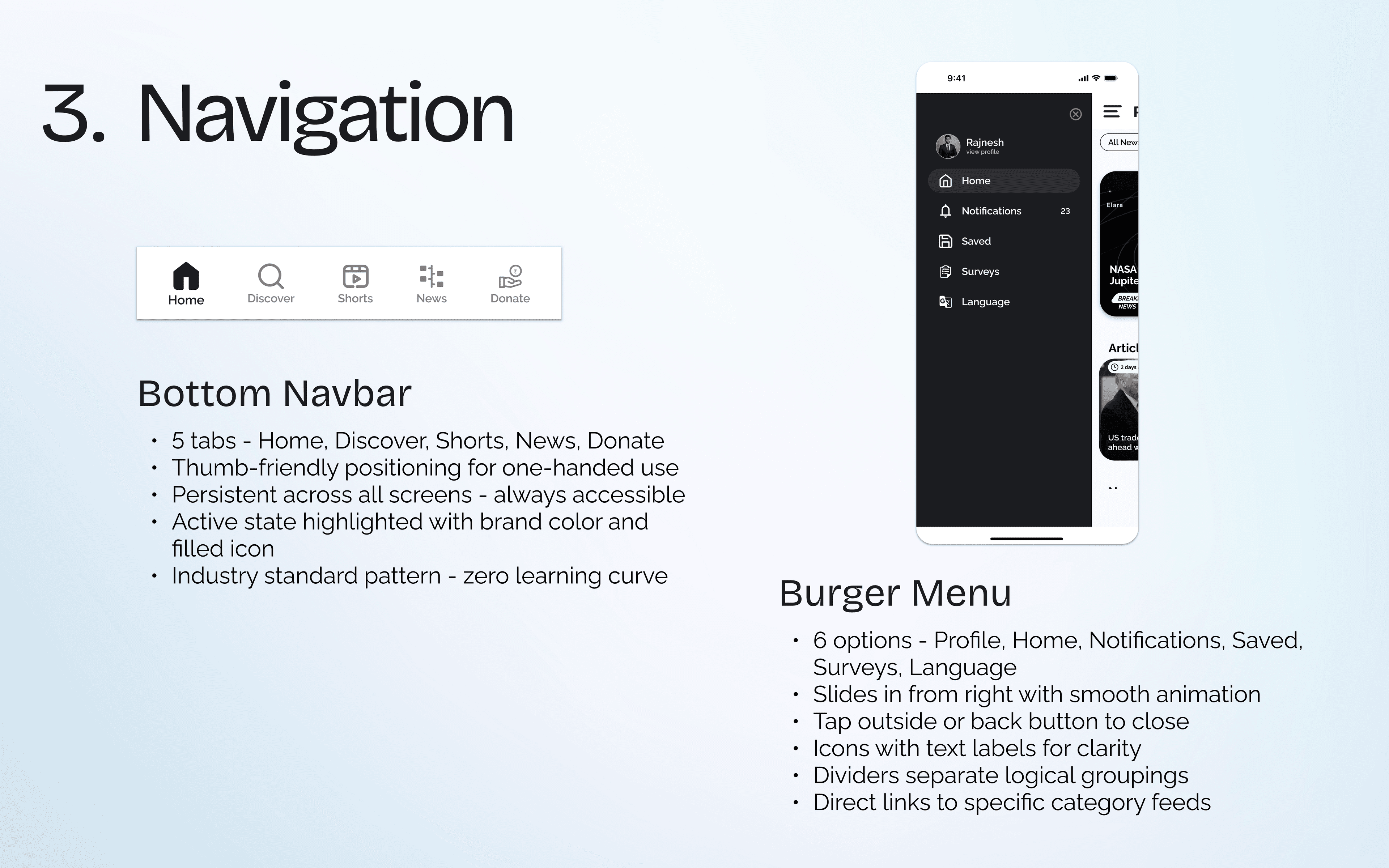
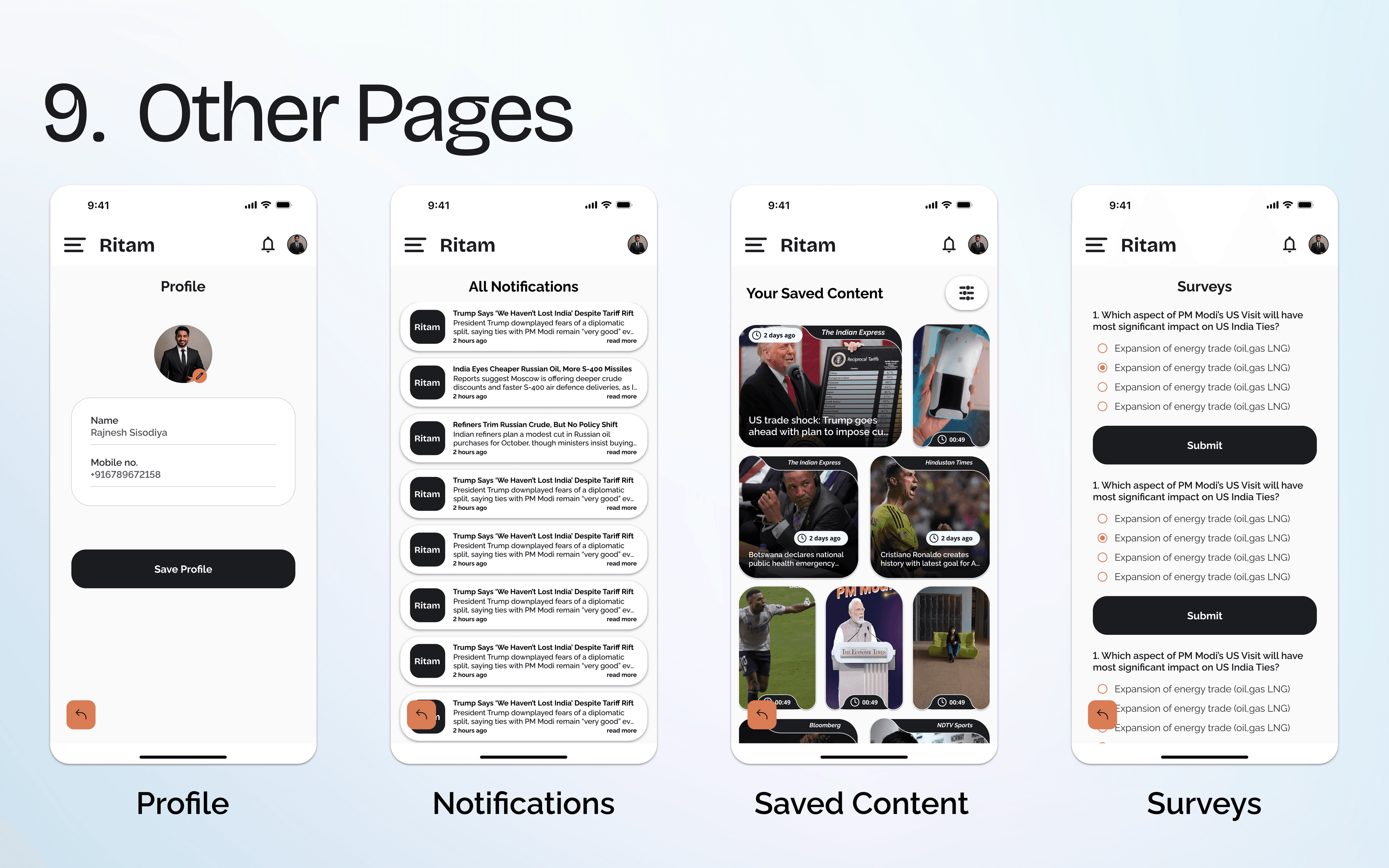
Before touching any screen, I mapped the entire information architecture — every flow, every connection, every dead end. The app needed five core tabs (Home, Discover, Shorts, News, Donate), a burger menu for secondary features (Profile, Notifications, Surveys, Saved, Language), and deep flows for article reading, search, and content filtering.
The Consumer Experience
The app needed to feel fresh and dynamic with each visit while maintaining consistency for comfortable usage patterns. Every design decision was driven by one question: does this help the reader find and enjoy news faster?
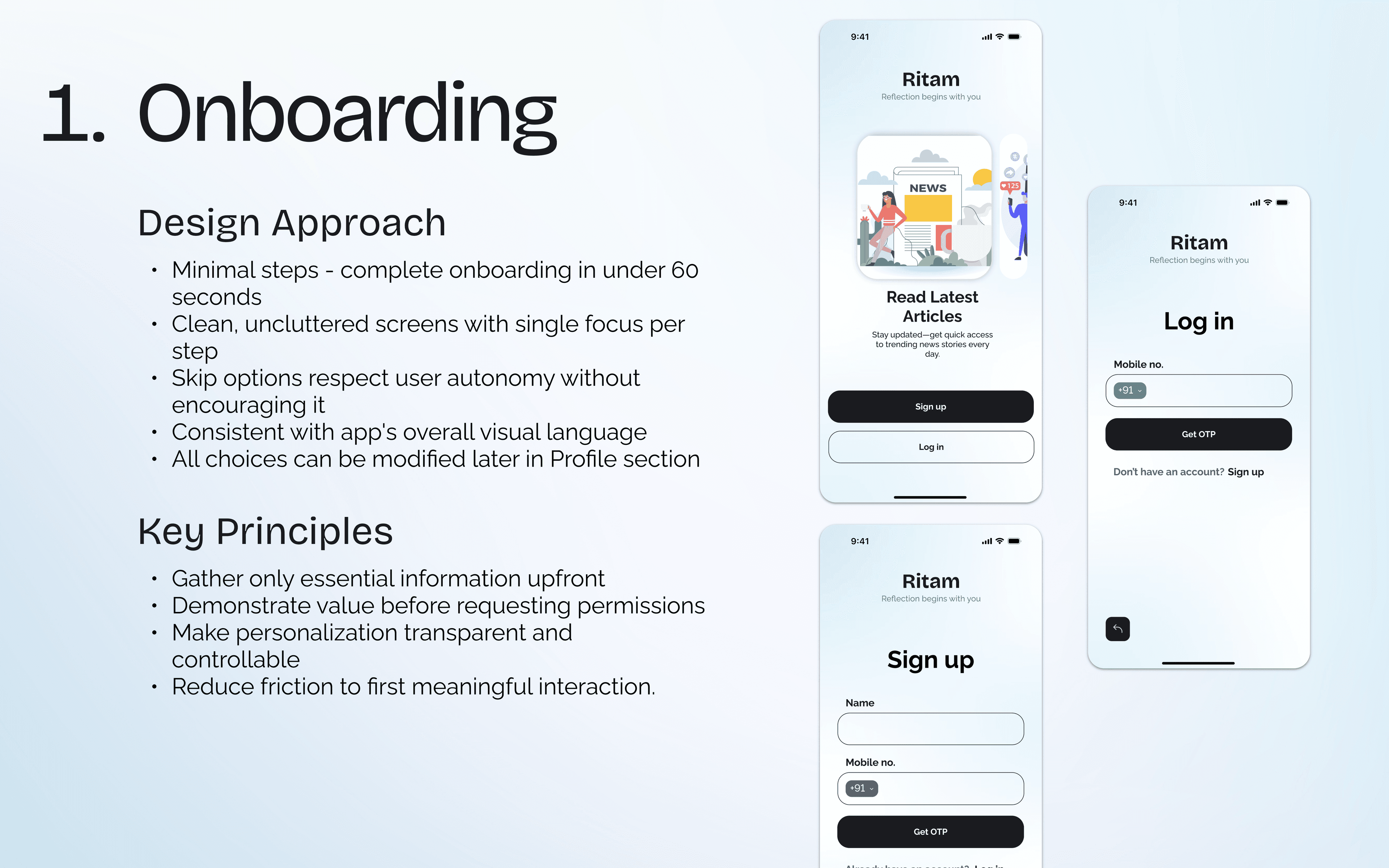
Onboarding
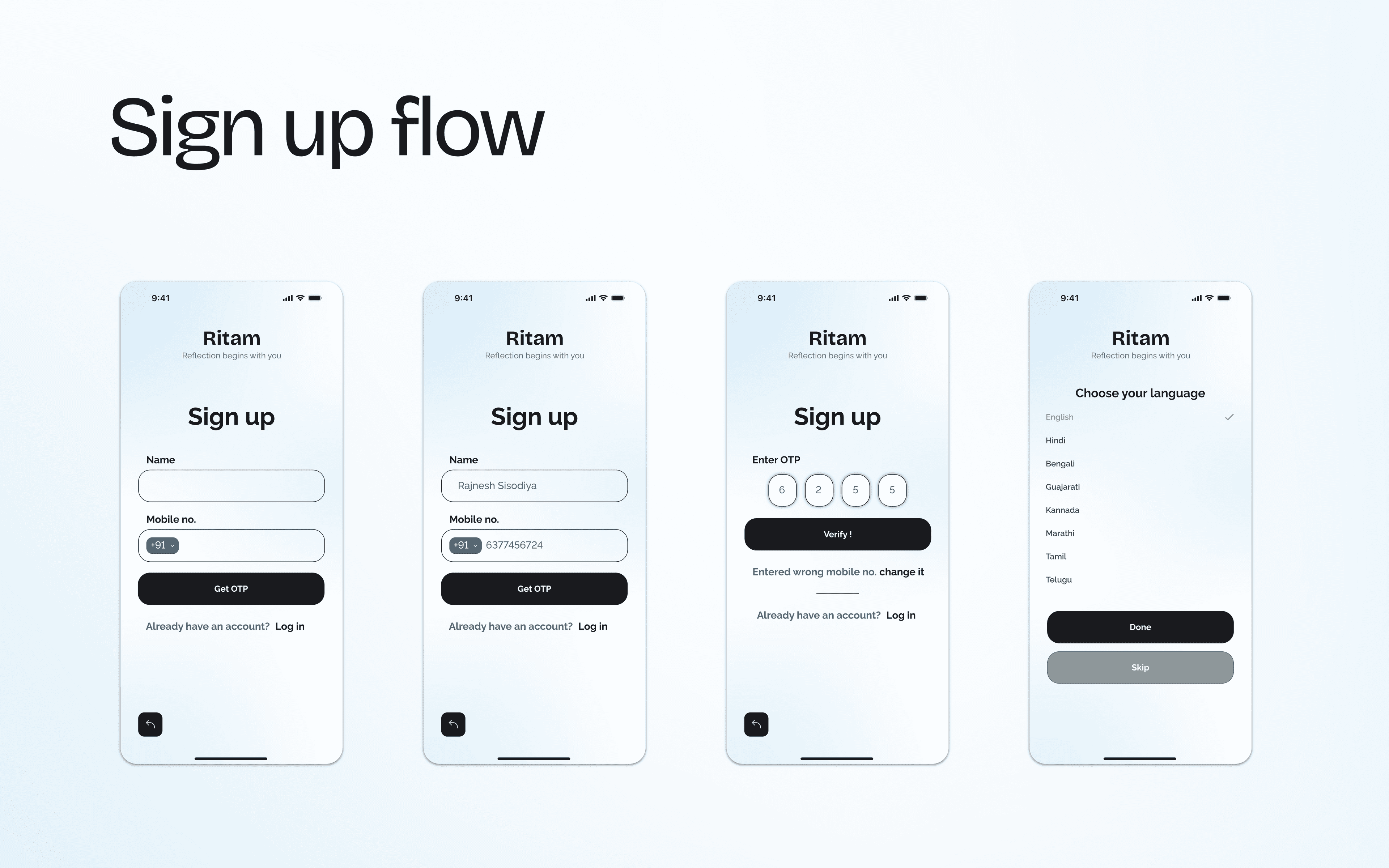
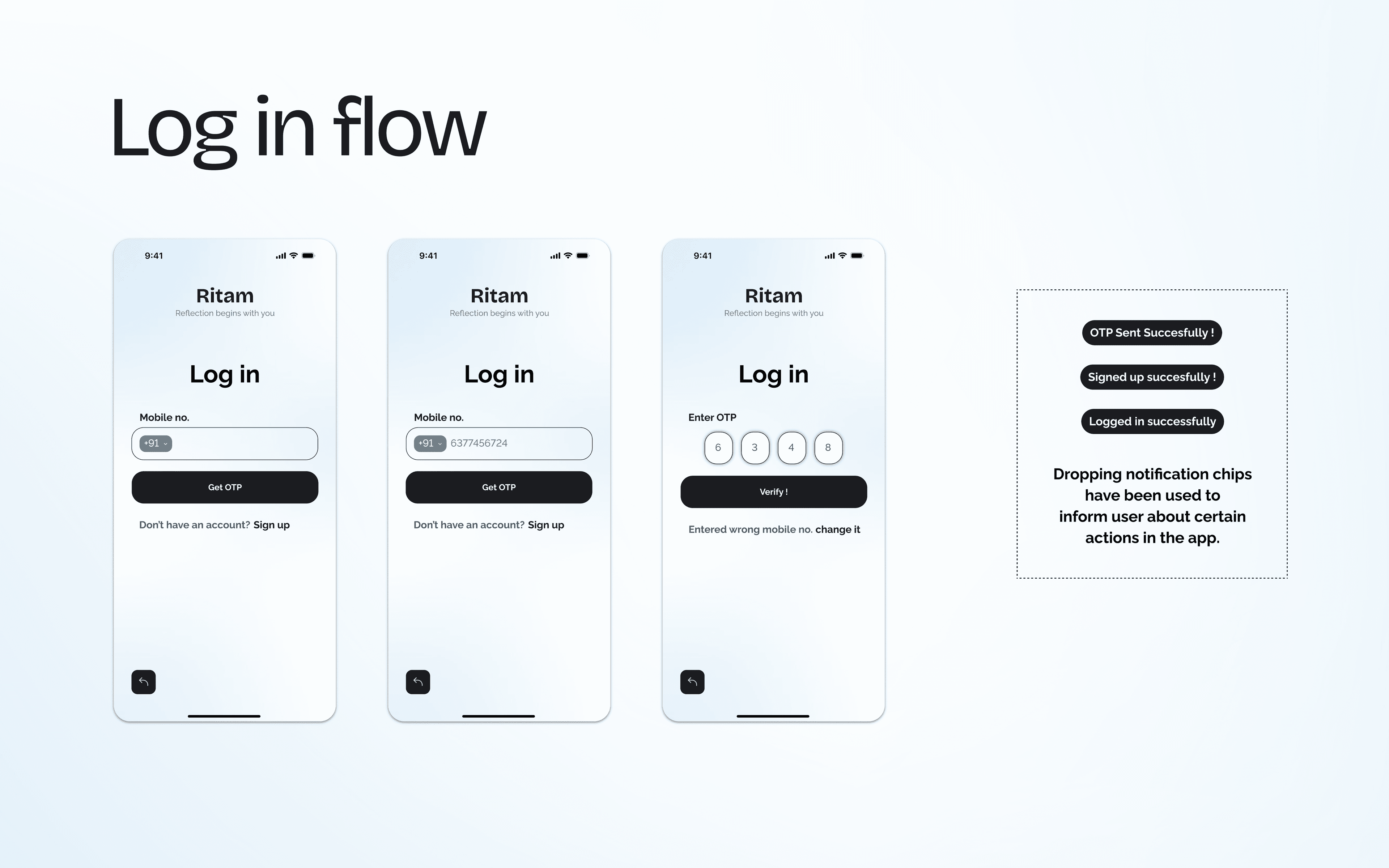
Minimal steps — complete onboarding in under 60 seconds. Clean, uncluttered screens with a single focus per step. Skip options respect user autonomy without encouraging it. Every choice can be modified later in Profile, so there's zero pressure during setup.
Home Screen & Feed System
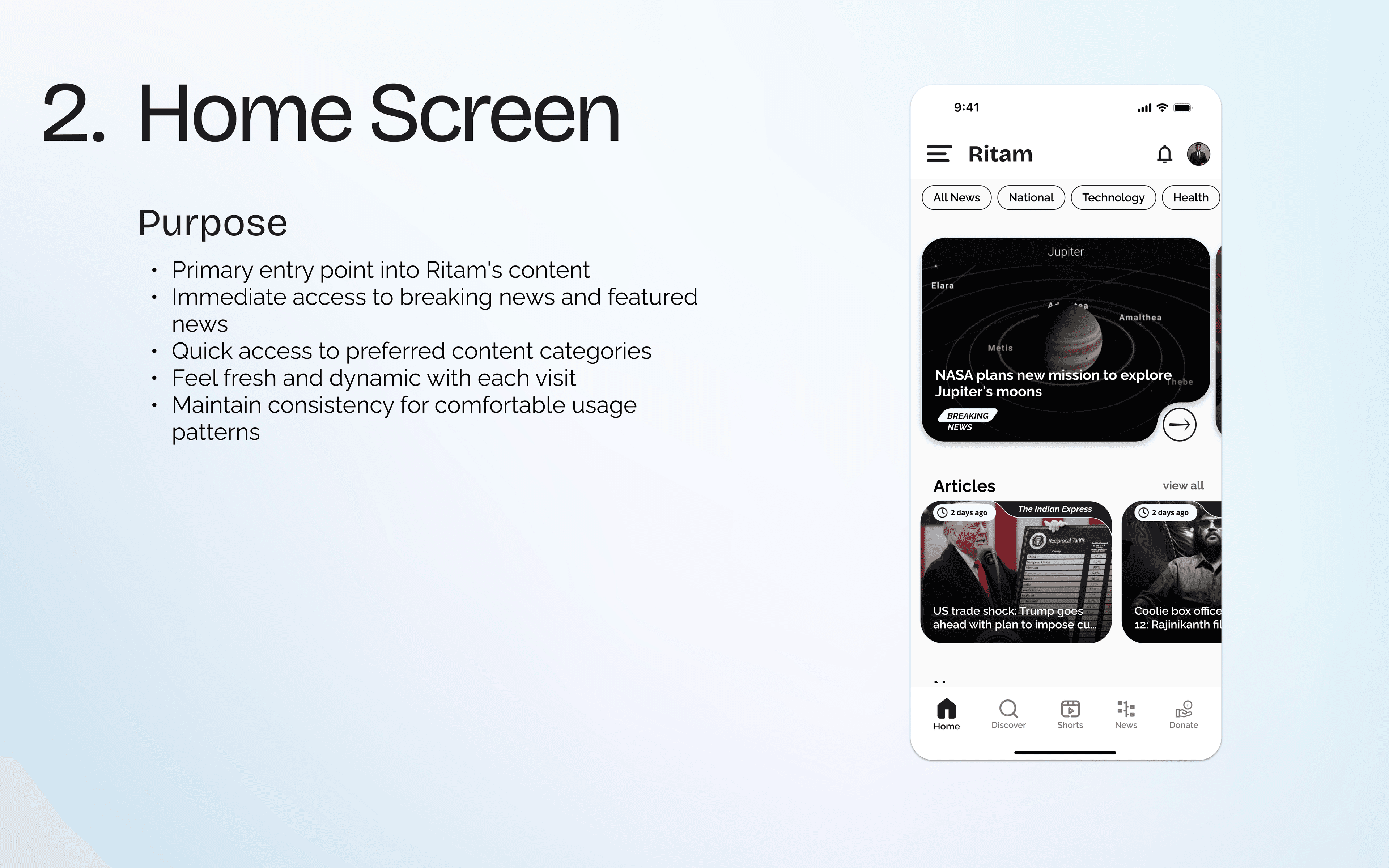
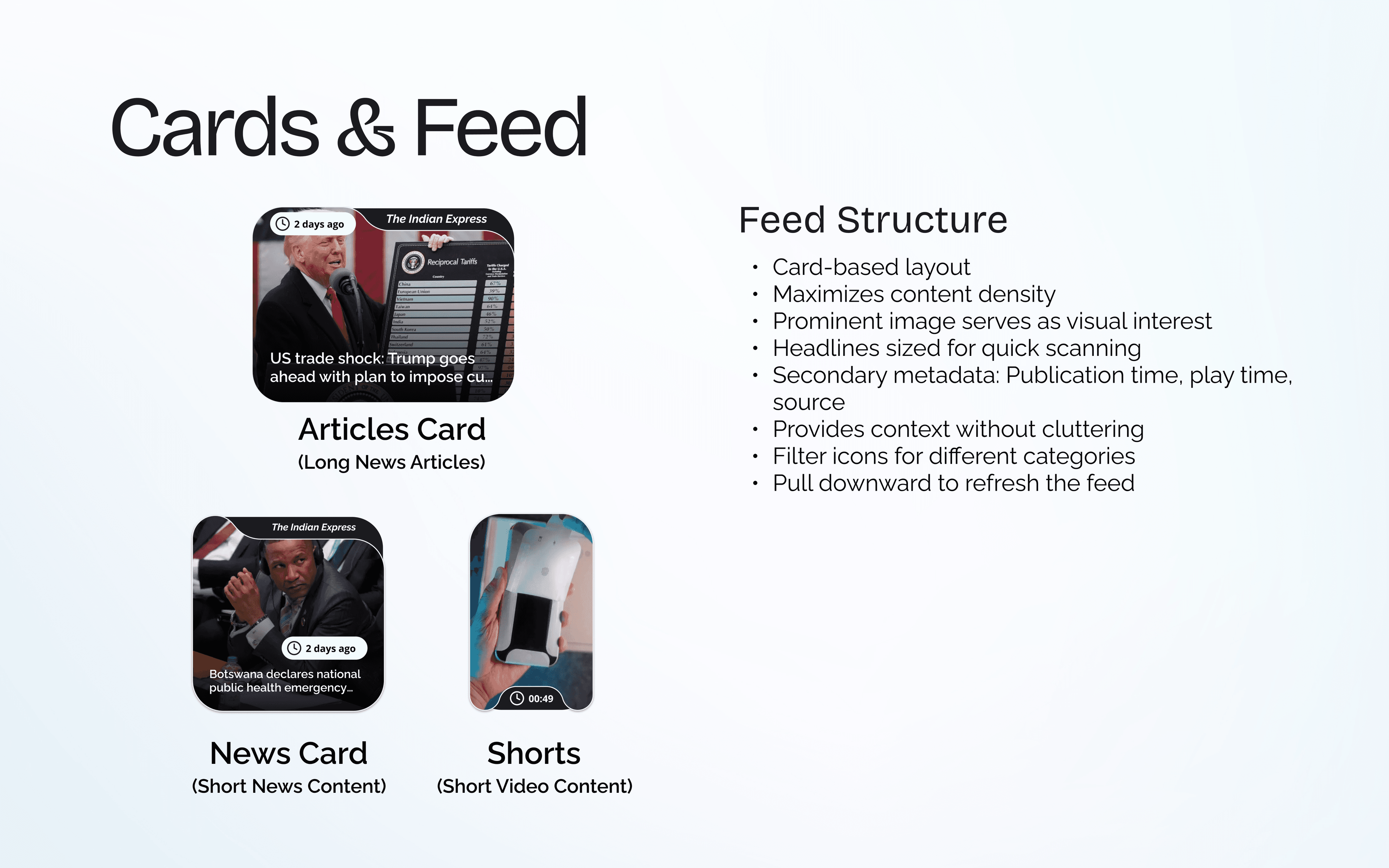
The home screen is the primary entry point into Ritam's content. It needed to give immediate access to breaking news, quick access to preferred categories, and feel dynamic with each visit. I designed three distinct card types — Articles (long reads), News (short content), and Shorts (video) — each optimized for its content format.
Navigation
Discover & Search
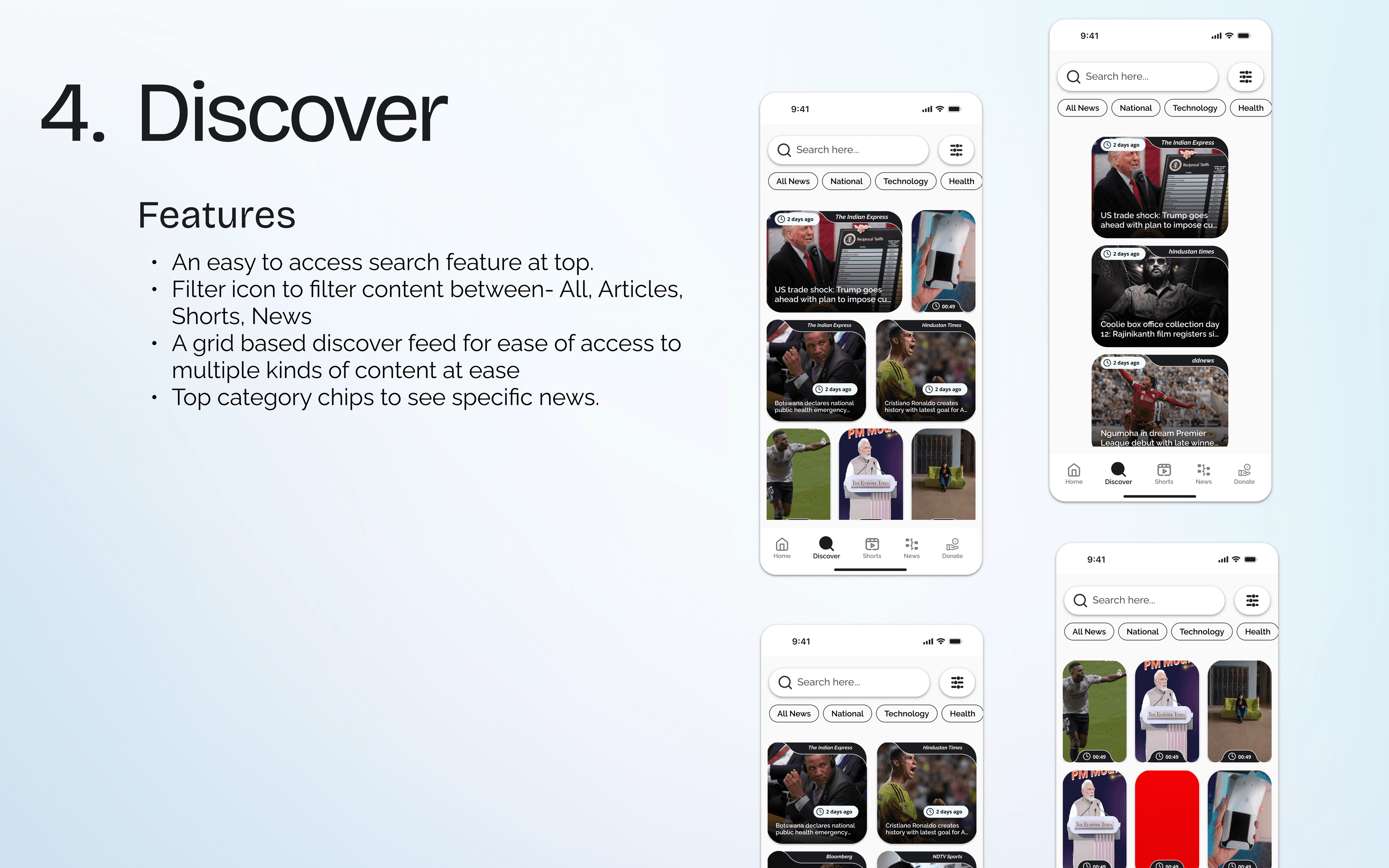
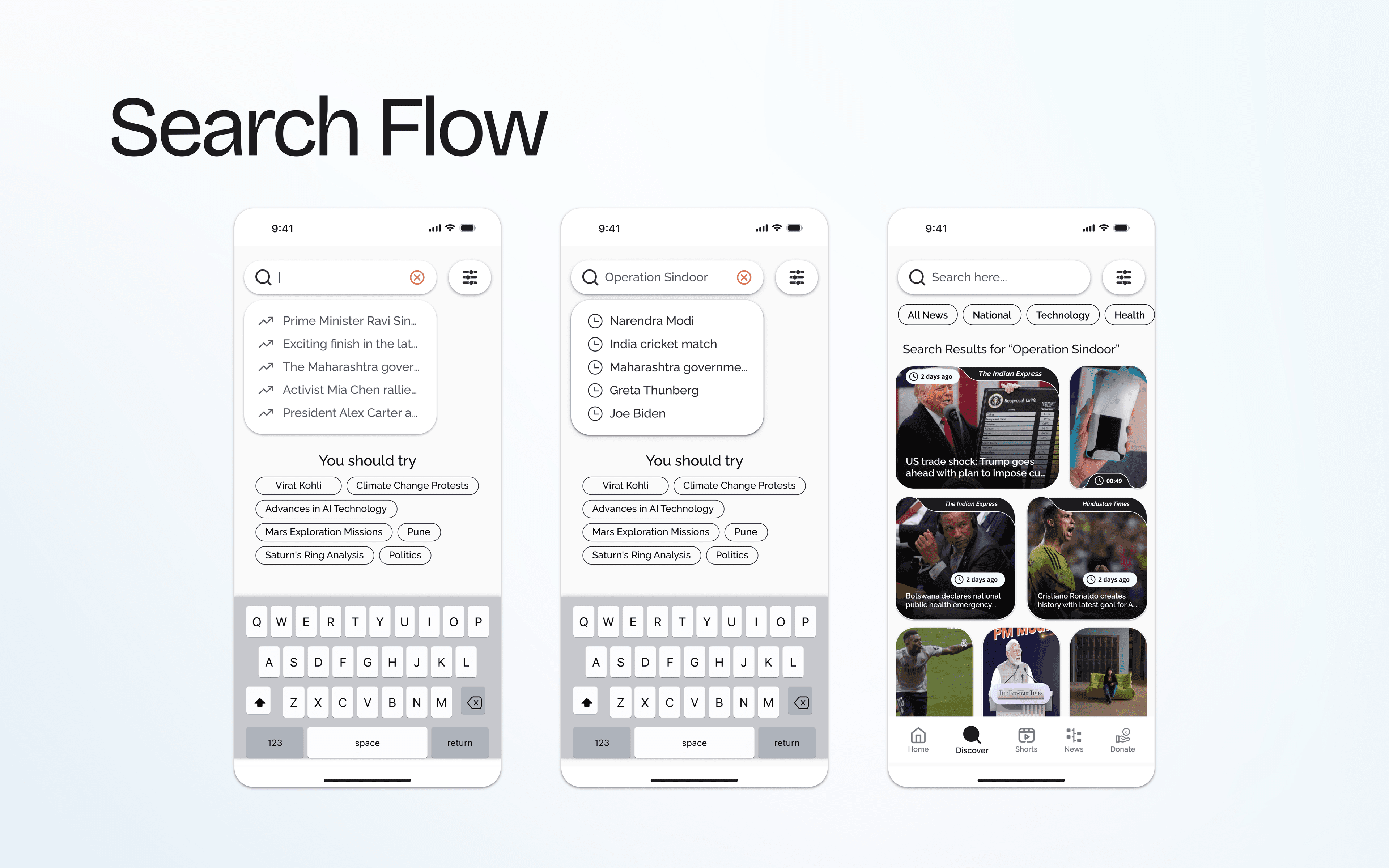
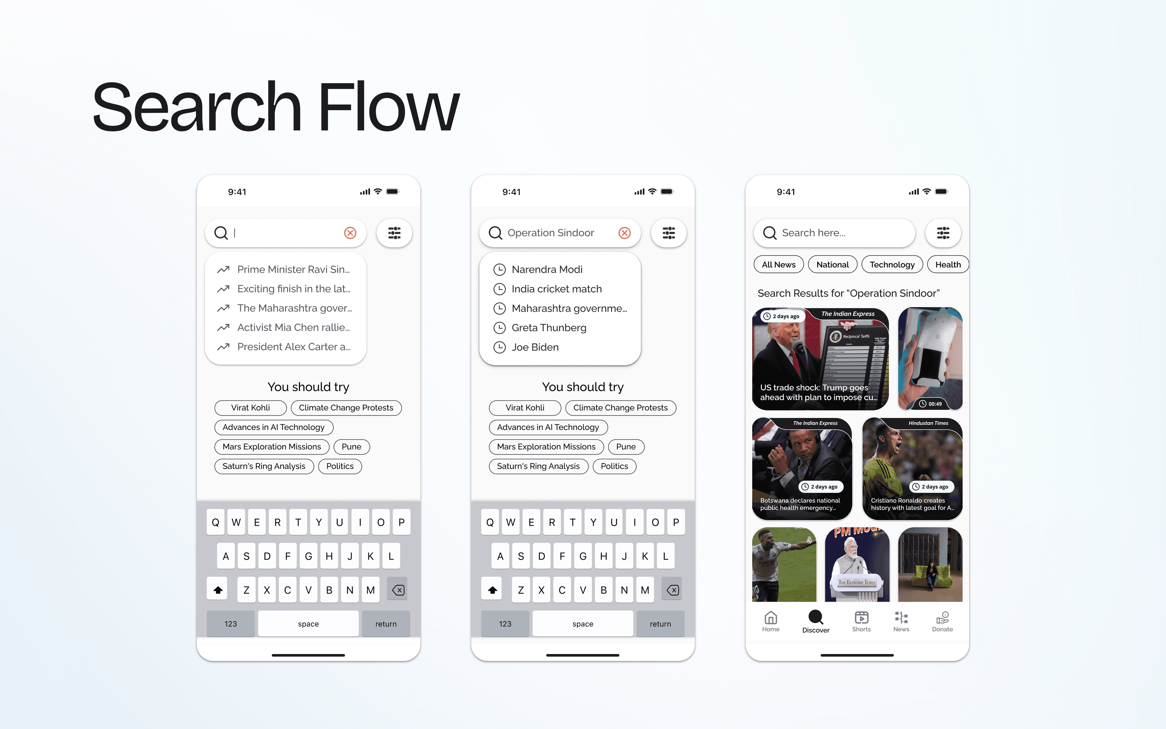
The discover page uses a grid-based feed for browsing multiple content types at ease, with top category chips and a filter icon to switch between Articles, Shorts, and News. Search includes recent searches, trending suggestions, and results filtered by category.
Reading Experiences
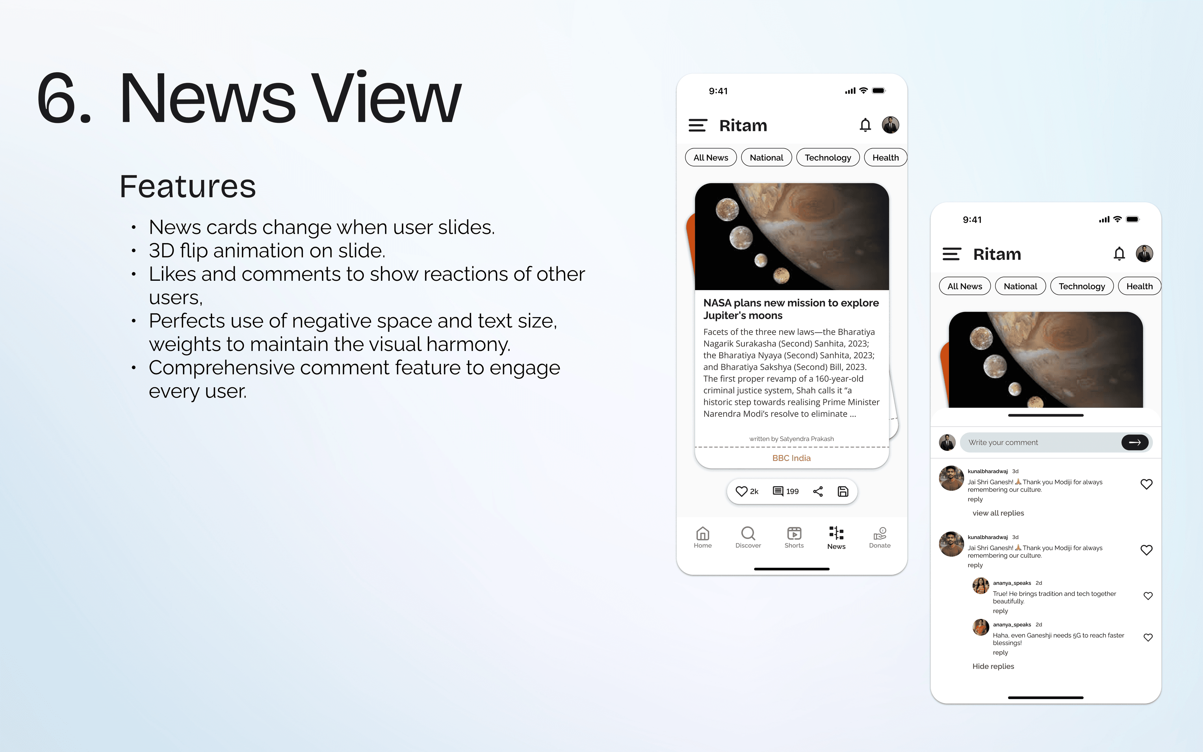
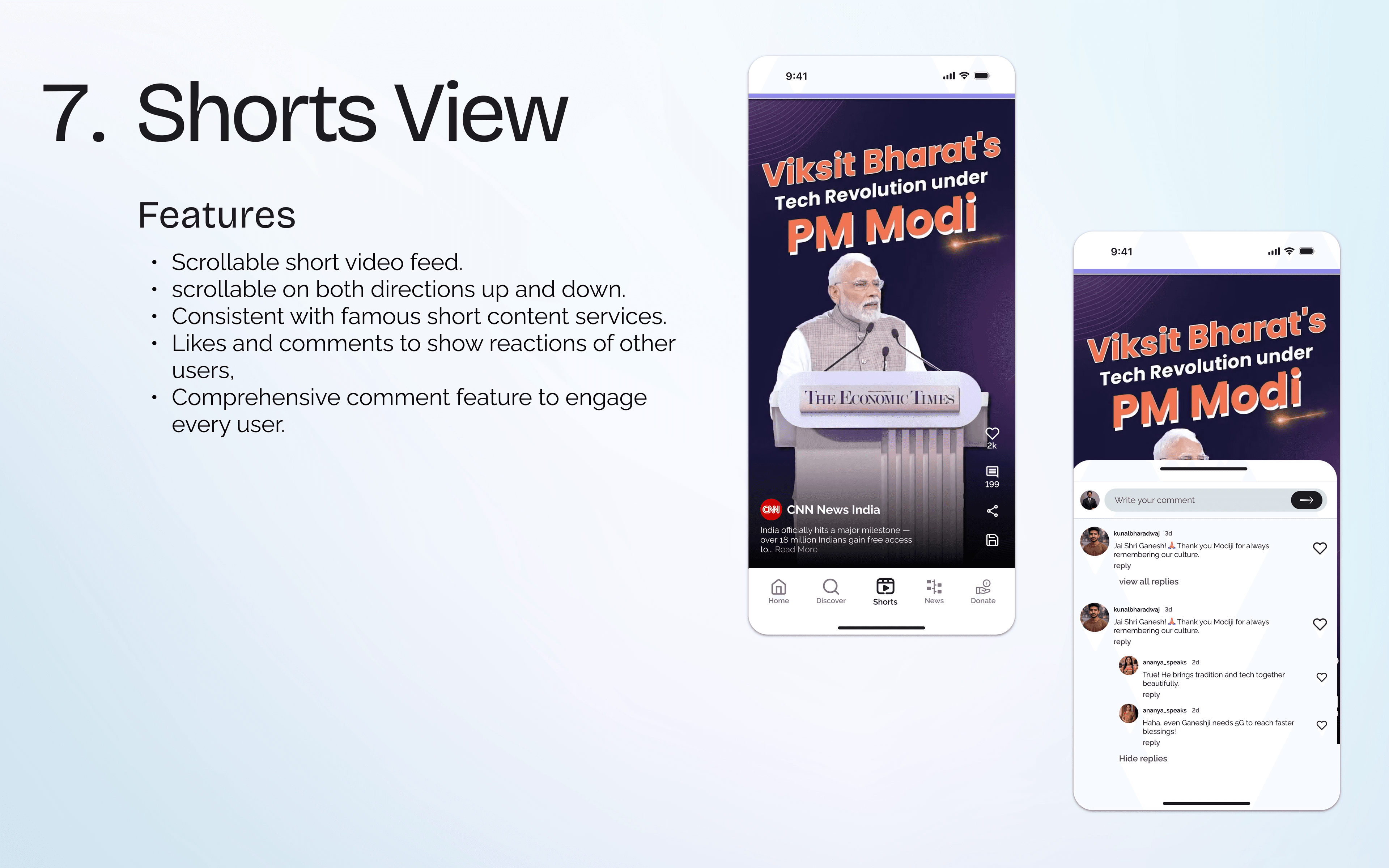
I designed three distinct reading experiences: long-form articles with sticky headlines and social engagement, a news view with 3D flip animation between cards, and a shorts view for vertical video content. Each format has its own comment section to drive engagement.
The Design System
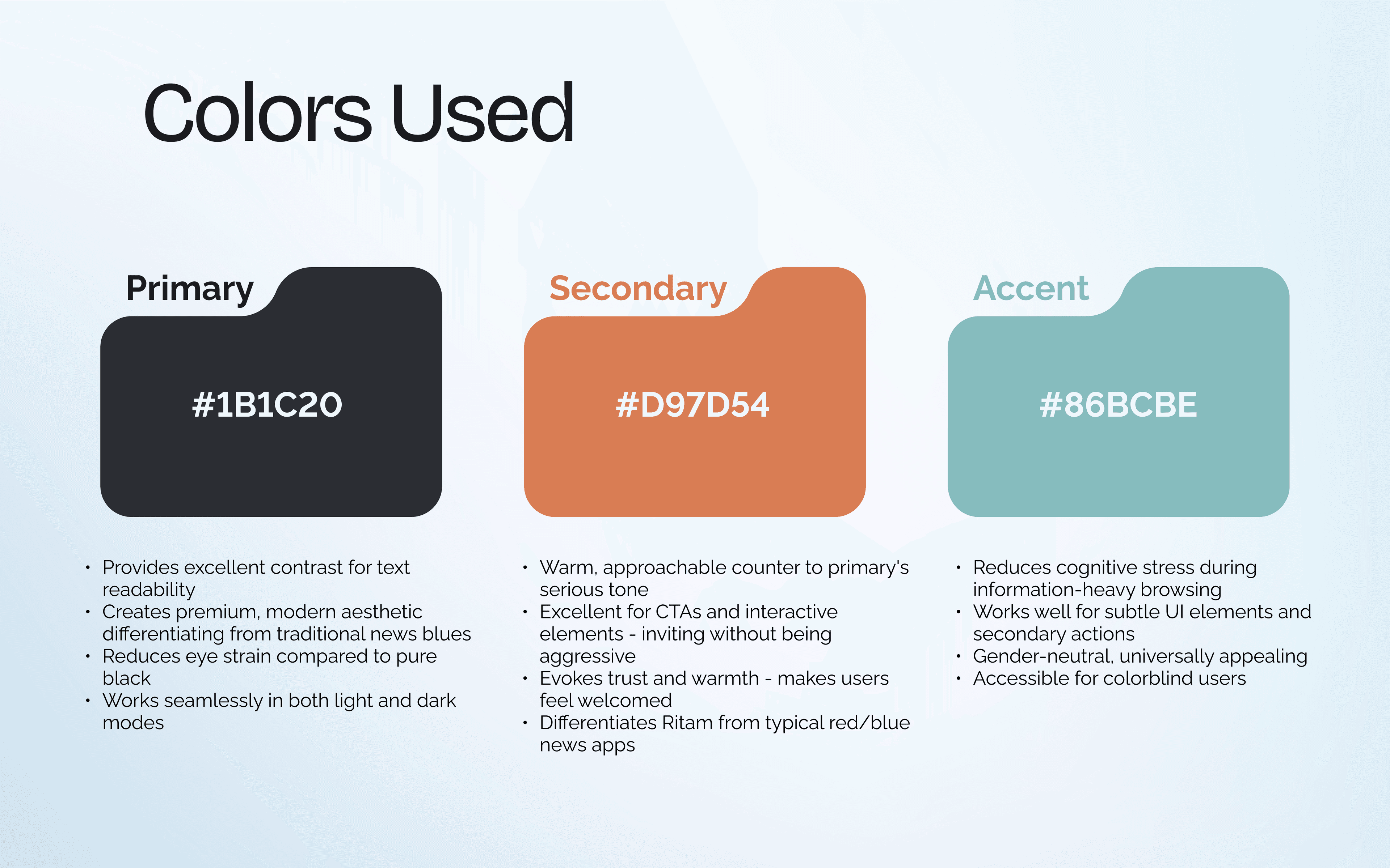
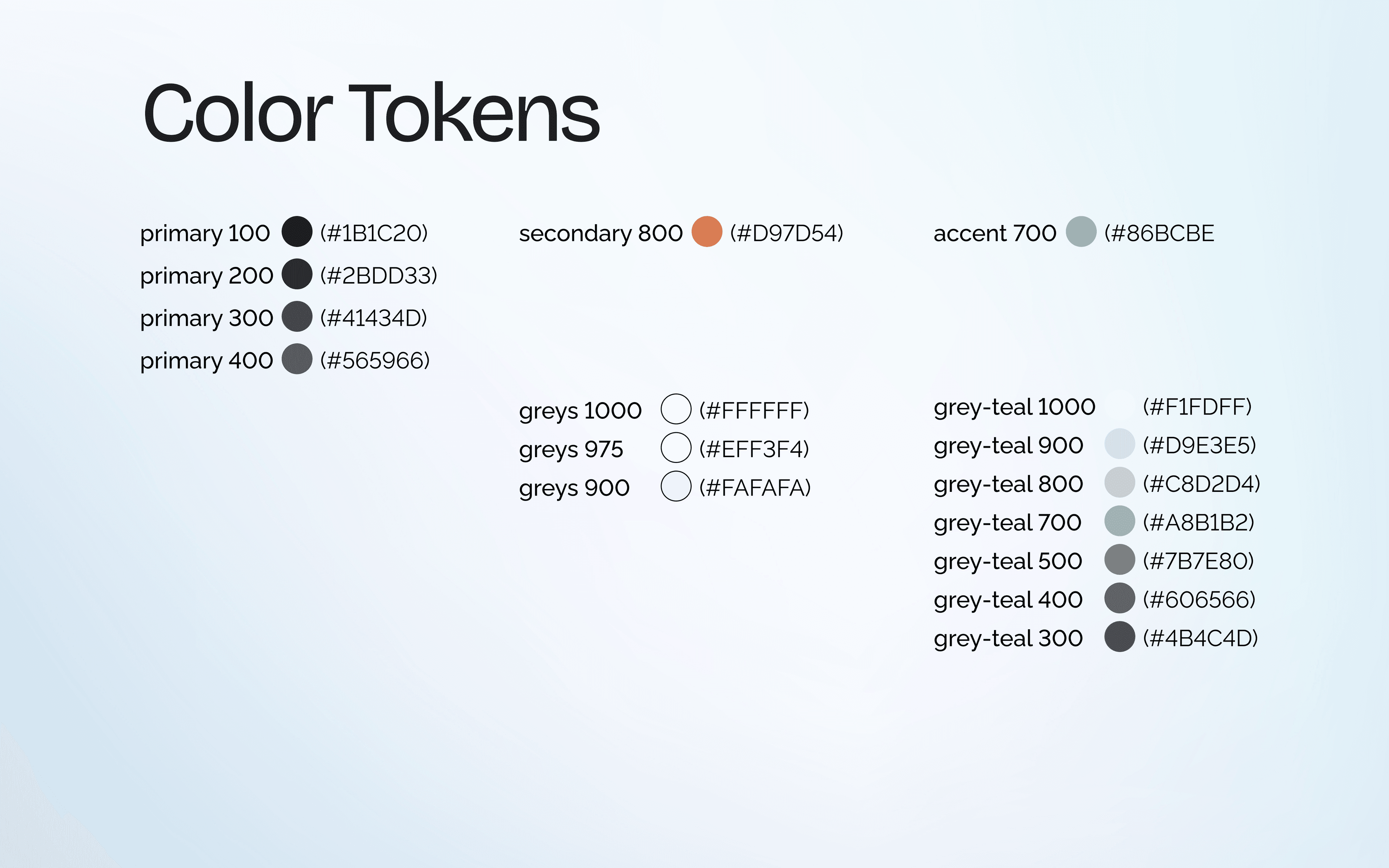
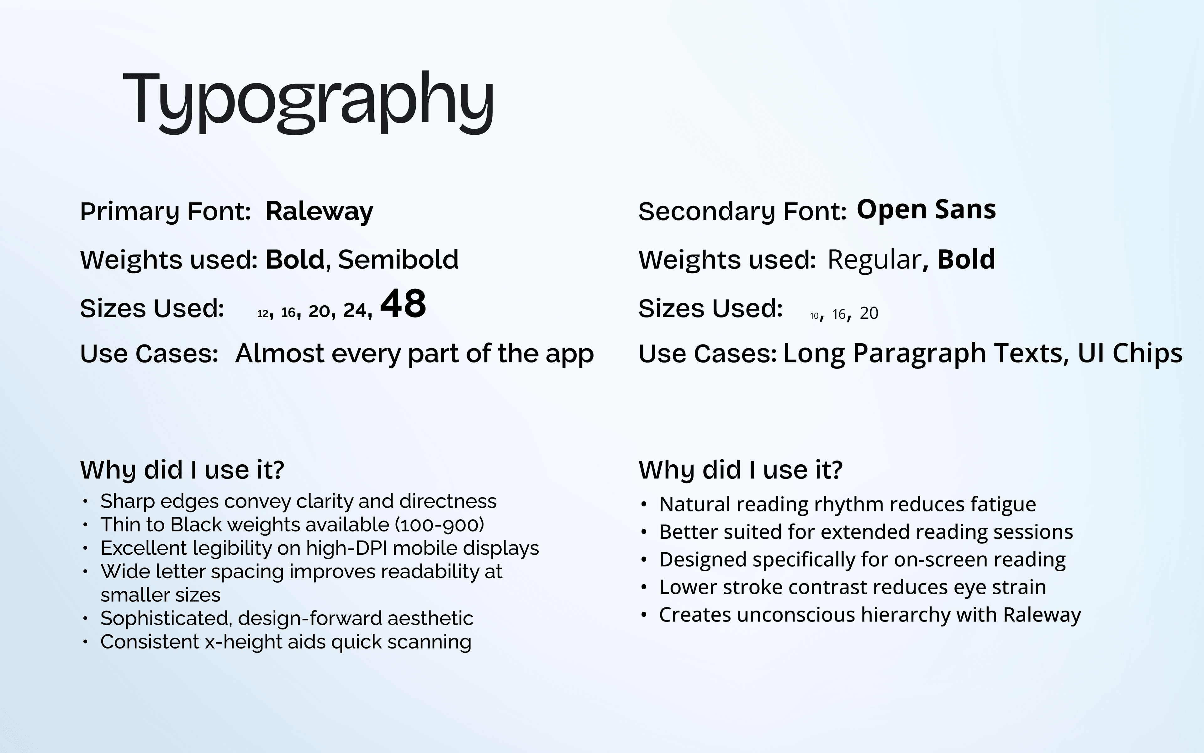
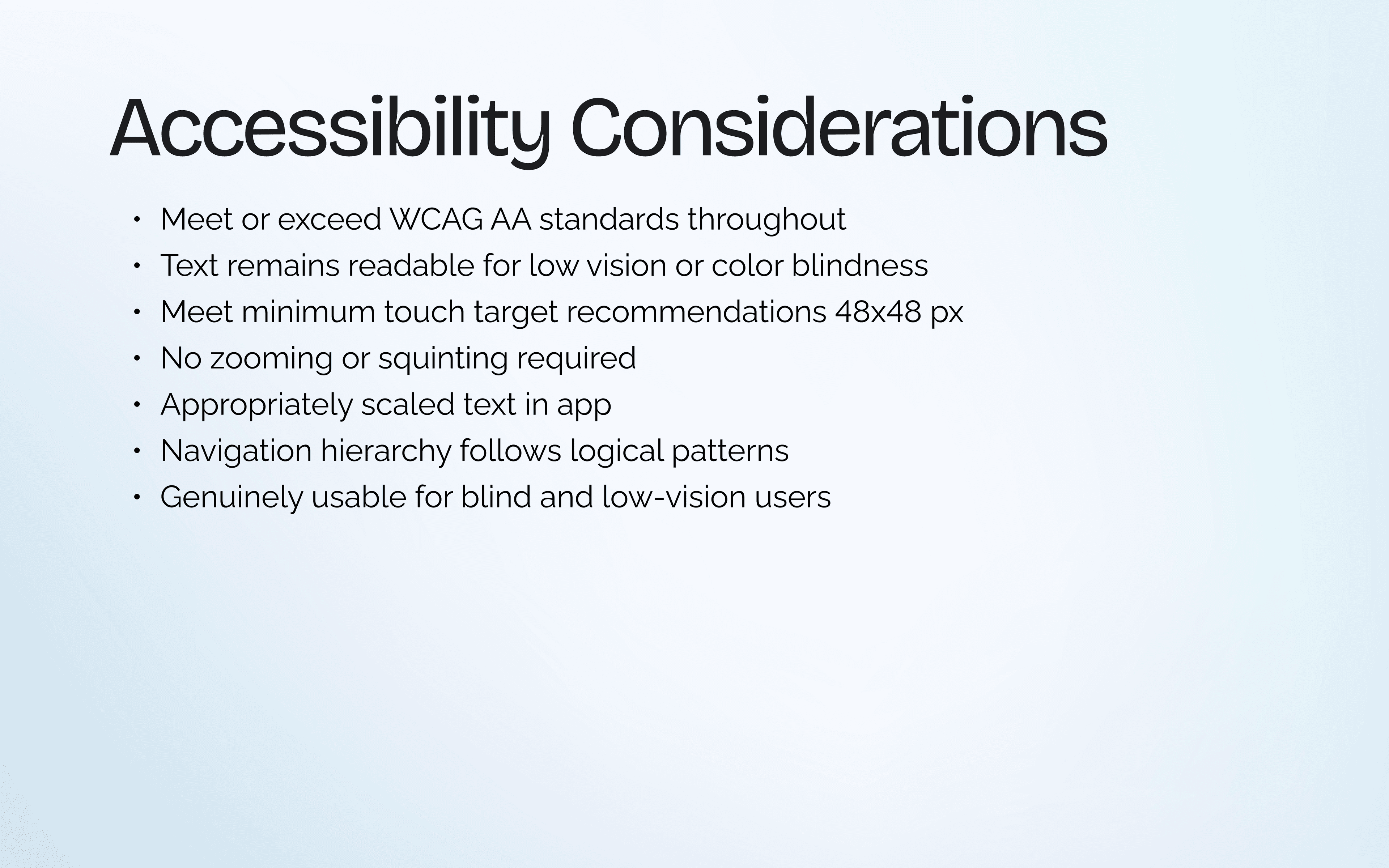
A shared design system ties the consumer app and admin panel together. I built it around three principles: readability for long reading sessions, scalability for future features and localization, and accessibility that meets WCAG AA standards throughout.
The Operations Backbone
A consumer app is only as good as the tools powering it. I designed Ritam's admin panel to handle everything behind the scenes — content creation, moderation, analytics, notifications, role management, and even a web crawler for sourcing content. The goal: make editors faster and give managers full control.
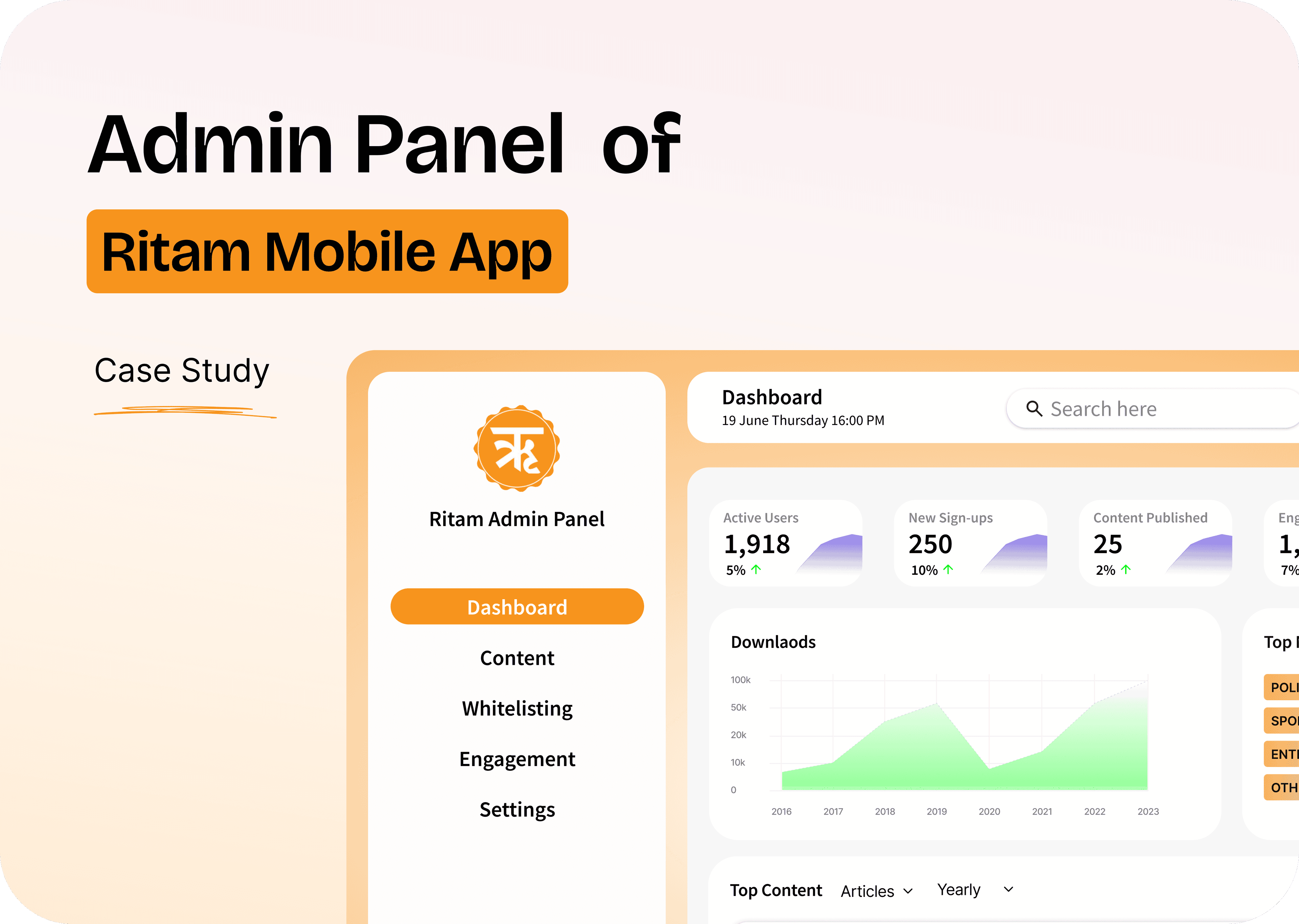
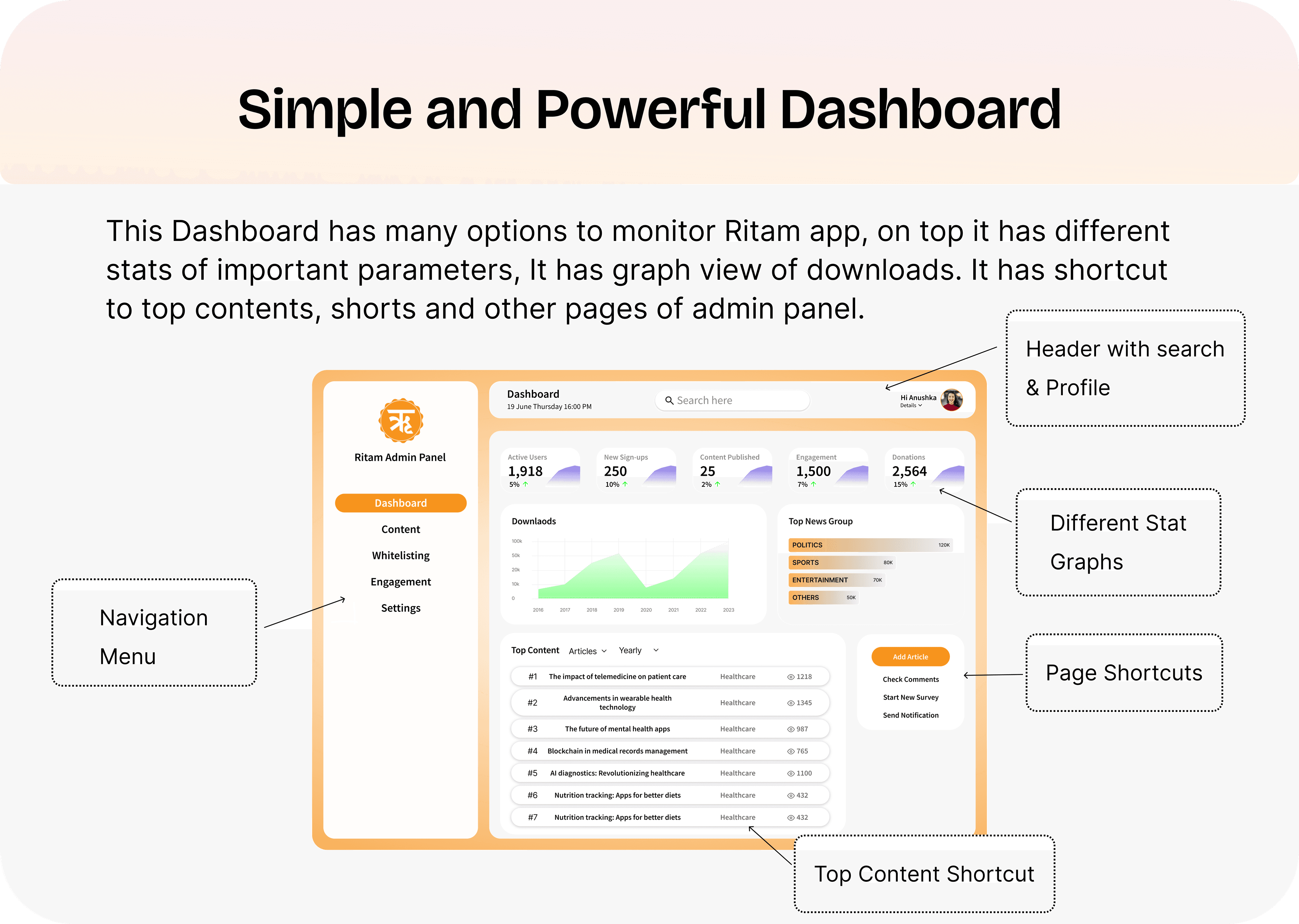
Dashboard
The dashboard gives editors and managers a single view of everything that matters — key stats at the top, download trends as a graph, top news groups, and shortcuts to top-performing content. Simple enough to scan in seconds, powerful enough to surface insights.
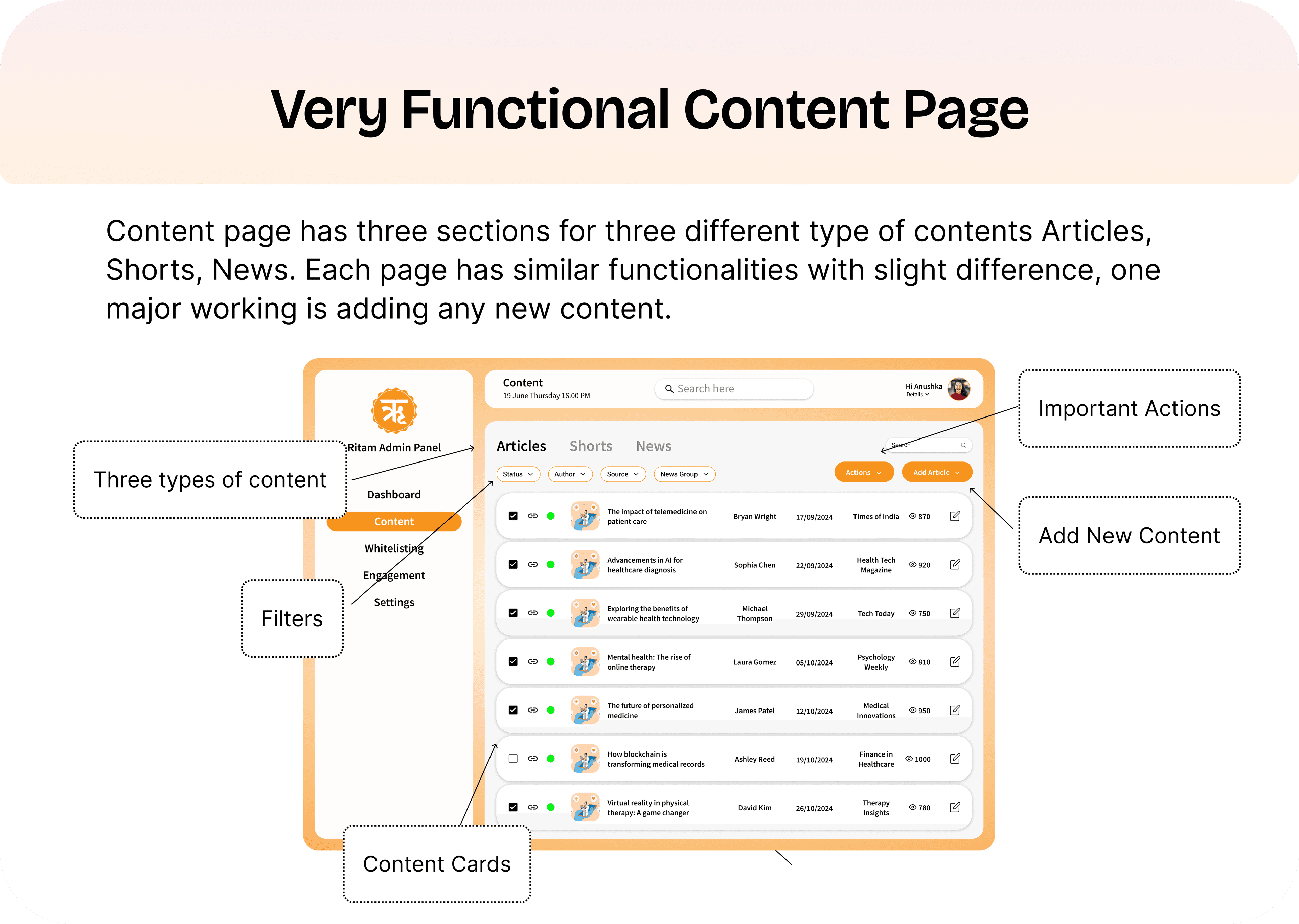
Content Management
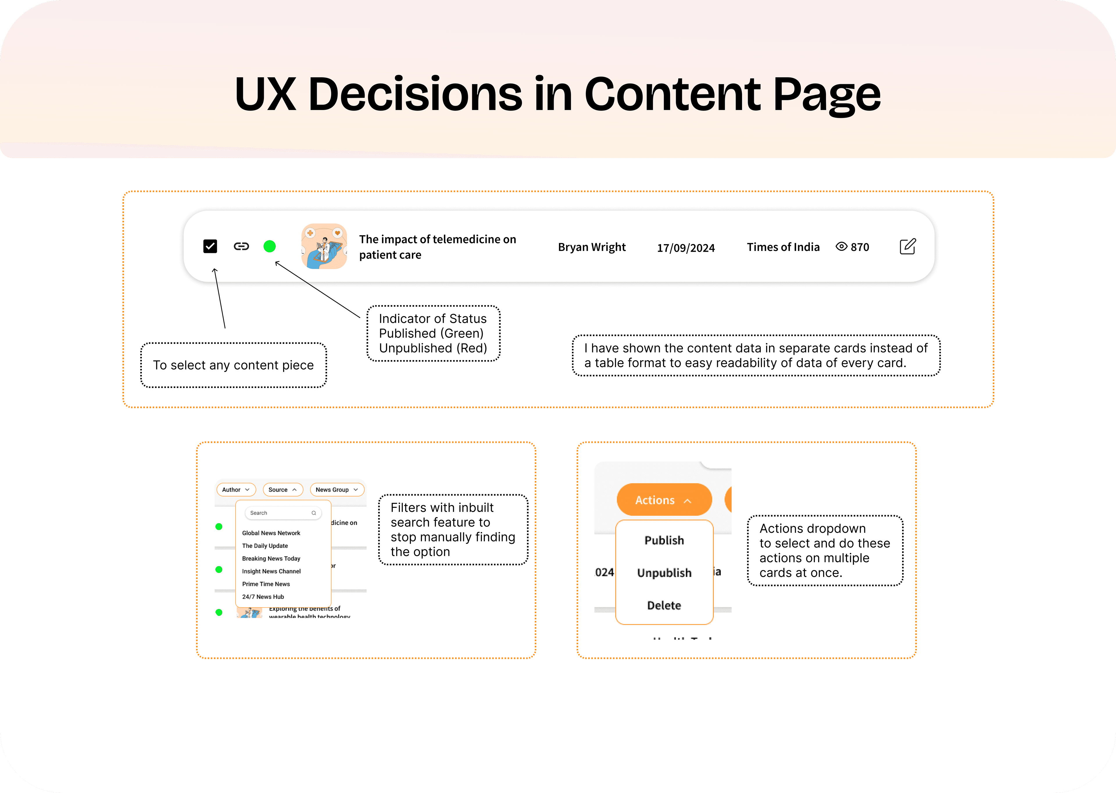
The content page manages three content types — Articles, Shorts, and News — in a unified table view. Each content piece shows its status (green = published, red = unpublished) at a glance. Editors can filter, search, and perform batch actions (publish, unpublish, delete) on multiple items at once.
Text Editor & Content Creation
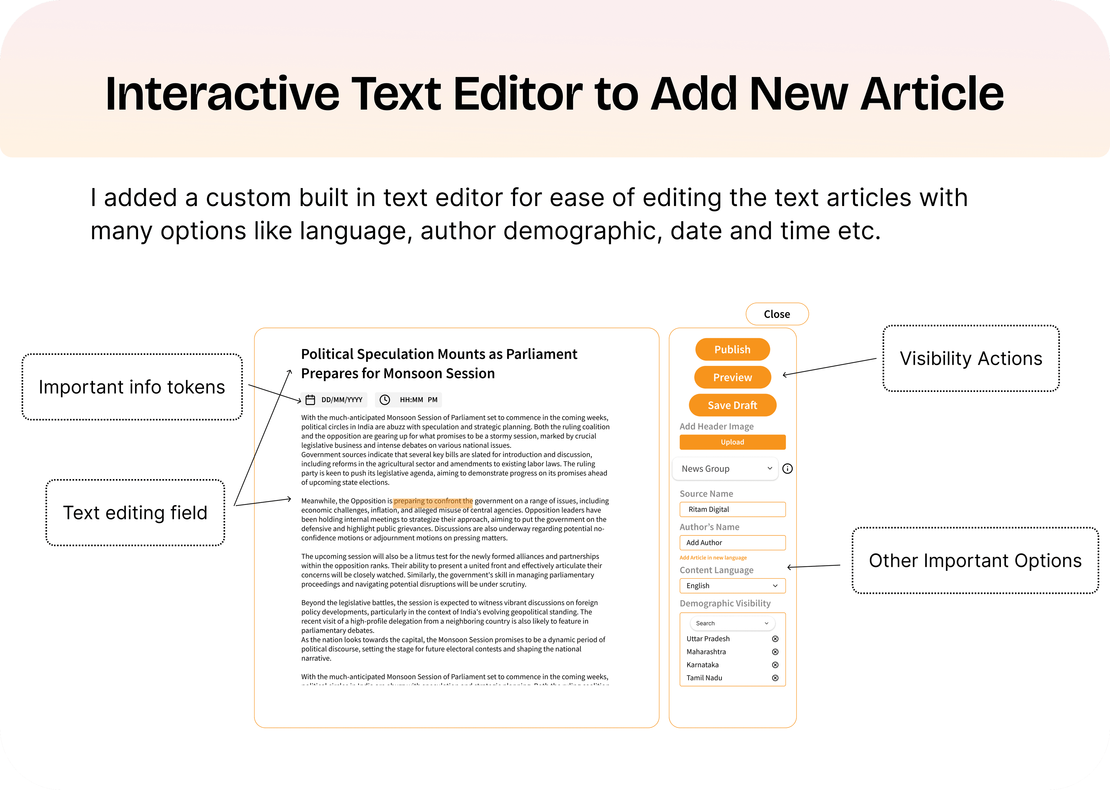
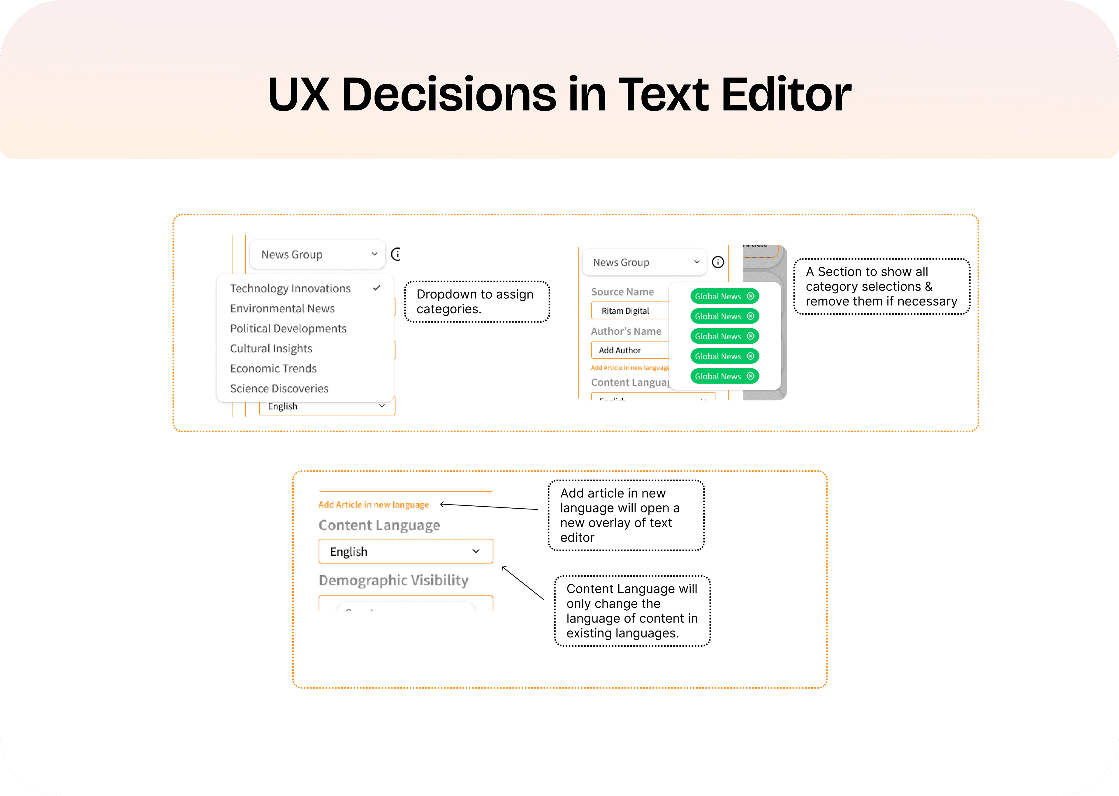
I designed a custom text editor with everything an editor needs: rich text formatting, category assignment via dropdown with visual chips, multi-language support (add an article in a new language and a fresh editor overlay opens), demographic visibility controls, and publish/preview/draft actions. The goal was to reduce average article publish time.
Content Crawler
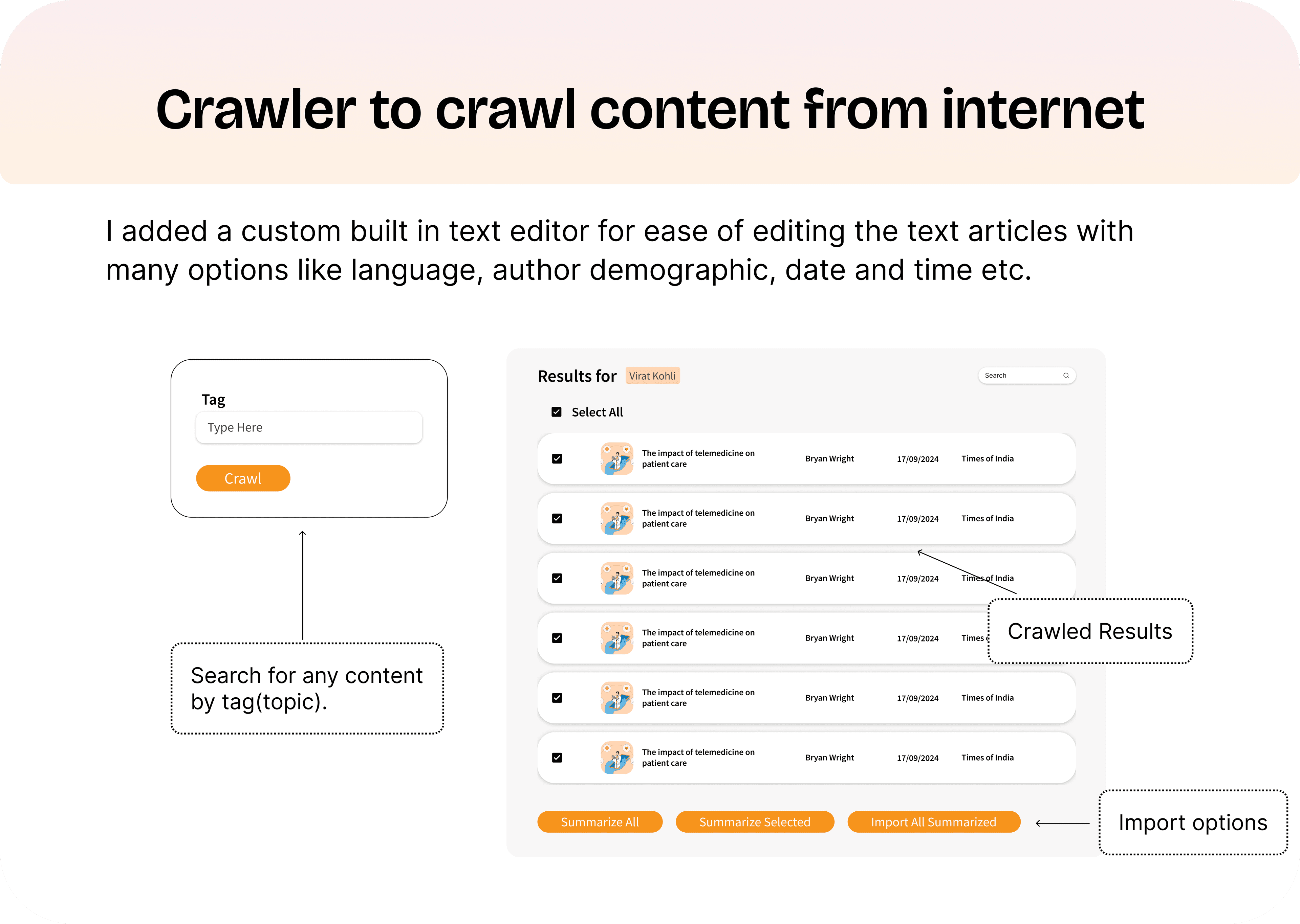
One of the most impactful features: a built-in crawler that lets editors search for content across the internet by tag or topic, preview results, and import them — either individually or in bulk — with options to summarize before importing. This turned hours of manual sourcing into minutes.
Moderation & Engagement
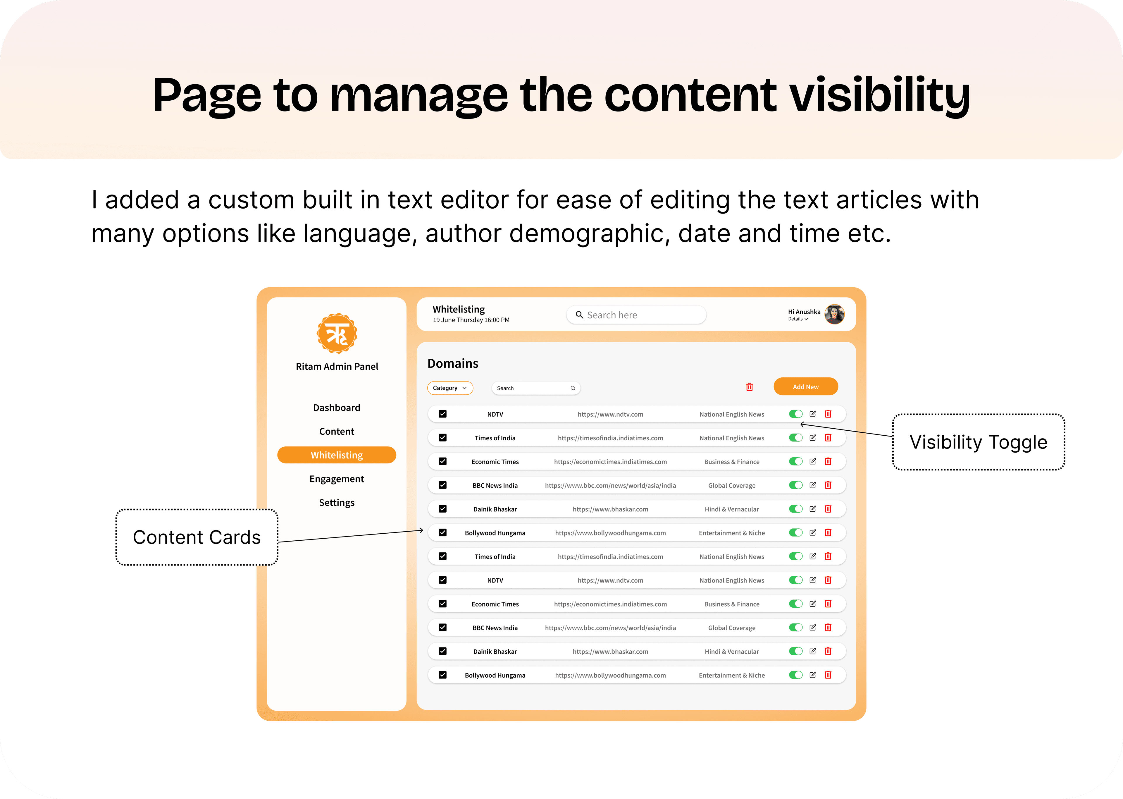
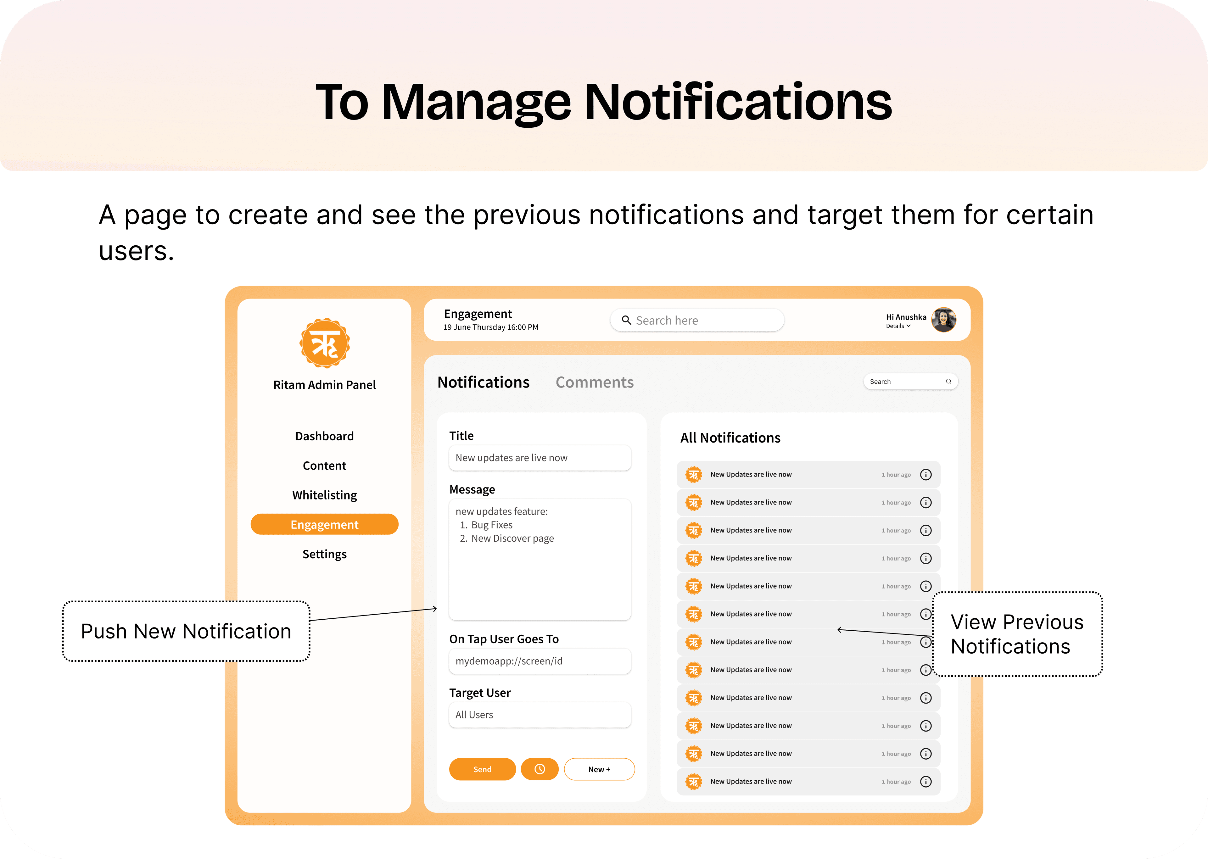
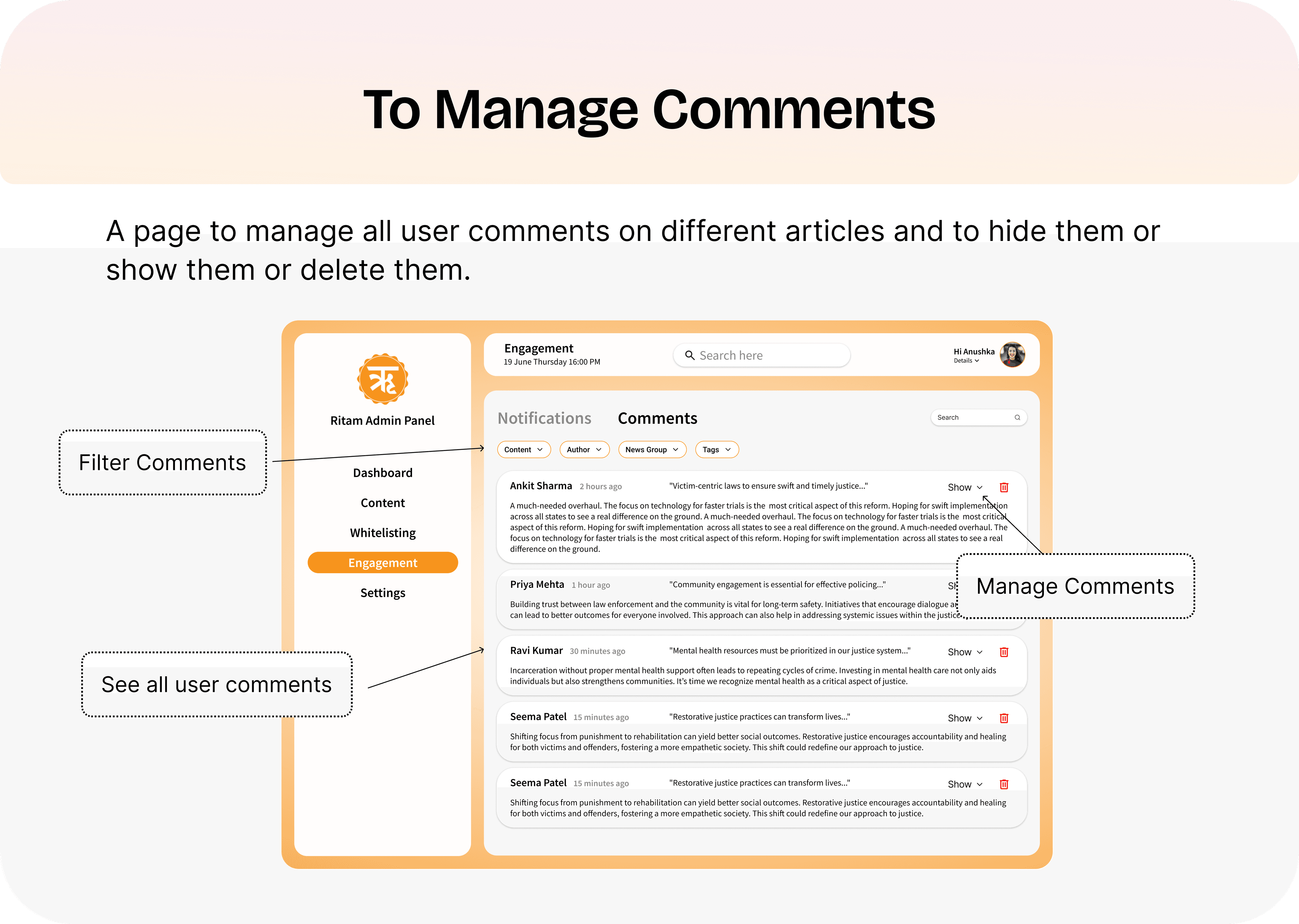
The Engagement section handles two critical functions: push notifications (compose, target users, and view history) and comment moderation (filter, review, show/hide per comment). The Whitelisting page controls which external content sources are visible in the app.
Access Control & Settings
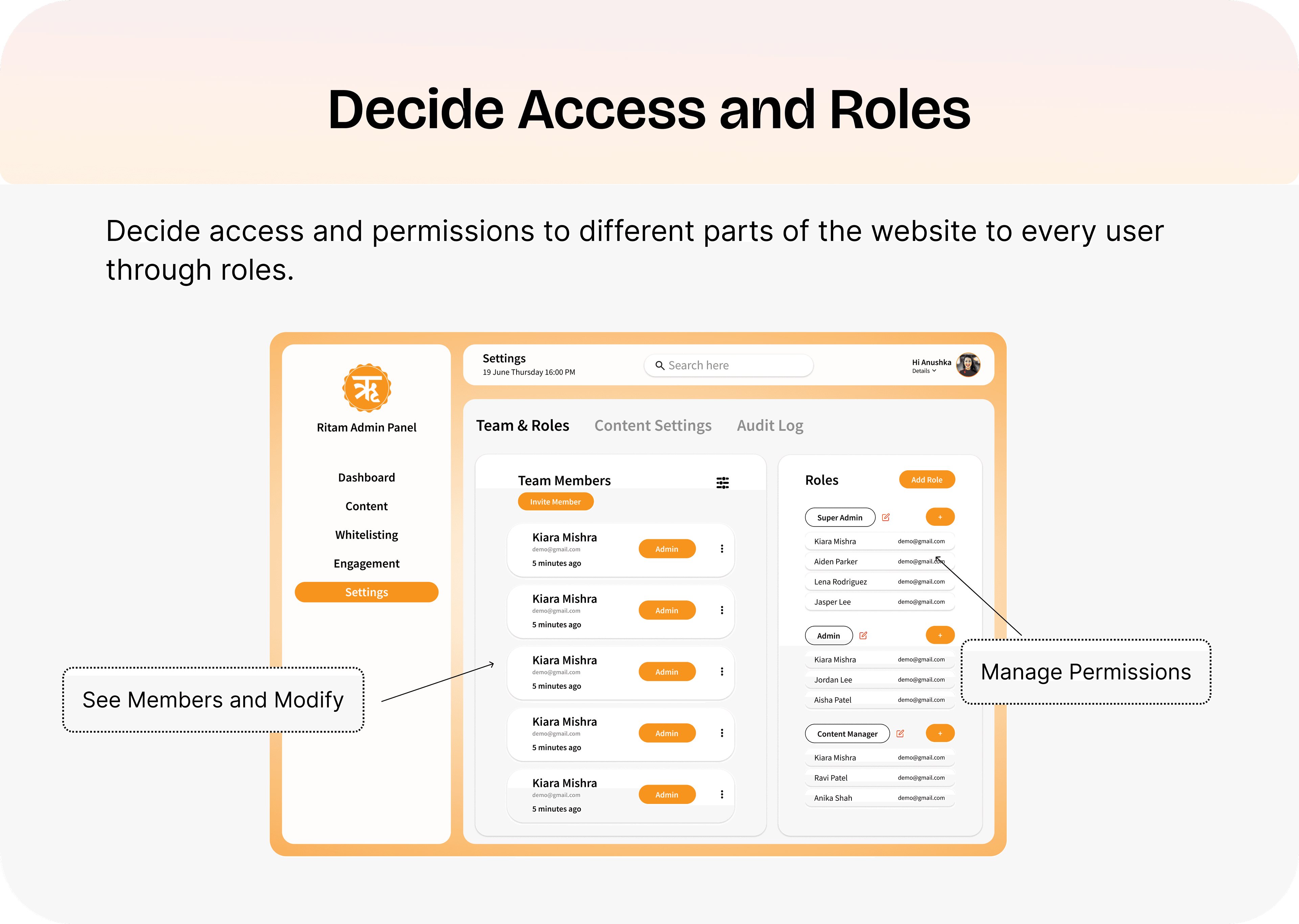
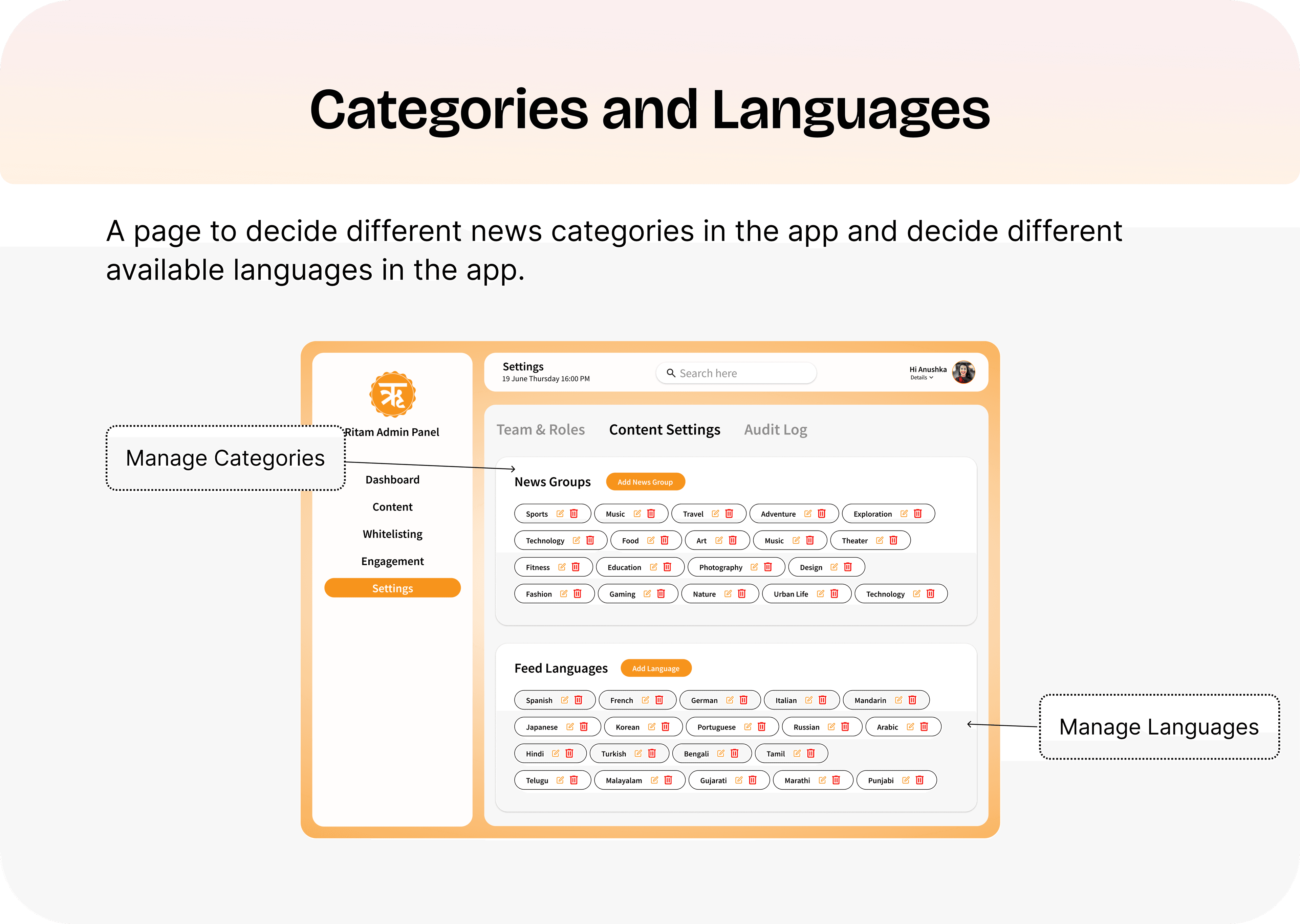
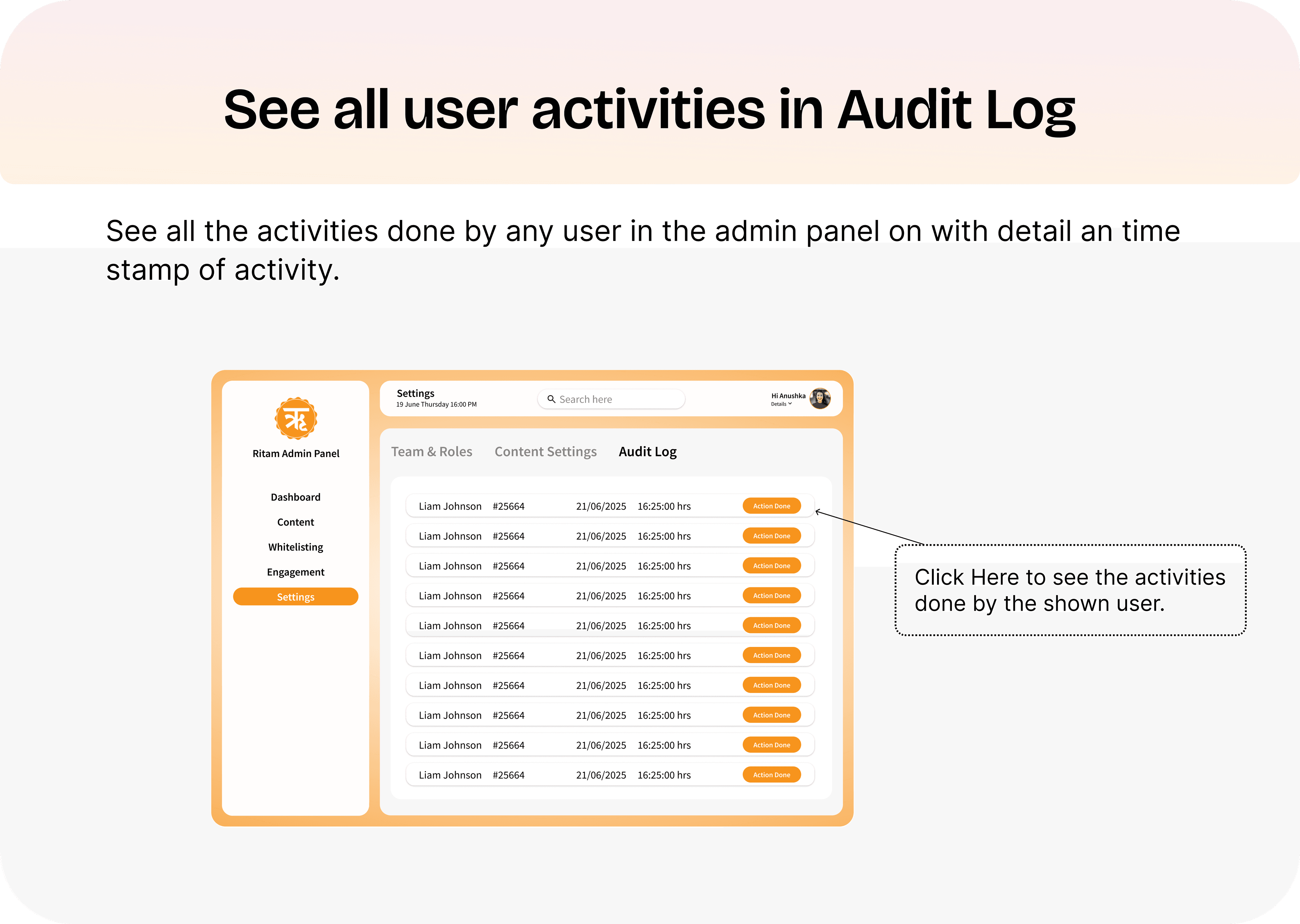
The settings section gives managers full control over who can do what. Team & Roles manages members, assigns roles (Super Admin, Admin, Author, Content Manager), and sets granular permissions. Content Settings manages news categories and supported languages. The Audit Log tracks every action by every user with timestamps.
Outcomes
40+
Screens Shipped
2 products
App + Admin Panel
12+
Languages Supported
- Average article publish time reduced with the new editor and crawler workflow
- Editors gained more time to focus on storytelling and creative work
- New editors found the system easier to learn and use
- Content discovery improved across categories through the redesigned feed system
- Role-based access gave managers full control without slowing editors down
- Scalable design system and token architecture ready for future features and localization
What I Learned
- Early setup of tokens and components enables fast, consistent updates across designs
- Combine algorithmic relevance with user control and content diversity to avoid echo chambers
- Showing users why they see certain content enhances credibility and engagement
- Micro-interactions, spacing, and typography subtly shape user trust and perceived professionalism
- Clear font hierarchy guides attention and improves readability without explicit cues
- Fast, adaptable interfaces aren't just technical wins — they define the overall experience
I don't just design what users see. I design the full system — the product, the tools that power it, and the design language that holds it all together.