Case Study
Syrin — Brand Identity for an AI Agent Control Plane
A full brand identity for an AI agent runtime control plane. Three strategic directions, three logo concepts, two font systems, one final 38-page guideline — delivered across four client decks. The brand mirrors the product: simple on the surface, complex in depth.
Client
Role
Timeline
Industry
A founder I'd never met sent me a Notion doc on a Monday. The brief was clean — control plane for AI agents, runtime-level, the works. The references were two URLs and a screenshot of a dashboard he liked. I opened the URLs. They were both blue. They were both dark mode. They could have been the same brand. I closed the doc and went looking for what not to do.
3
Strategic directions
3
Logo concepts
4
Decks delivered
Three Days of Not Sketching
I didn't open a sketchbook for the first three days. I read instead. Five long-form brand audits — Claude, ChatGPT, Gemini, Grok, Perplexity. Three thousand lines of notes by the time I was done. Looking for what was already true about the category, before deciding what Syrin should add to it.
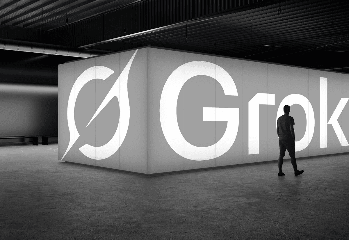
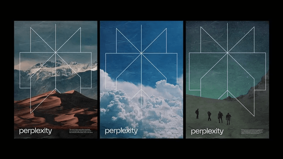
The pattern showed up around brand three. Everyone was using blue. Everyone was using dark mode. Every tagline said powerful or intelligent. The category had a uniform, and the brief I'd just been handed was, however unintentionally, asking me to design another one. The whole project pivoted on that observation. The job wasn't to design a good AI brand. The job was to design one that didn't disappear into the others.
If a Syrin moodboard is indistinguishable from a Datadog moodboard, I've already failed.
Three Directions, On Purpose
Strategy never converges in the first session, so I refused to. The first deliverable was a Brand Direction Document with three full directions, each with its own concept, mood board, color palette, and type philosophy. Three real options. Each one I could have honestly defended.
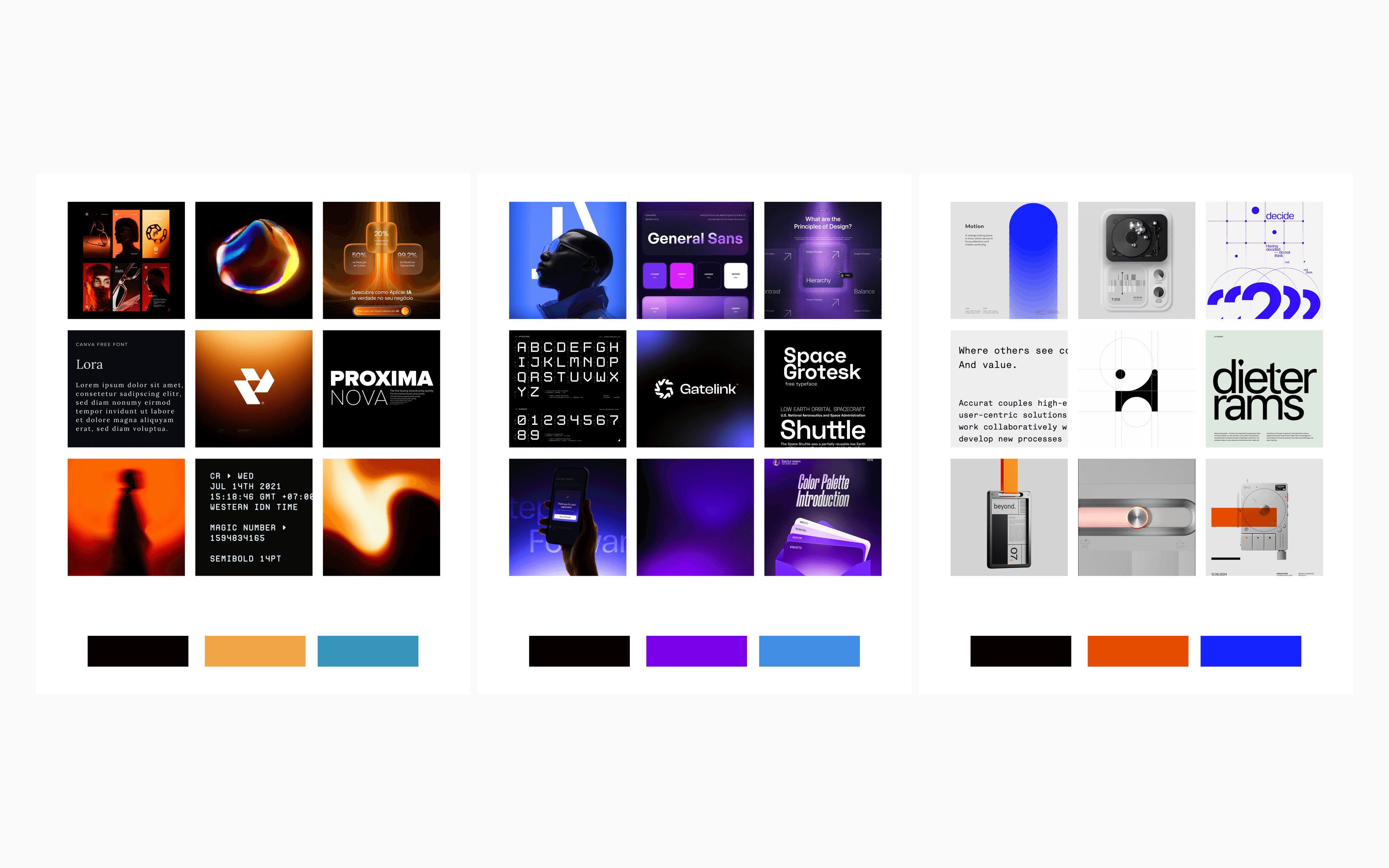
/AI+HUMAN said the provocative thing. Agents behave like humans — they fail, they leak, they go off-script. The brand visualized that with orange bleeding through black, like ink staining paper. Three fonts: a sans for the engineer, a serif for when agents talk to each other, a monospace for code. The bleed was the brand. Risky, memorable, easy to get wrong.
/EVERYTHINGISAI said the safe thing. Pure power. Mission control. Dark blue-black, electric blue glow, violet for the premium tier. Two fonts: Space Grotesk and Space Mono. Every CTO on the planet would understand it on first look. That was also the problem — they would understand it because they'd already seen it twenty times.
/MINIMAL said the quiet thing. Black and white on the surface, ninety percent of what users see. Color appears only when the user goes deeper into agent internals. The deeper you go, the more color you see. The surface stays calm. The depth is rich. The brand, if I built it right, would tell the same story as the product: simple to use, complex to build.
The Brand Has to Argue the Same Thing as the Product
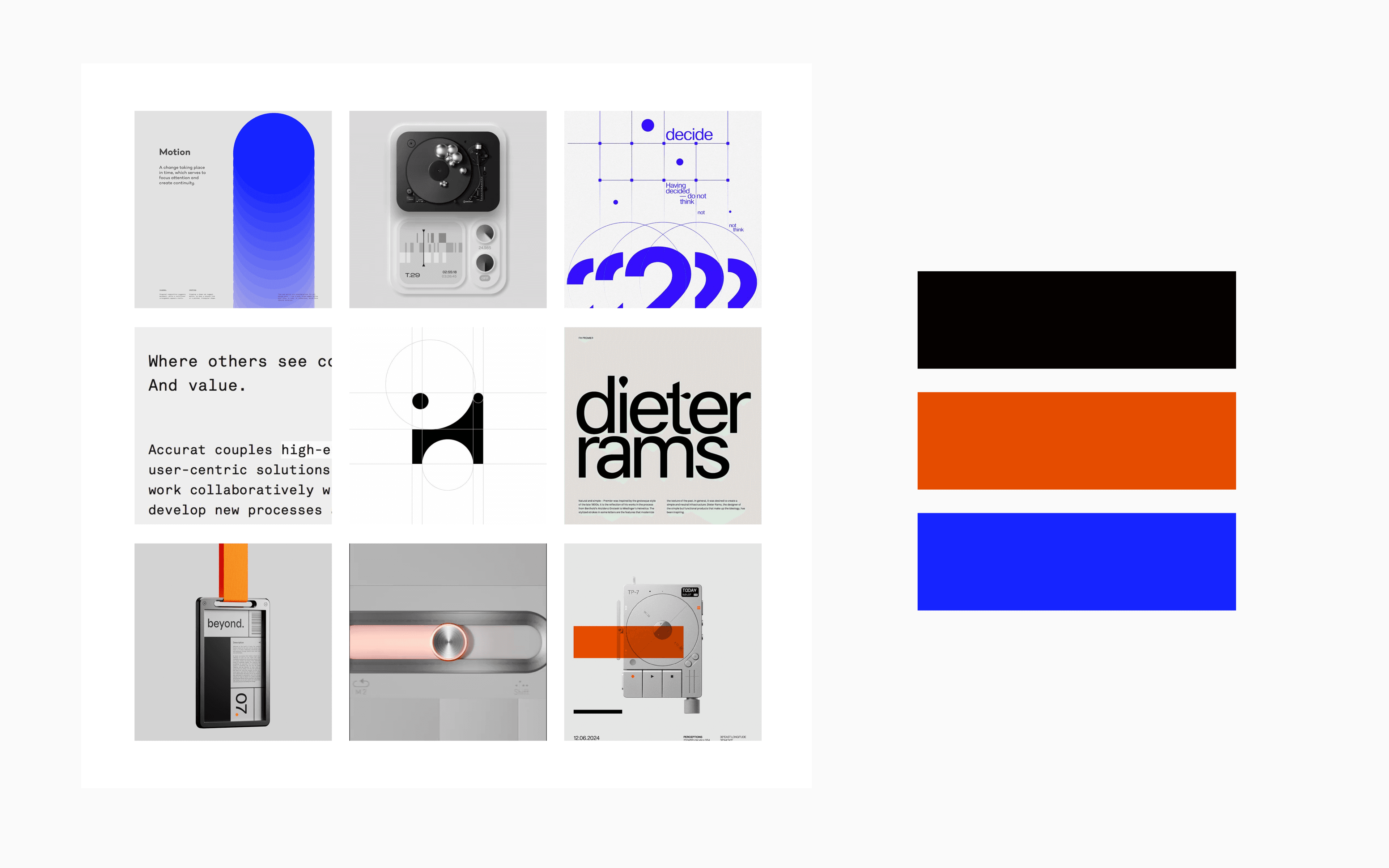
Three good directions. One right one. I sat with it for an evening, and the answer came from outside the deck — from Syrin's product positioning. Syrin is the platform that makes managing AI agents feel simple even though the underlying problem is hard. That's the whole pitch. A brand that looks simple on the surface and reveals complexity on inspection isn't decoration. It's the positioning, made visible.
The brand and the product had to argue the same thing.
Three Logos, and the One I Almost Picked Wrong
/MINIMAL set the rules: black-and-white only, geometric, must hold at 16px. Within those rules I sketched five concepts on paper, narrowed to three, and built each into a full Logo Ideas Deck with concept, versions, and a sidebar UI mockup.
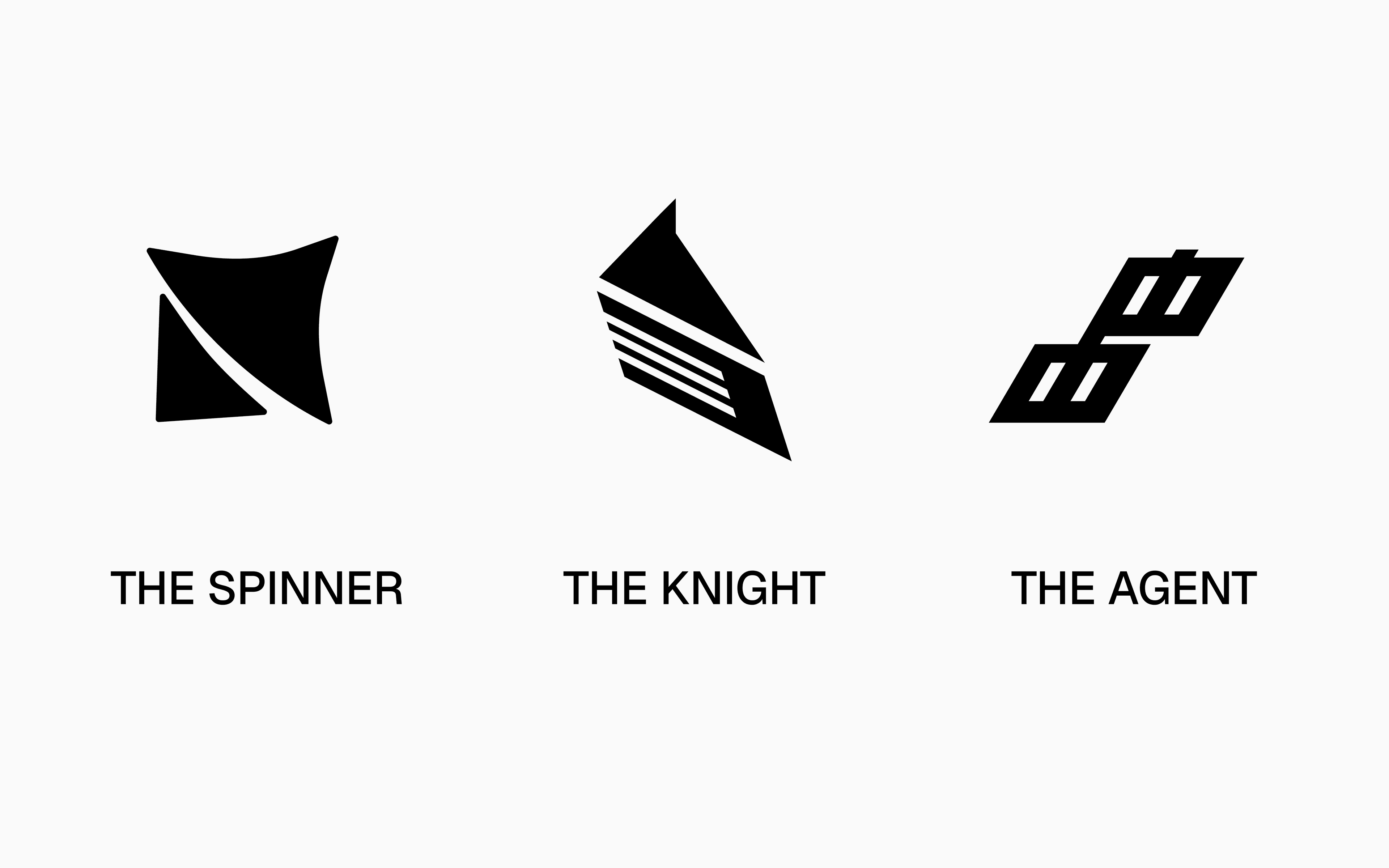
The Knight was a chess knight built from the letter S. The knight is the only piece that jumps over obstacles, that reaches squares others can't — the strategic piece on the board. Syrin reaches into agent execution where no other tool can go. And inside the mark, three horizontal cuts spelled S in morse code. A hidden detail that only rewards close inspection. I love that detail. I still love that detail. It was the cleverest mark on the page.
The Agent was two figures interlocked in conversation, inspired by chat boxes and robots. About what happens between agents — the interaction layer. It also formed an S, which two of the three marks did. Conceptually rich. But when I dropped it into a 16-pixel favicon test, it broke into noise. It was the one that didn't survive the smallest size.
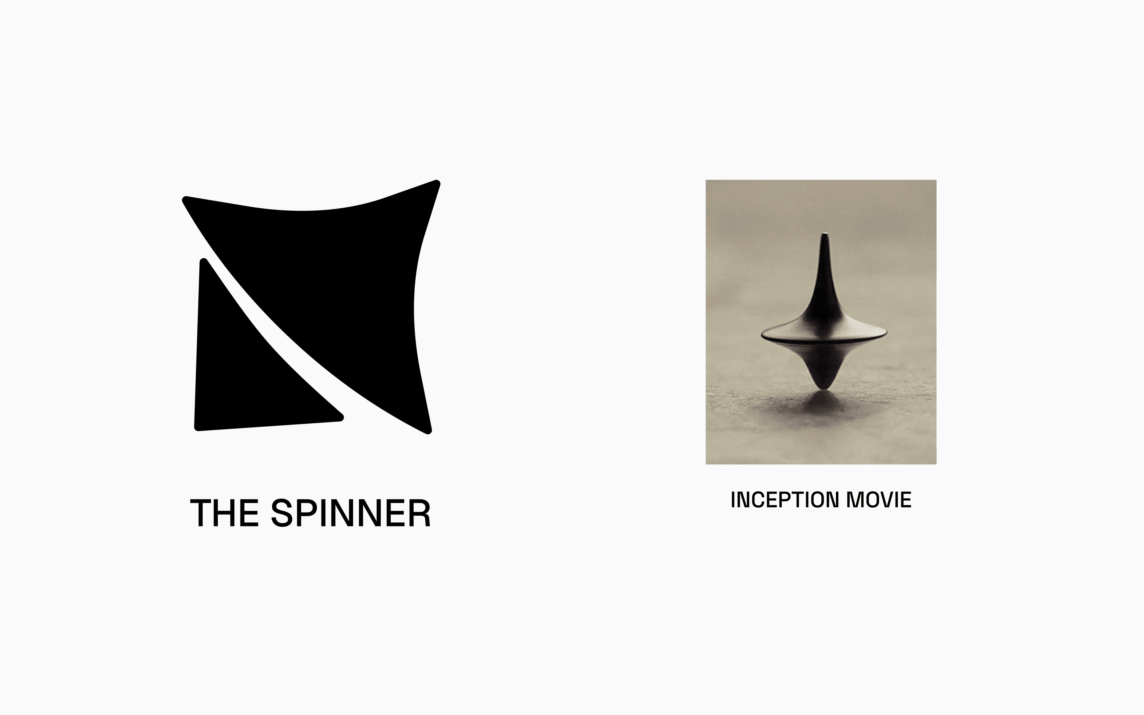
The Spinner was a spinning top — upper half an AI star (the machine), lower half two human legs (the manager). Inspired by Inception's spinning top — the object that exists between two realities, always testing which one you're in. Syrin operates at exactly that boundary: where human control meets AI execution.
I went into recommendation week thinking I'd argue for The Knight. The morse code S was a designer's mark — clever, hidden, the kind of detail that gets shared on Twitter. *The day before the meeting I rebuilt the deck. The Knight said power. The Agent said connection. Only the Spinner said boundary — and Syrin's whole positioning is built on the boundary between human and AI.* The cleverest mark wasn't the one that argued the brand's actual case. So I changed the recommendation.
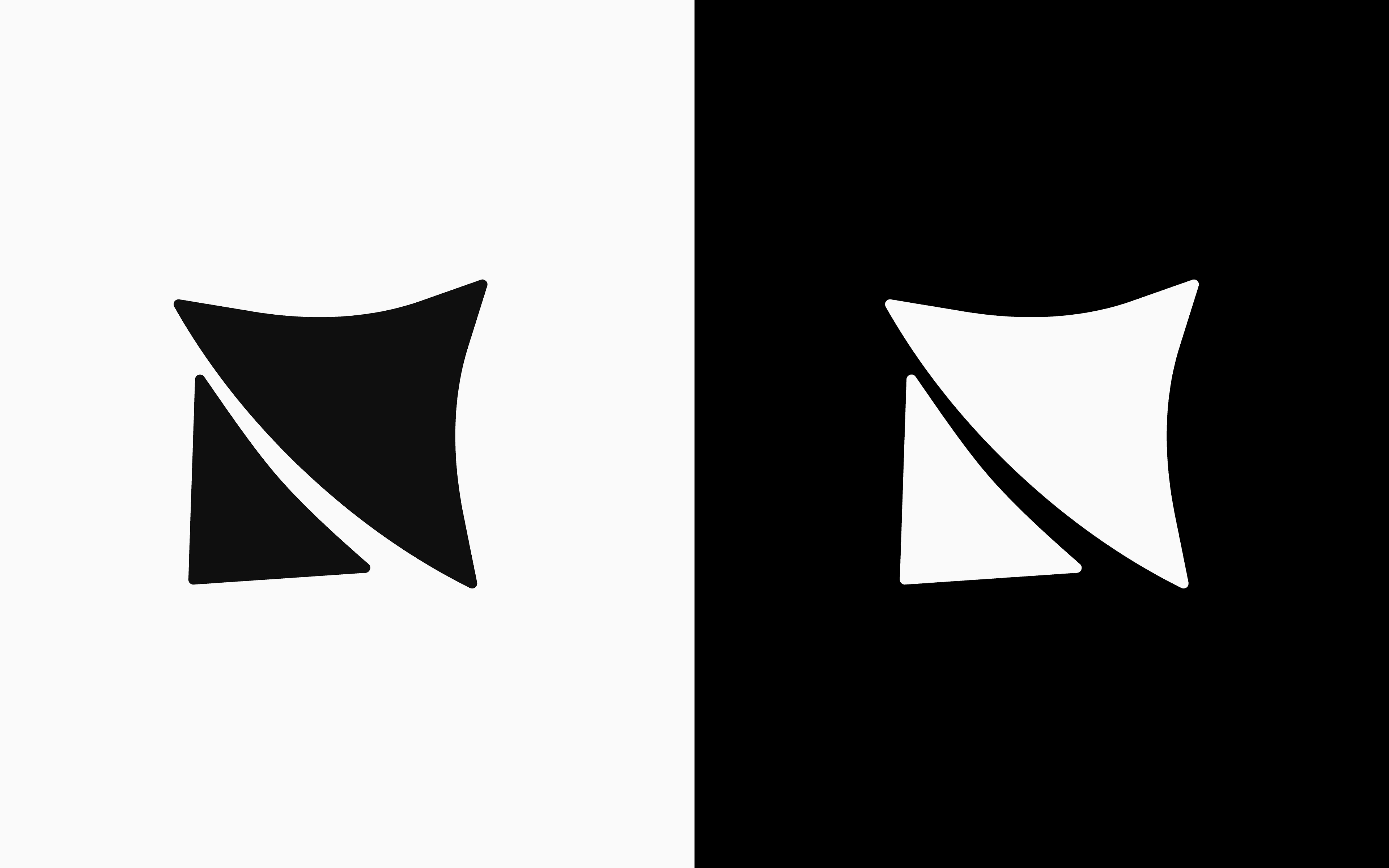
One object. Two identities. Spinning at the boundary between human and AI.
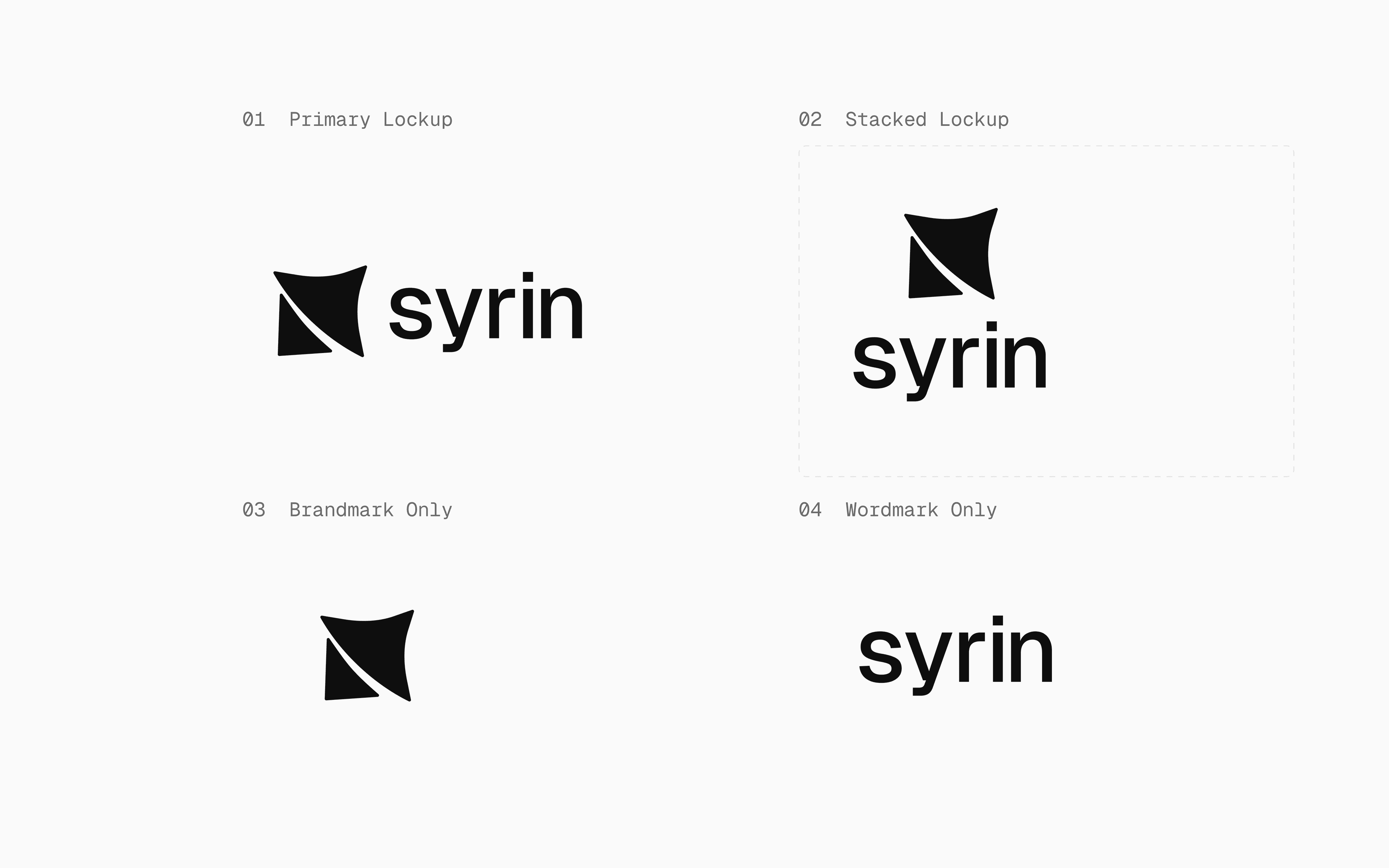
Then the system. Primary lockup, stacked lockup, brandmark only (favicon, app icon, social avatar), wordmark only (footers, narrow contexts). Clear-space rule of x/2 around the lockup. Minimum sizes — 24px for the brandmark, 96px for the wordmark, never below. Two special-use color variants — Orange and Blue — for brand graphics only, never the standard logo. Eight don'ts, one of them just don't recreate it.
Fonts Were a Navigation Problem, Not a Typography Problem
Type became its own deck — the Fonts & Colors Document. Two real font combinations, presented side-by-side with the same content laid out in each: the Syrin headline, the marketing body copy, the UI labels (12 active · 1 failed · 340ms · 99.7%), and the same terminal output. Same content, two voices.
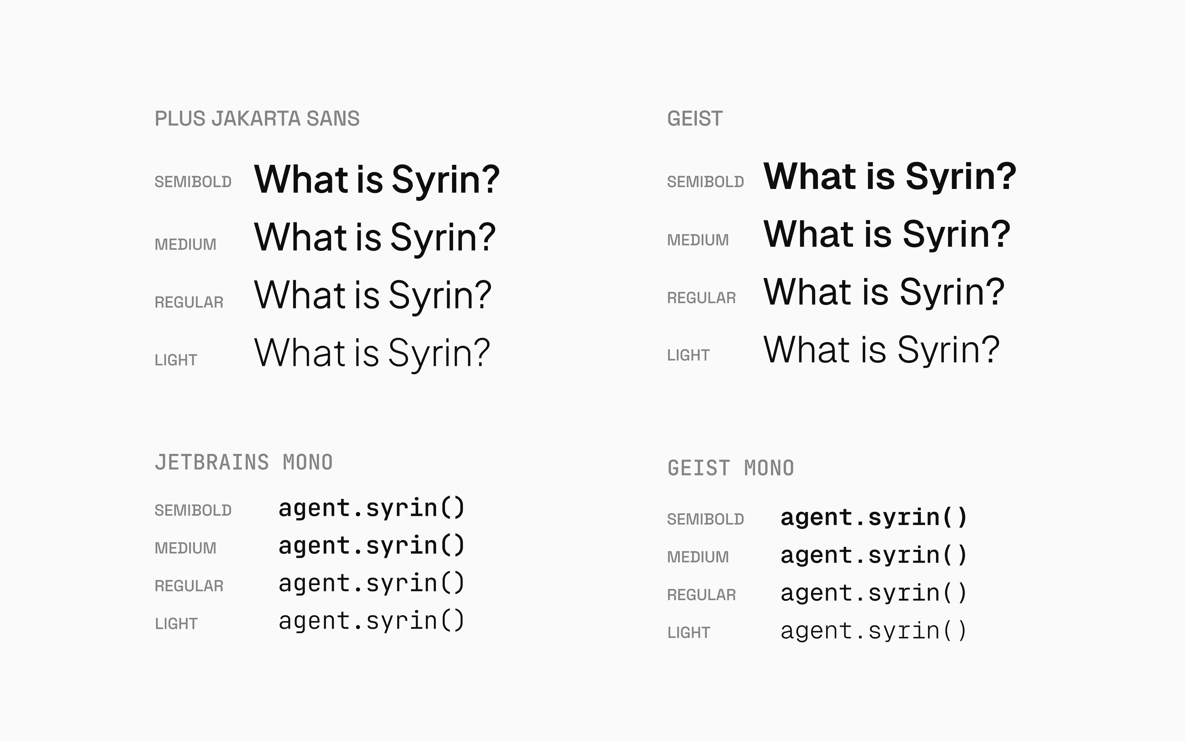
Option A was Geist + Geist Mono — both designed by Vercel, same foundry, shared metrics, shared OpenType features. Option B was Plus Jakarta Sans + JetBrains Mono — a trusted dev-tool pairing, but two different foundries with two different design philosophies. Both were good. Picking the right one was a navigation problem in disguise.
Here's the thing about Syrin's product: in the dashboard, the user crosses from surface (sans-serif body text) into depth (monospace agent logs) inside the same paragraph. The font switch IS the moment they enter the machine. If the two fonts come from different foundries, that crossing feels like a glitch — like the page accidentally swapped CSS files. Same foundry means same skeleton, same rhythm, same air. The crossing feels like a step deeper into the same room. The recommendation was Geist + Geist Mono. The client agreed in 24 hours.
Geist for everything human-facing. Geist Mono the moment the user enters depth. The font switch is the navigation cue, not a styling choice.
Color, the Same Idea
Color works the way type works. The surface is black and white — Pearl White (#FAFAFA) and Coal Black (#0F0F0F), interchanging by mode. Five greys for text, borders, and surfaces. That's almost everything the marketing site ever shows.
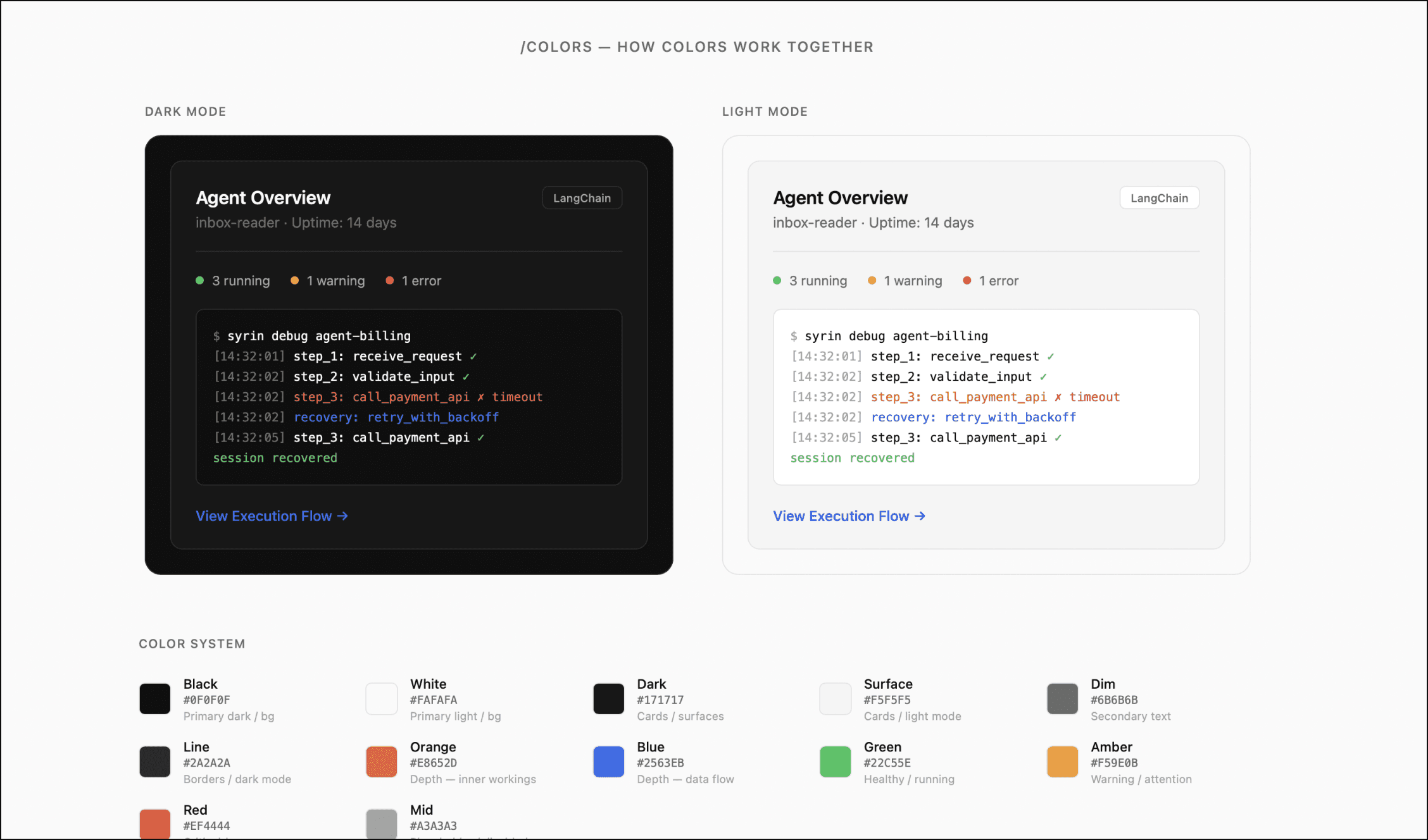
Color appears only in depth. Orange (#E8652D) for inner workings. Blue (#2563EB) for data flow and active processes. Both WCAG AA against black and white — non-negotiable for a developer tool. Plus the standard three system states — green, amber, red — for status only, never decoration.
The rule: the deeper the user goes, the more color appears. Marketing pages stay 99% black and white. The dashboard adds subtle status dots. The execution view floods in with blue and orange. The deepest debug view uses the full palette. Color isn't decoration — it's a depth meter. The user always knows how far in they are by how much color is on screen.
Four Decks, One Brand
38
Pages in final guideline
6
Sections
4
Decks led to it
By the time the final guideline shipped, it was the eighth document on the project. Brand Direction Document. Logo Ideas. Fonts & Colors. Each one a real client conversation, with a real decision at the end of it. The 38-page brand identity guideline was less a deliverable than a summary — six sections (Logo, Type, Color, Voice, Don'ts, BTS), the kind of document a Series A founder can hand to a future hire and have them build on-brand without a single follow-up question.
The Page That Took Longest

The longest page in the deck to design wasn't the cover. It wasn't the type spread. It was the BTS — the photographs of the original paper sketches, the Illustrator construction grid, the circles and intersections that became the final mark. I almost didn't include it. Most brand guidelines hide their messy origin. But the whole project's argument was that the surface should reveal depth on inspection, and the brand's own origin story was a depth worth revealing. So in it went, on the second-to-last page.
Brand identity isn't a logo. It's the smallest set of rules a team needs to make every future decision look like the same company.