Case Study
Nammatales — Brand Identity for a Bengaluru Food & Travel Social-Media IP
A full brand identity for a Bengaluru-based food and travel vlog channel. Three mood directions, two logo concepts — landing on a Kannada ನ monogram that fuses Latin n, Latin t, and Kannada na into one warm, drop-shadowed glyph. Hand-painted, streetside, unmistakably Bengaluru.
Client
Role
Timeline
Industry
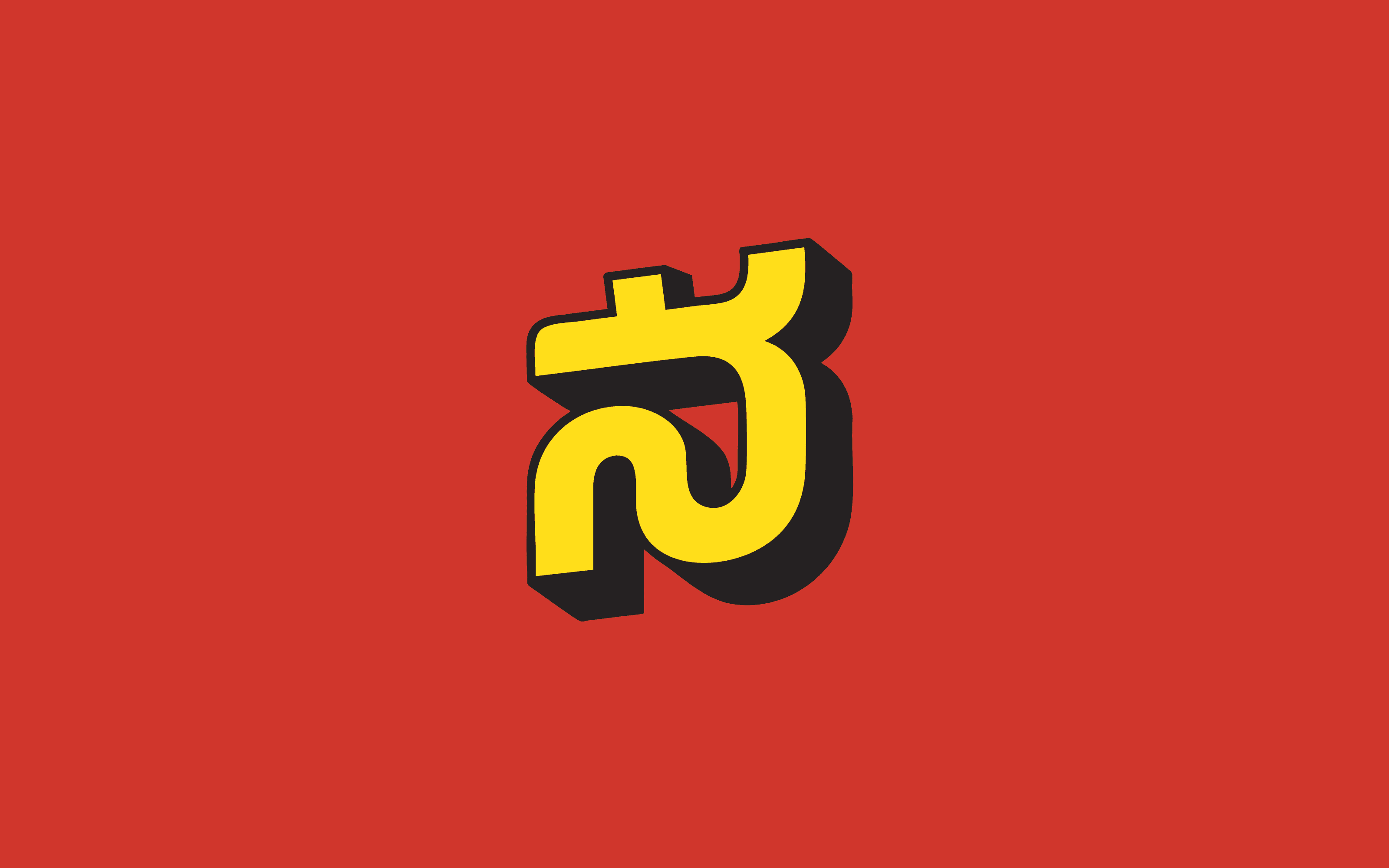
The brief named the city before it named the brand. Nammatales. In Kannada, namma means our — the kind of our that belongs to a neighbourhood, a street, a circle of friends who know which dosa cart opens at 6:30am. Tales did the rest of the work. A social-media IP for food and travel vlogs of Bengaluru, made by people who actually live in the lanes they're filming. The brand's only real job was to look like it belonged there.
3
mood directions
2
logo concepts
22
colour pairings tested
What Every Indian Food Channel Looks Like
Before sketching, I spent four days inside the category — Indian food and travel creators, regional vloggers, city-specific channels. The pattern showed up fast. Every brand looked like a Zomato spinoff. Clean sans-serifs. English-first names. Gradient backgrounds in saturated reds and yellows. A camera-and-fork icon, or a stylised plate. The visual grammar of a delivery app pretending to be a creator.
Bengaluru doesn't look like that. Bengaluru looks like hand-painted Iyengar bakery boards, Kannada signage three storeys tall, theatre hoardings in primary colours, awnings stained by twenty monsoons. The actual visual texture of the city was nowhere in the category's reference deck. If Nammatales looked like every other food channel, it would lose to every other food channel — because the bigger ones already had the same costume and more reach.
If our brand looks like a delivery app, we've already lost to one.
Three Directions, One Street
The first deliverable was a Brand Direction Document with three full mood worlds — same brief, three honest answers. Each had its own typography, palette, image language, and reference shelf.
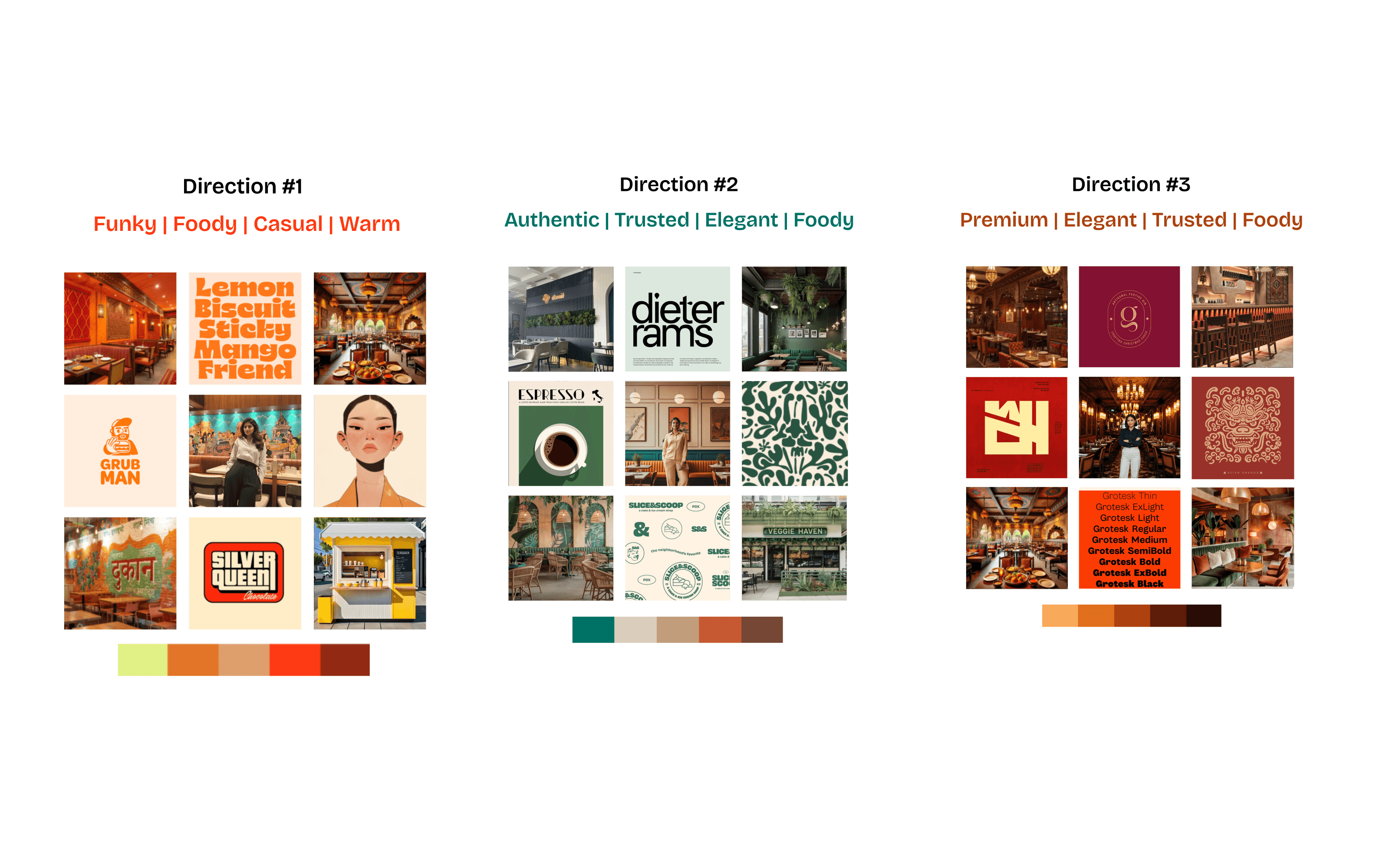
Direction #1 — Funky / Foody / Casual / Warm. Streetside. Cream yellow, chilli red, dark roasted brown. References: hand-painted dukaan murals, Silver Queen chocolate wrappers, Grub Man-style mascots, lemon-biscuit-sticky-mango type stacks. The Bengaluru of footpaths and tiffin shops. The brand of someone you'd actually run into at a vlog set.
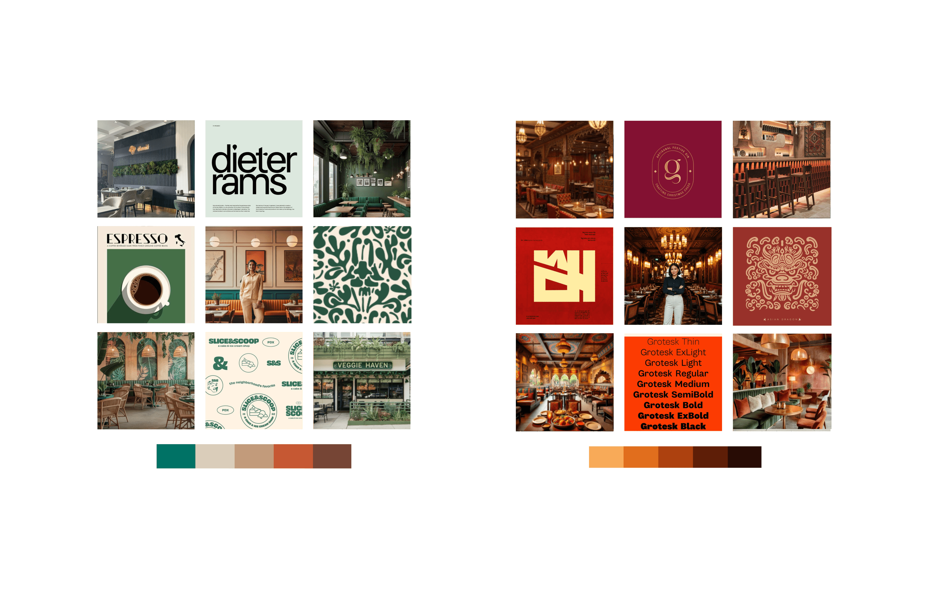
Direction #2 — Authentic / Trusted / Elegant / Foody. Editorial. Deep forest green and cream, organic leaf patterns, Dieter Rams-grade typography, Slice & Scoop sketchbook stamps. The Bengaluru of leafy 5th-Block cafes — speciality coffee, plant walls, Veggie Haven storefronts. Beautiful. Also exactly what every new café in Indiranagar already looked like.
Direction #3 — Premium / Elegant / Trusted / Foody. Maroon and amber. Dragon motifs, ornate monograms, candlelit interiors, Grotesk-family display type. The Bengaluru of high-end restaurants reaching for the Conrad-and-Leela aesthetic. Genuinely premium. Genuinely somebody else's brand. Nammatales wasn't a Michelin guide; it was a vlog channel.
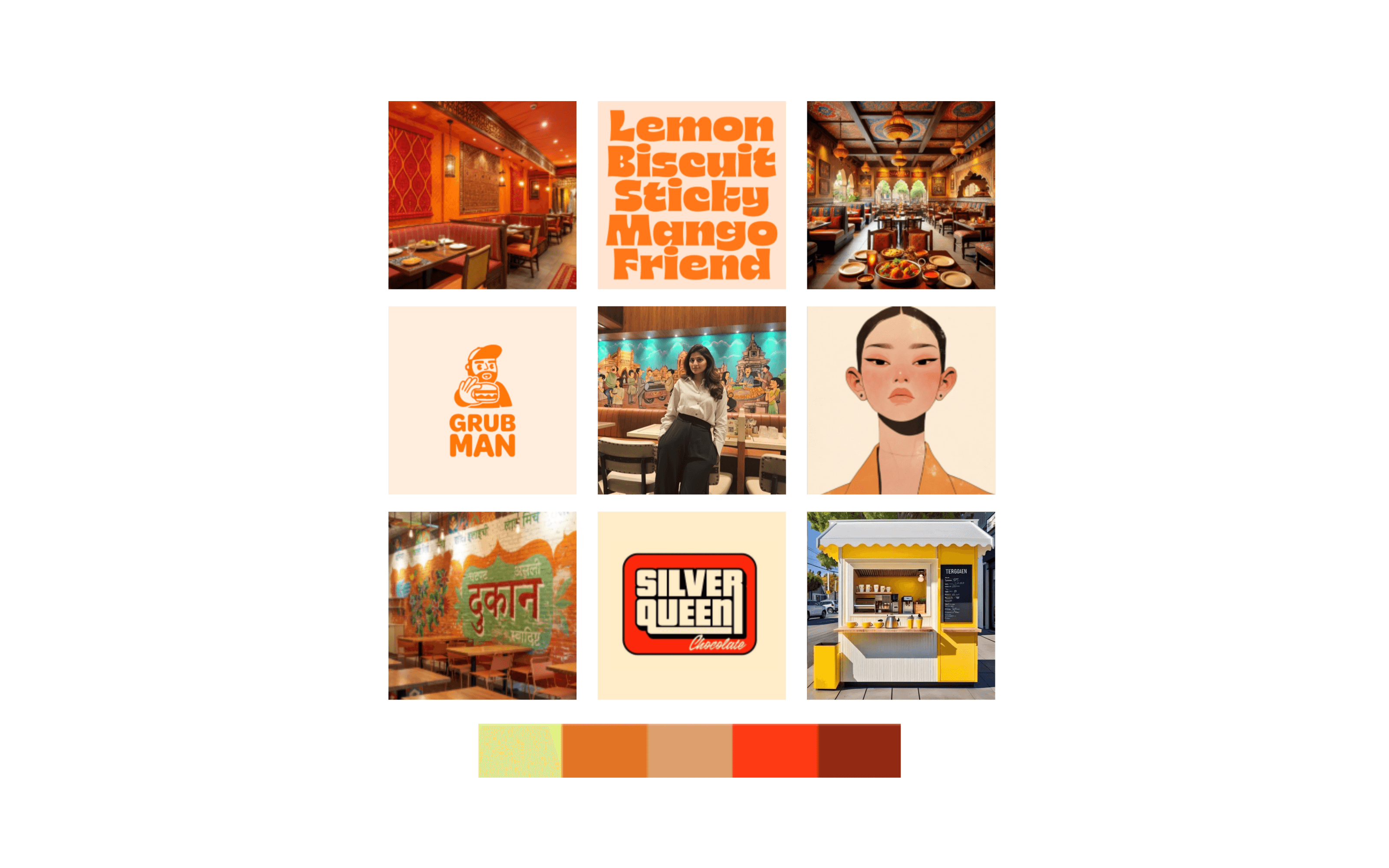
The client picked Direction #1 the same week. The reason held up: Directions #2 and #3 were the costumes the restaurants wore. Nammatales wasn't a restaurant — it was the camera turning toward the restaurant. The brand had to live in the same colour temperature as the food being filmed, not the dining room around it. The footpath, not the table.
Pick the direction that points the camera, not the one that runs the restaurant.
Two Logos, One Fork in the Road
Logo round. Two concepts, both built end-to-end — full lockup, colour test, Instagram mockup. They were honestly different bets.
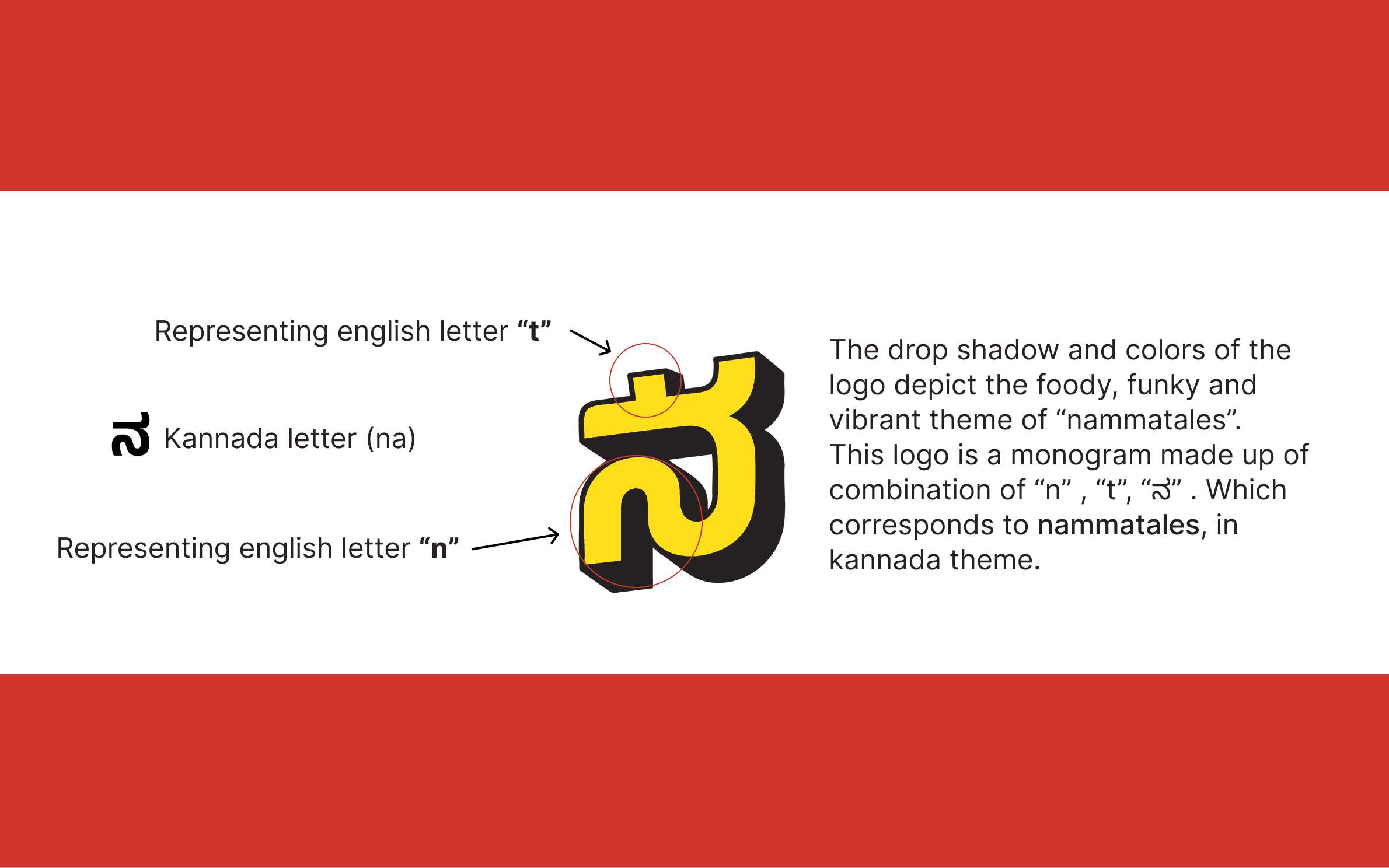
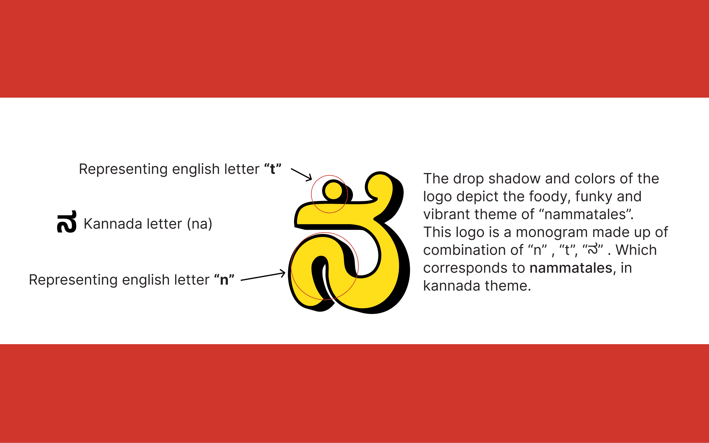
Concept A — The ನ Monogram. A single Kannada character — na — drawn as a stacked, blocky letterform with a 3D drop shadow. Inside the same mark, three letters live at once: the Latin 'n' in the lower curve, the Latin 't' in the upper crossbar, and the Kannada ನ that holds them both. Nammatales, compressed to one glyph. A non-Kannada reader sees it as a shape. A Kannada reader reads it as a word. The mark contains both audiences without compromising either.
Concept B — The 'nt' Italic. A bold, forward-leaning Latin lockup — lowercase nt with the same retro drop shadow, the same warm palette. Easier to read in one second on a feed. Easier to license, easier to embroider on a hat, easier for an English-first audience to type into a search bar. Genuinely the safer mark. Genuinely well made.
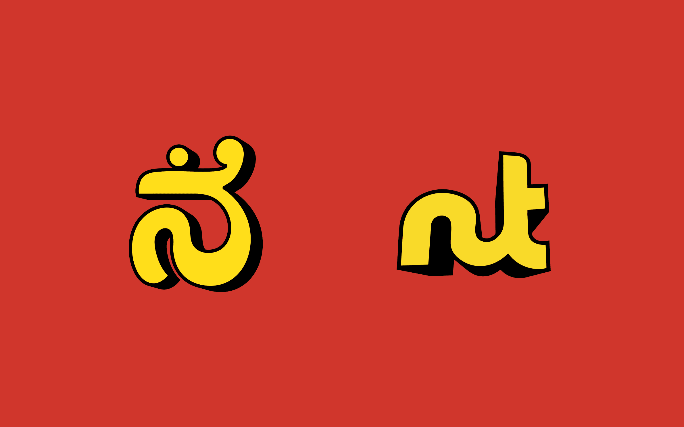
Looking at them side by side, the argument was the project itself. *Concept B was a logo that worked everywhere. Concept A was a logo that belonged somewhere.** The 'nt' could have been a Brooklyn coffee bar, a Berlin sneaker drop, a Mumbai food channel. The ನ could only be from Bengaluru. The 'nt' was readable. The ನ was true.*
The client chose Concept A. The reason matched the brief one-to-one: Nammatales doesn't need to win the algorithm in Texas; it needs to be the channel that someone in Malleshwaram sees and thinks that's mine. Picking the Kannada-fused mark was picking the audience the brand was actually for, before chasing the audience that was easier to reach. Readability isn't a virtue when it costs you identity.
A logo that belongs somewhere beats a logo that works everywhere.
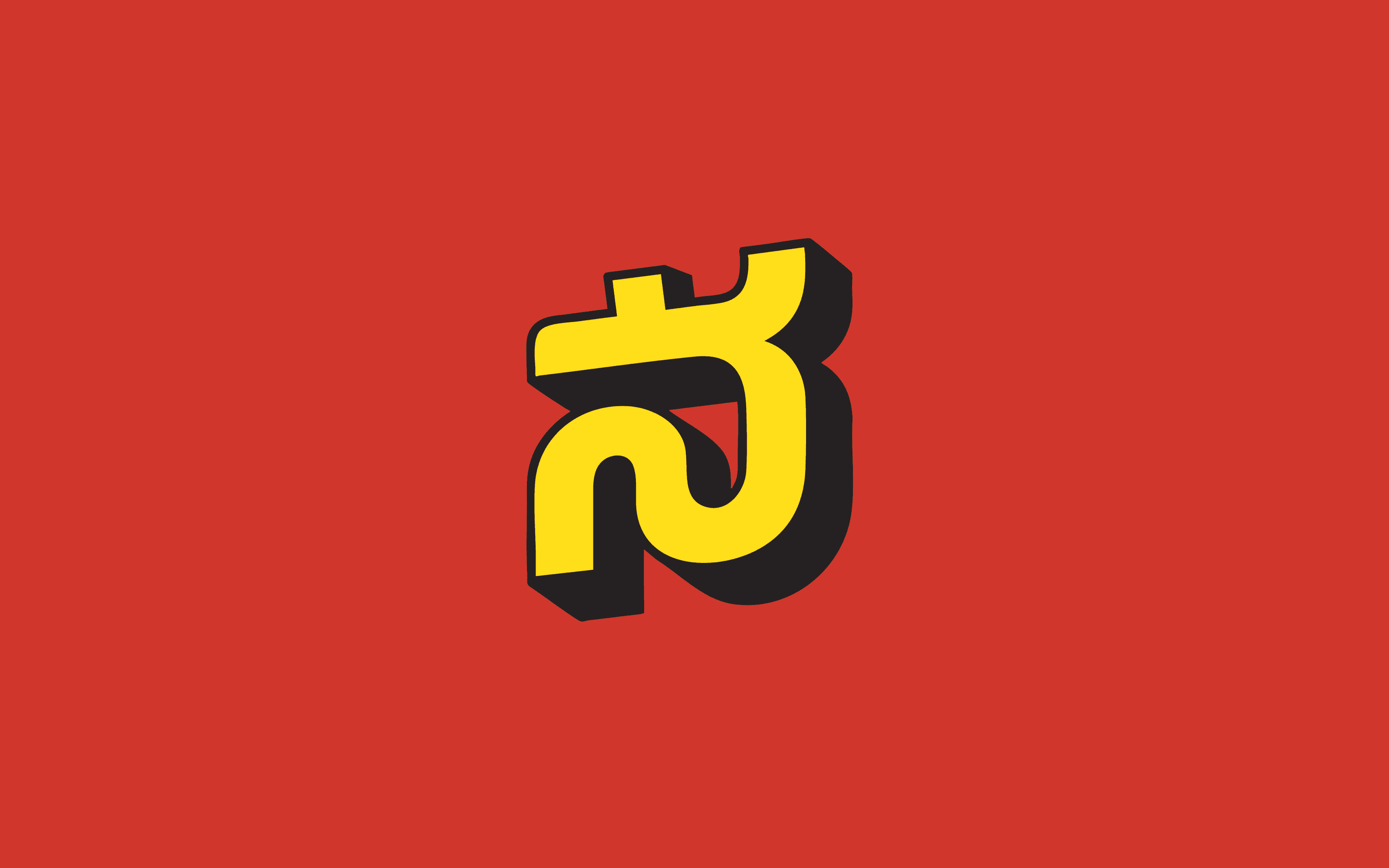
n. t. ನ. Three letters. One glyph. One city.
The ನ tilts forward — the entire mark sits on a slight axis, leaning into the drop shadow. That tilt is a quotation. Hand-painted shop signs across Bengaluru — Iyengar bakeries, Janatha Bazaar boards, the lettering on old single-screen theatre hoardings — were almost never set straight. They were chunky, three-dimensional, slightly tilted, slightly imperfect, painted by humans who didn't have a kerning panel. The shadow on the Nammatales mark is a direct lift from that lineage. Not a Photoshop bevel. A reference.
And it's drawn, not type-set. Off the shelf, the Kannada na is a thinner, more delicate character. Drawn for this mark, it's blocky, weighted, almost slab-serif in feel — built to survive at small sizes and to read as a logo before it reads as a letter. The closer you look, the more the three readings unlock. From across the room, it's just a strong, warm shape.
Colour, the Long Way Around
The mark's hardest design problem wasn't the form — it was the colour. The drop shadow needed two colours minimum, sometimes three counting the background. That meant every palette had to work as a trio, not a duo. I tested twenty-two pairings across the same logo before the final combination earned its place.
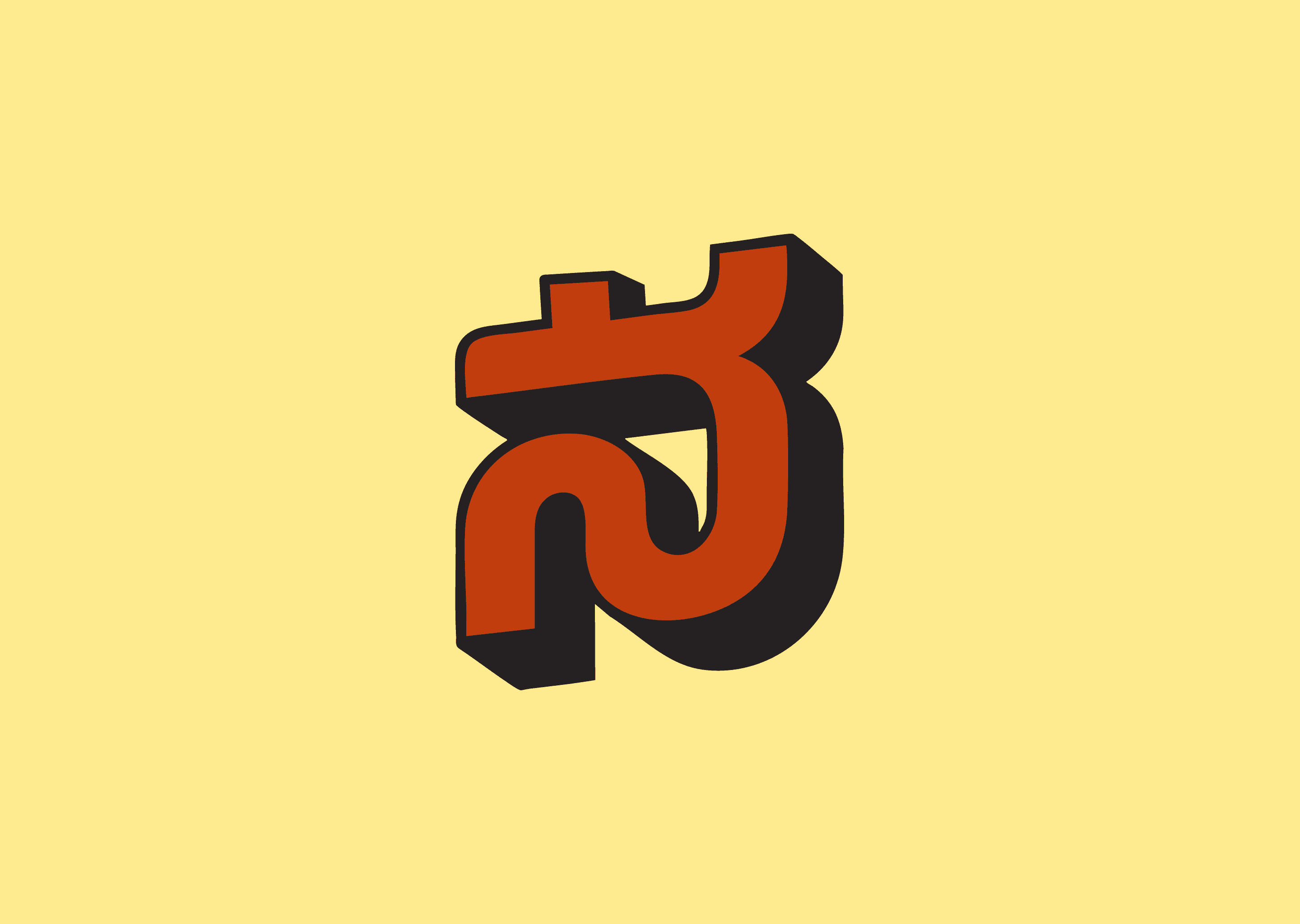


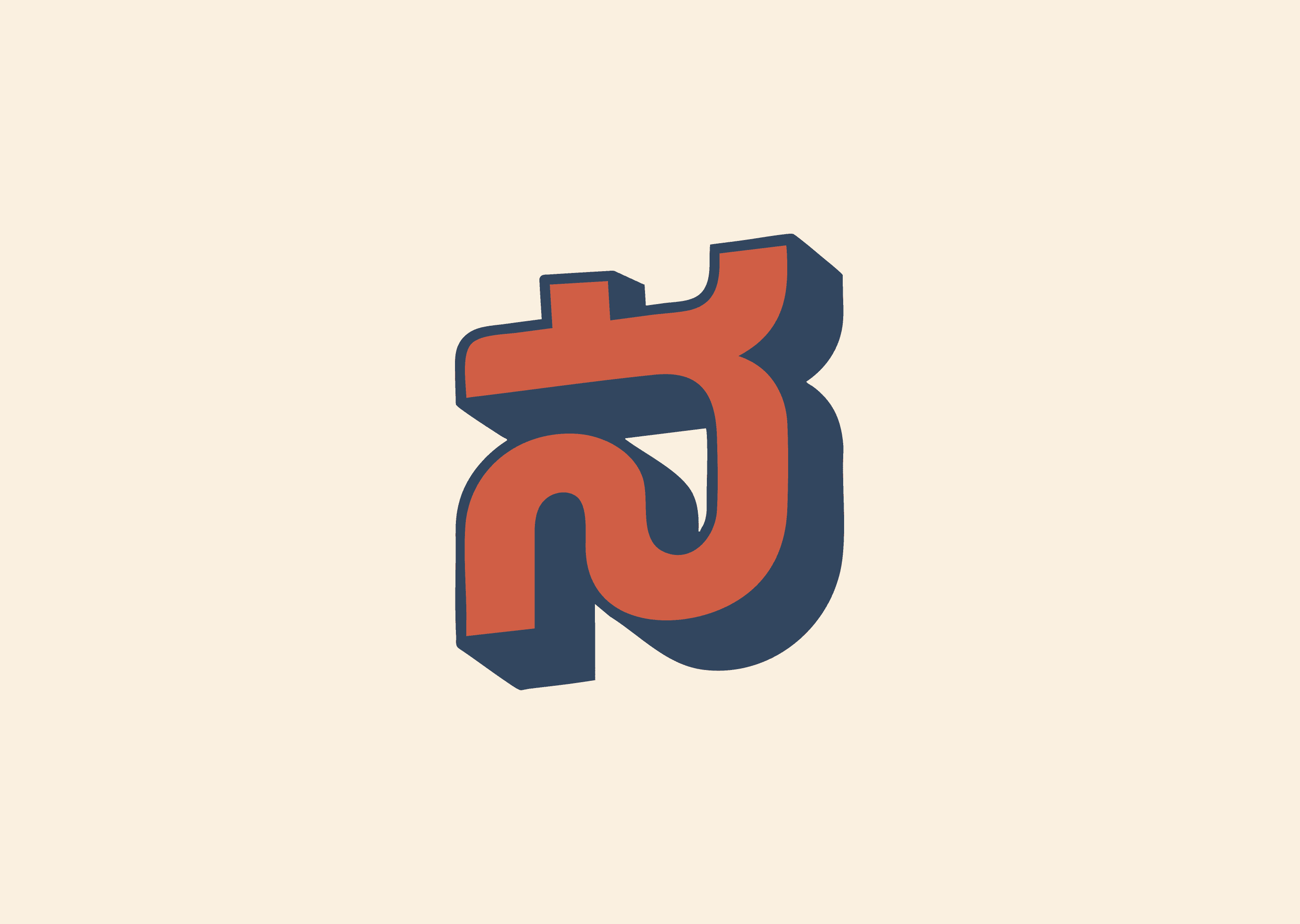
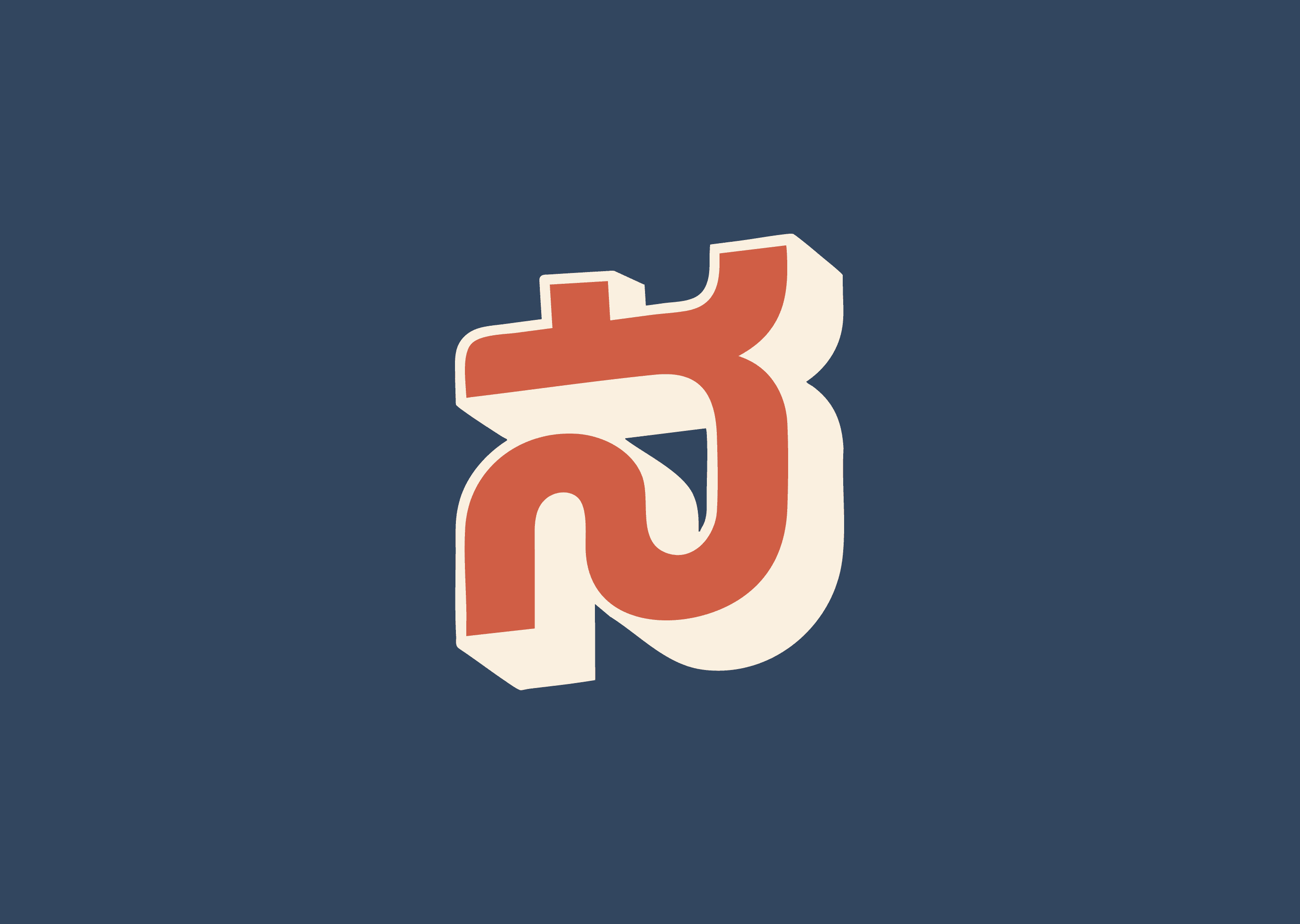
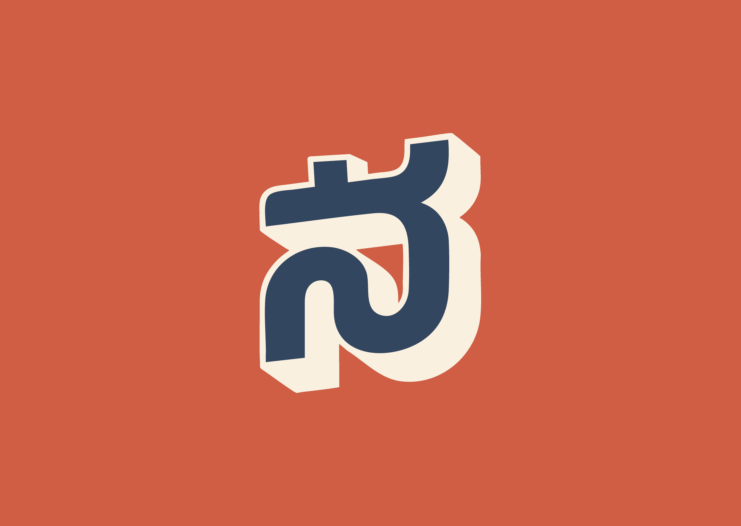
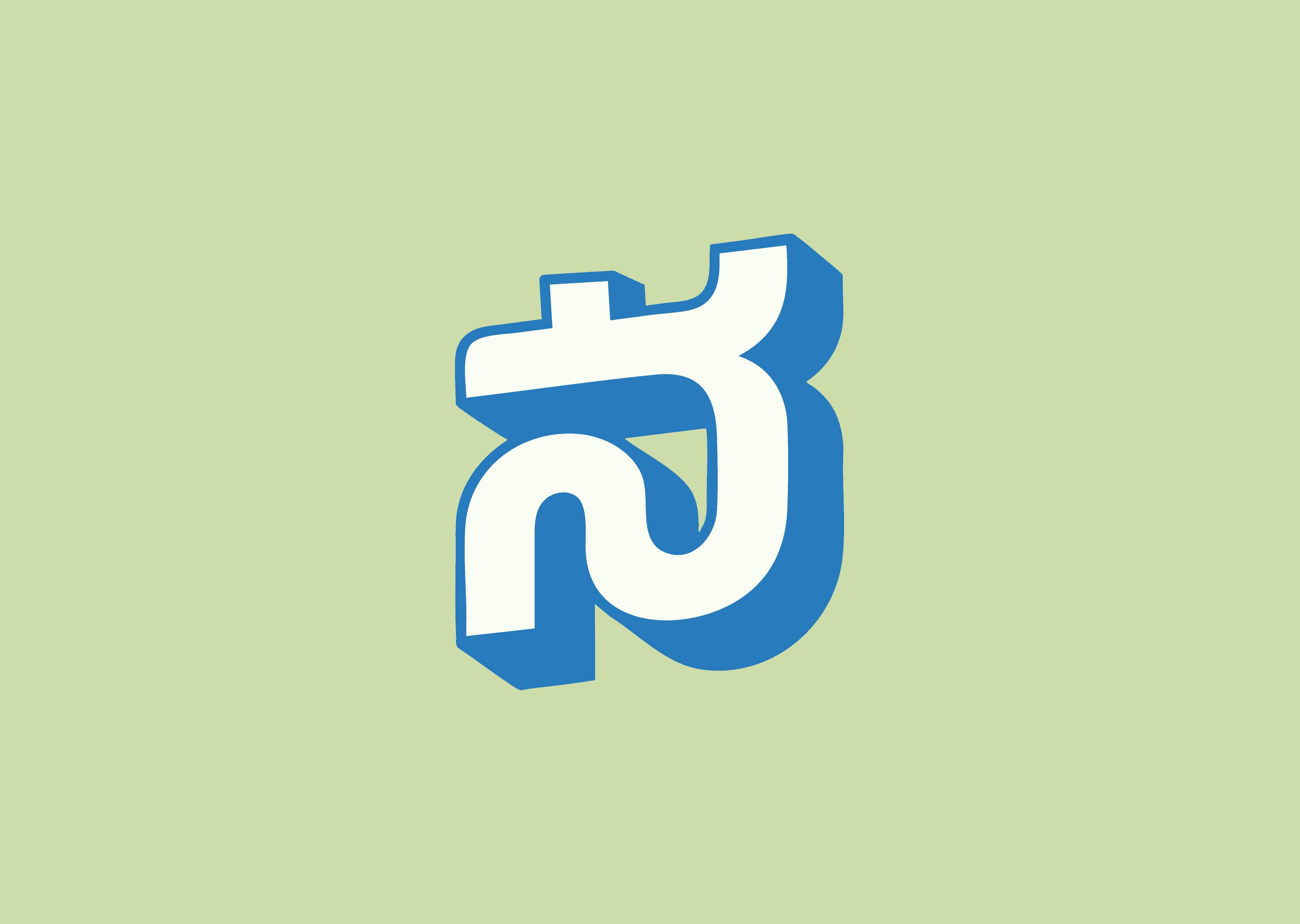

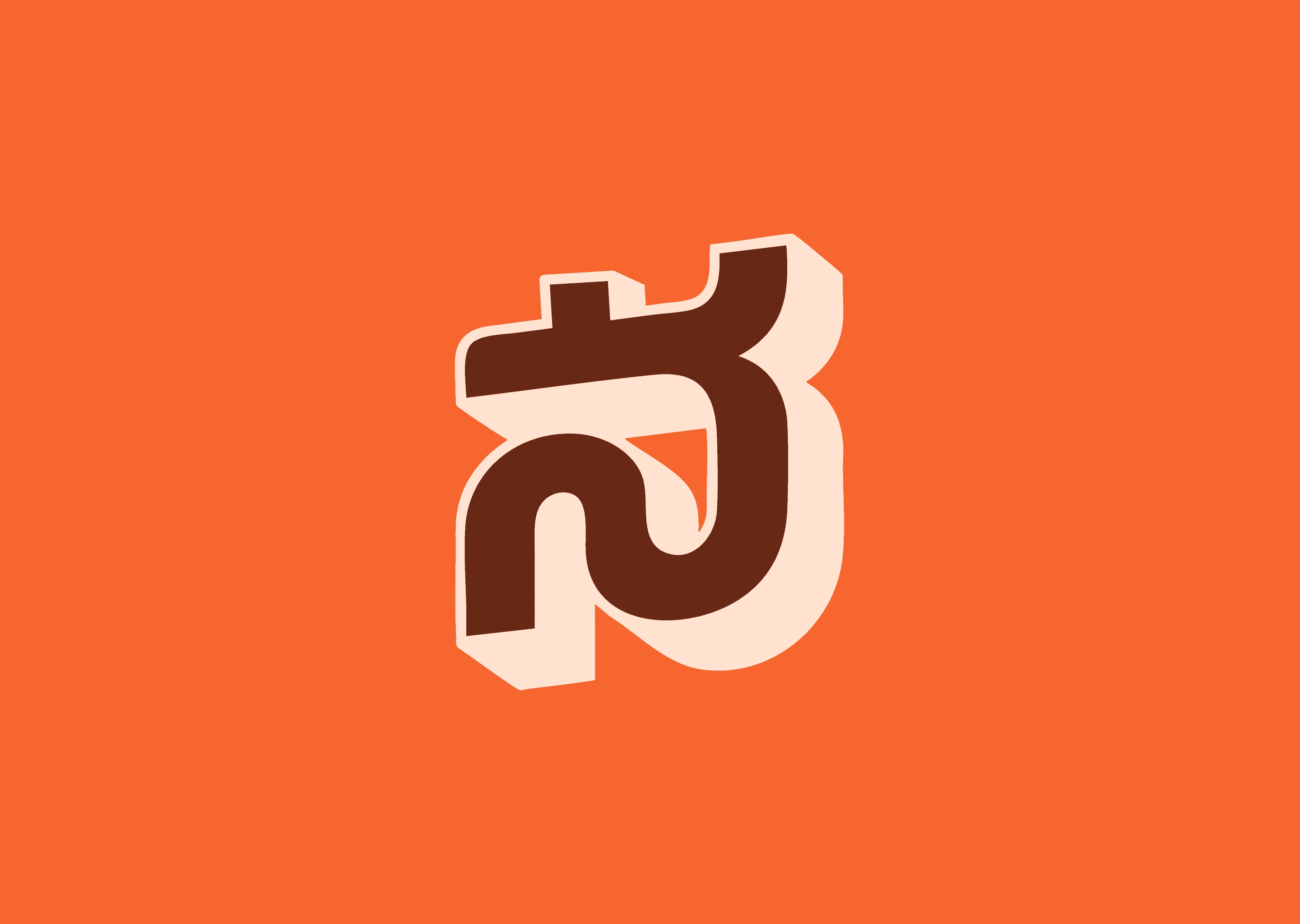
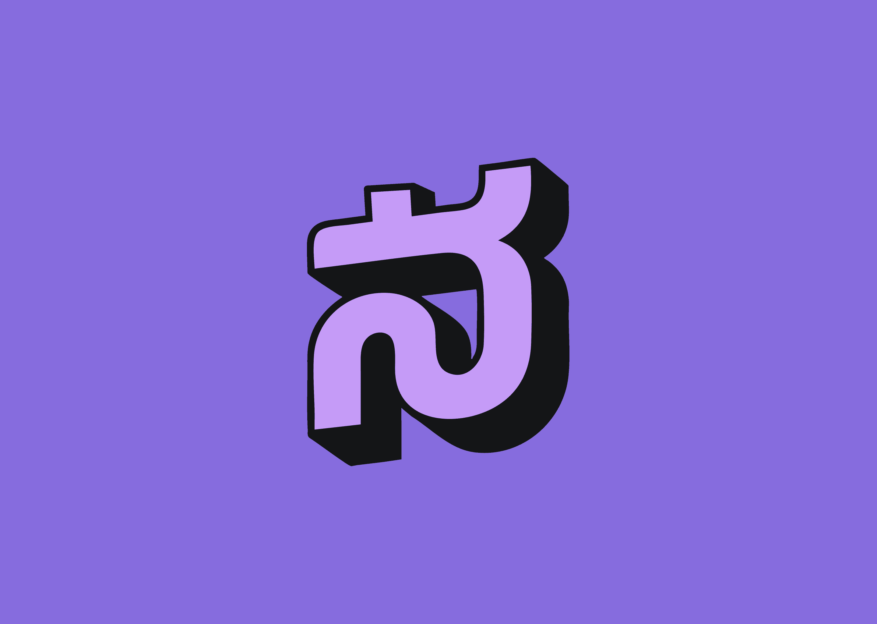

Most pairings failed for the same reason: they made the brand look like a brand, not like a place. Cobalt blue + cream felt European. Dark navy + black felt corporate. Olive green + brown felt like a brewery. Pastel pink + crimson felt like a bakery. Each was a competent palette. None of them sounded like Bengaluru.
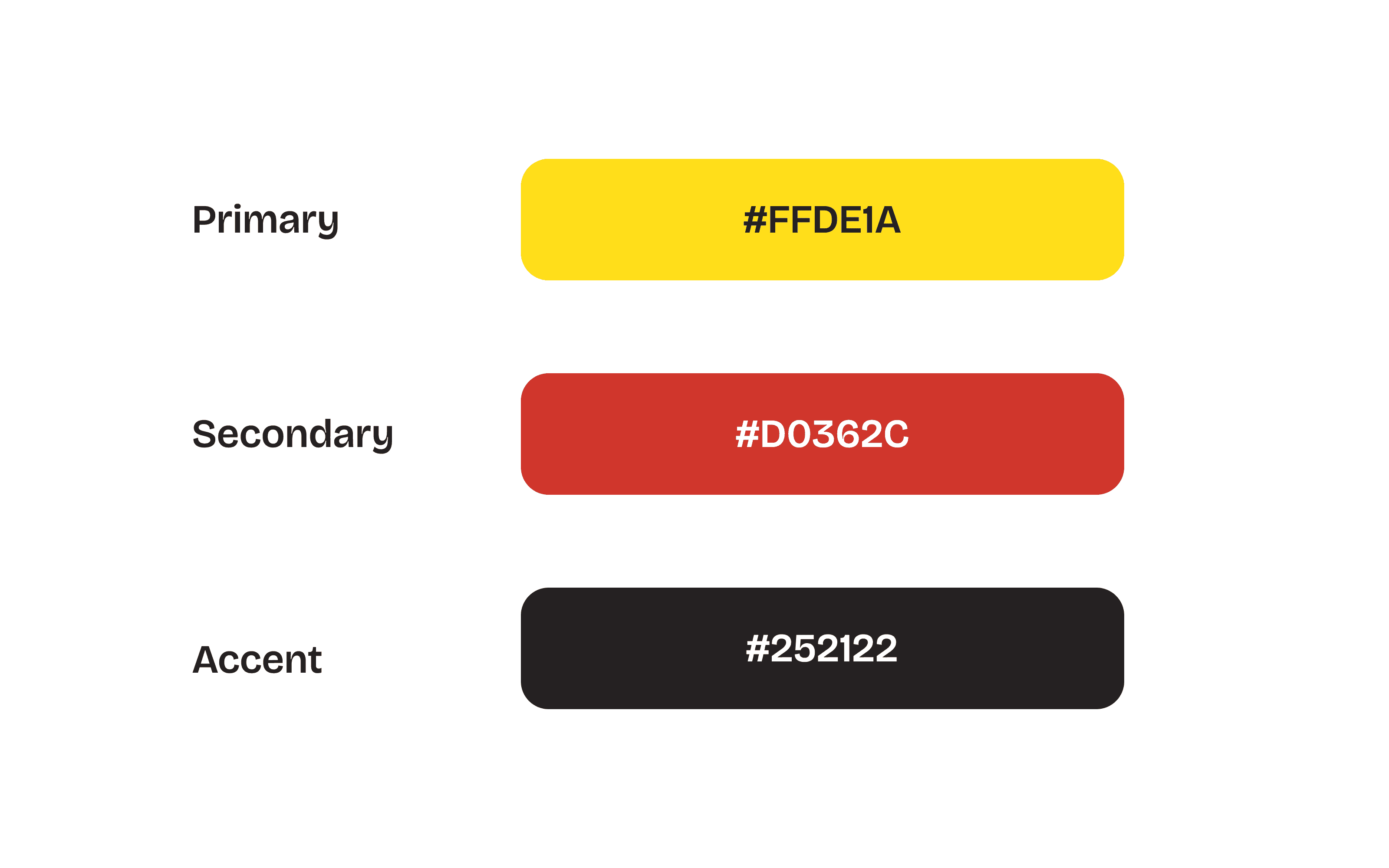
The pairing that won was the most obvious one in the deck — and the one I tested twice to make sure it wasn't lazy. Cream Yellow as the surface. Red Orange as the body of the mark. Black as the drop shadow. The exact three colours of a Bengaluru tiffin spread — turmeric, chilli, charred kadai. The exact three colours of an Iyengar bakery sign. The exact three colours of a 1970s theatre hoarding. The palette was already in the city; I just had to stop looking for a more original one.
Cream is the wall. Red is the sign. Black is the shadow the sun puts behind it.
Built for the Feed
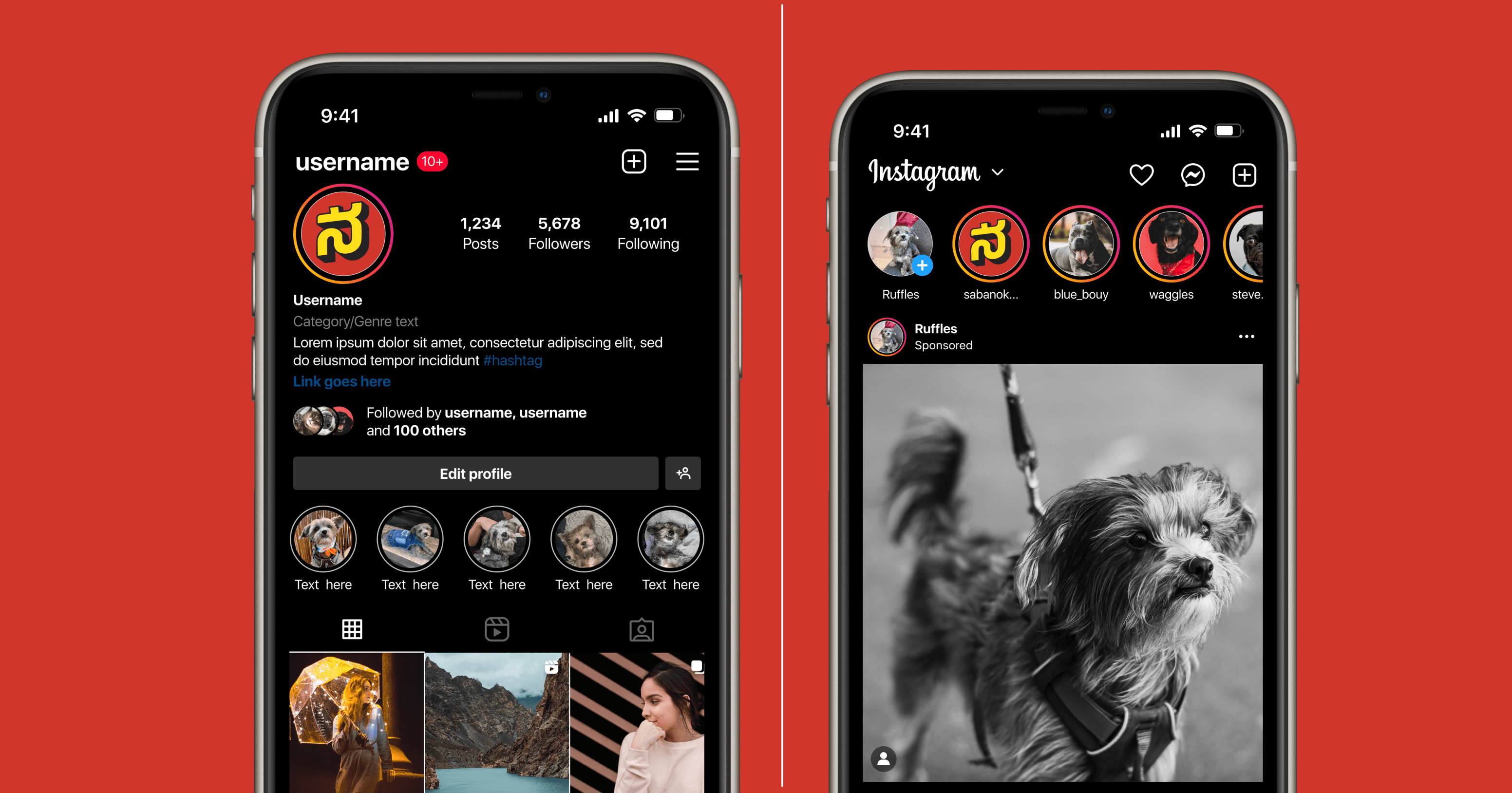
Nammatales lives on social platforms first — Instagram before website, Reels before YouTube long-form, story rings before printed merch. The brand had to launch with every social touchpoint already pressure-tested. Profile photo at 110 pixels. Story rings at 64 pixels. Feed thumbnail at 320. The full lockup with shadow on a Reel cover at 9:16.
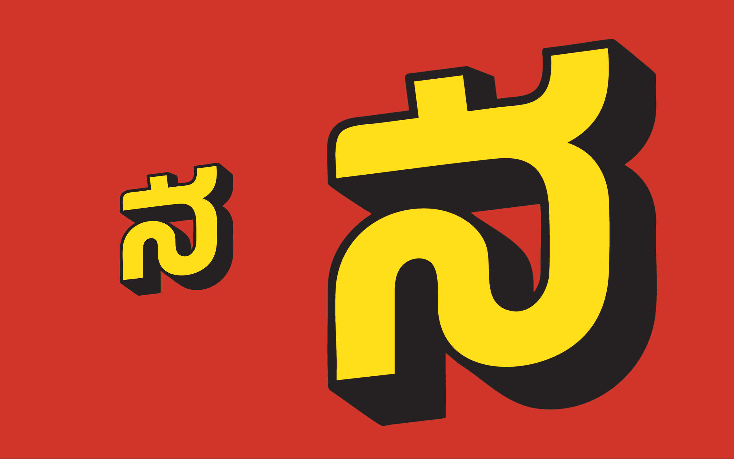
The 110-pixel test was where most monogram brands quietly fail. The drop shadow tends to fuse into the letter at small size, turning the whole mark into a blob. The fix wasn't to drop the shadow — the shadow is the brand. The fix was to draw two versions of the mark: a standard version with the full shadow for sizes above 64px, and a compact version with a tighter shadow offset for everything below. Same brand, two builds. The system is the only reason the mark survives the platforms it actually lives on.
A food channel for a city should look like the city, not like the food. The food shows up in the videos. The brand has to do the other job — saying we live here before a single frame plays.