Case Study
Orbit Haus — Brand Identity for a Creator Management & Social IPs Agency
A full brand identity for a creator management and social-media IPs agency. Three logo rounds, four mood directions, eleven color palettes — landing on a slanted-hut mark over an orbital sun, in a calm three-color system designed to recede behind the talent it represents.
Client
Role
Timeline
Industry
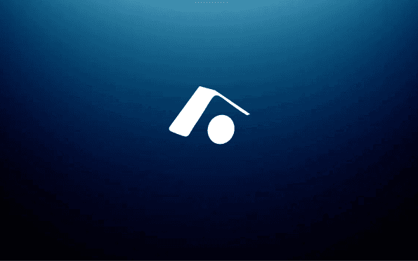
The brand named itself before the work started. Orbit Haus. A creator management and social-media IPs agency, building formats and franchises around the people who already had audiences. The name was a complete idea — orbit (the path) and haus (the structure) — and the brand had three months to catch up to it.
3
logo rounds
4
mood directions
11
color palettes tested
What Every Creator Agency Looks Like
Before sketching anything, I spent four days inside the category. Talent agencies, IP studios, multi-channel networks, modern post-MCN creator companies. The pattern was loud and immediate. Every brand looked like a YouTube thumbnail. Bold gradients. Screaming display type. Founder photos on the homepage. Neon accents. The visual grammar of attention, not the visual grammar of infrastructure.
But Orbit Haus isn't the creator. Orbit Haus is the building creators come into. The agency is the quiet part — the desks, the deals, the structure. The creators are the loud part. If the brand competed with the creators, the brand was wrong. The haus had to recede so the orbits could shine.
If our brand looks louder than our talent, we've already failed.
Three Directions, One Obvious Winner
The first deliverable was a Brand Direction Document with three full mood worlds. Same brief, three honest answers. Each had its own typography, color, image language, and reference set.
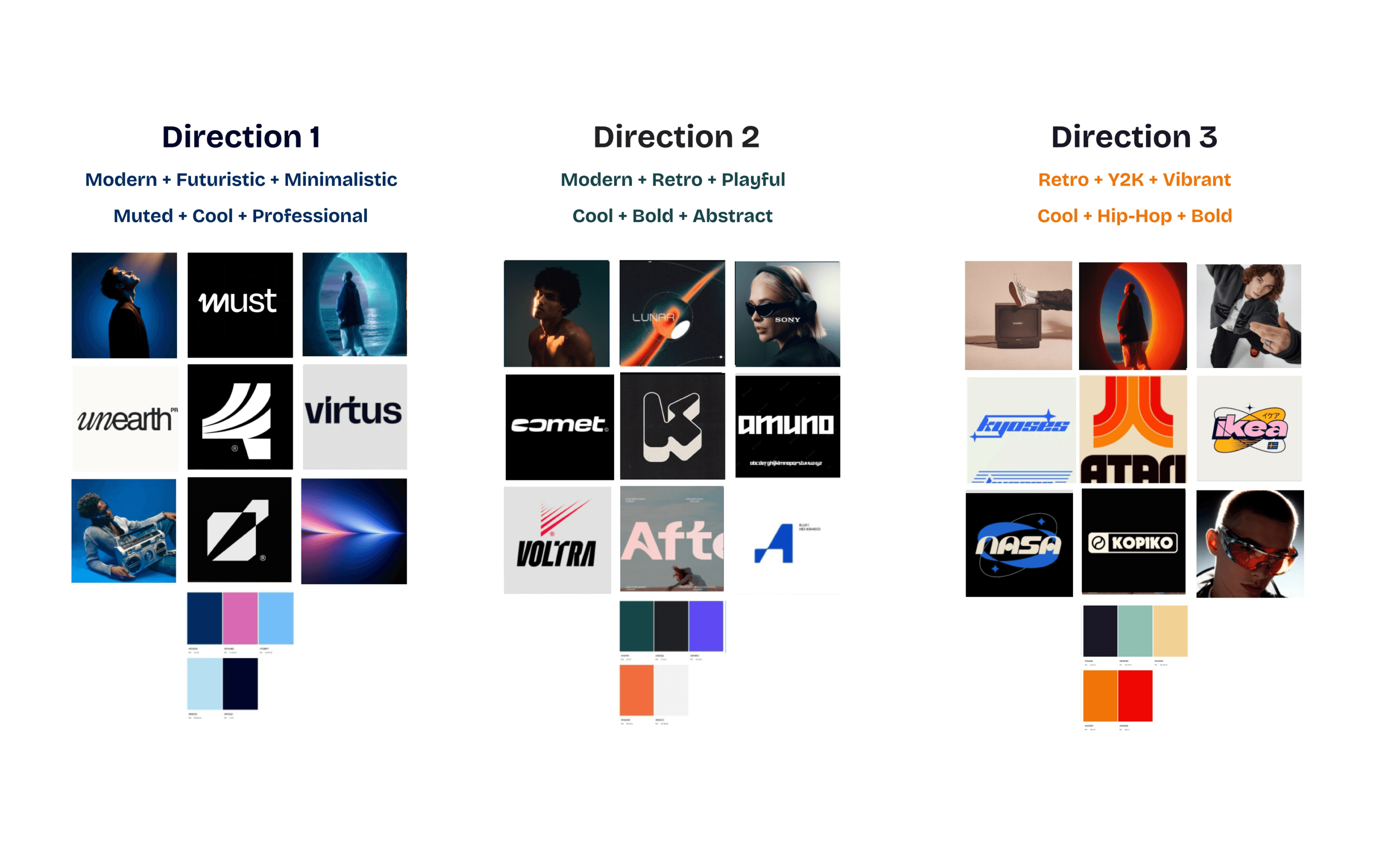
Direction 1 — Modern + Futuristic + Minimal. Muted, cool, professional. Deep navy and ice blue. Architectural photography, sans-serif type, white space as a weapon. The 'haus' as quiet infrastructure. The reference shelf was Virtus, Must, Unearth — brands that felt premium without raising their voice.
Direction 2 — Modern + Retro + Playful. Cool, bold, abstract. Deep teal and electric violet, with an orange accent. Comet, Voltra, Amuno — display-type-driven, rhythmic, designed for motion graphics. A version of Orbit Haus that read as a content studio first and a business second.
Direction 3 — Retro + Y2K + Vibrant. Cool, hip-hop, bold. Atari orange, NASA blue, Kopiko cream. The streetwear-meets-spaceship version. Built for merch, drops, collabs, and the kind of Instagram grid that gets reposted by sneaker accounts.
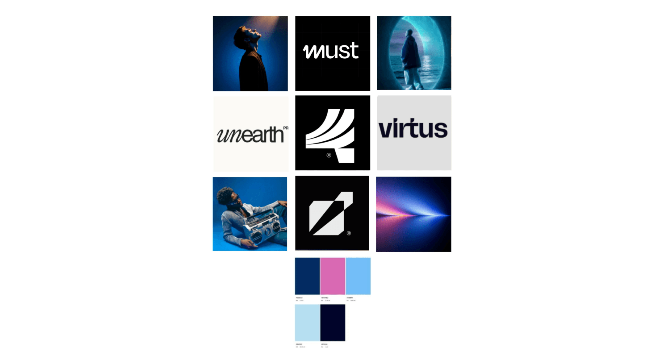
The client picked Direction 1 inside the meeting. Not after a follow-up call. Not after a sleep-on-it. The reason was clean: every other creator agency in their reference deck was already doing Direction 2 or 3. Picking either of those was picking the uniform. Direction 1 was the only one nobody else in the category was wearing.
Pick the direction nobody in the category is already wearing.
Round One — The Literal Trap
First logo round. Three concepts, each pushed to a full lockup, color test, and app-icon mock. The brief I gave myself: make the orbit visible. In hindsight, that was the wrong brief — but I had to make all three to know it.
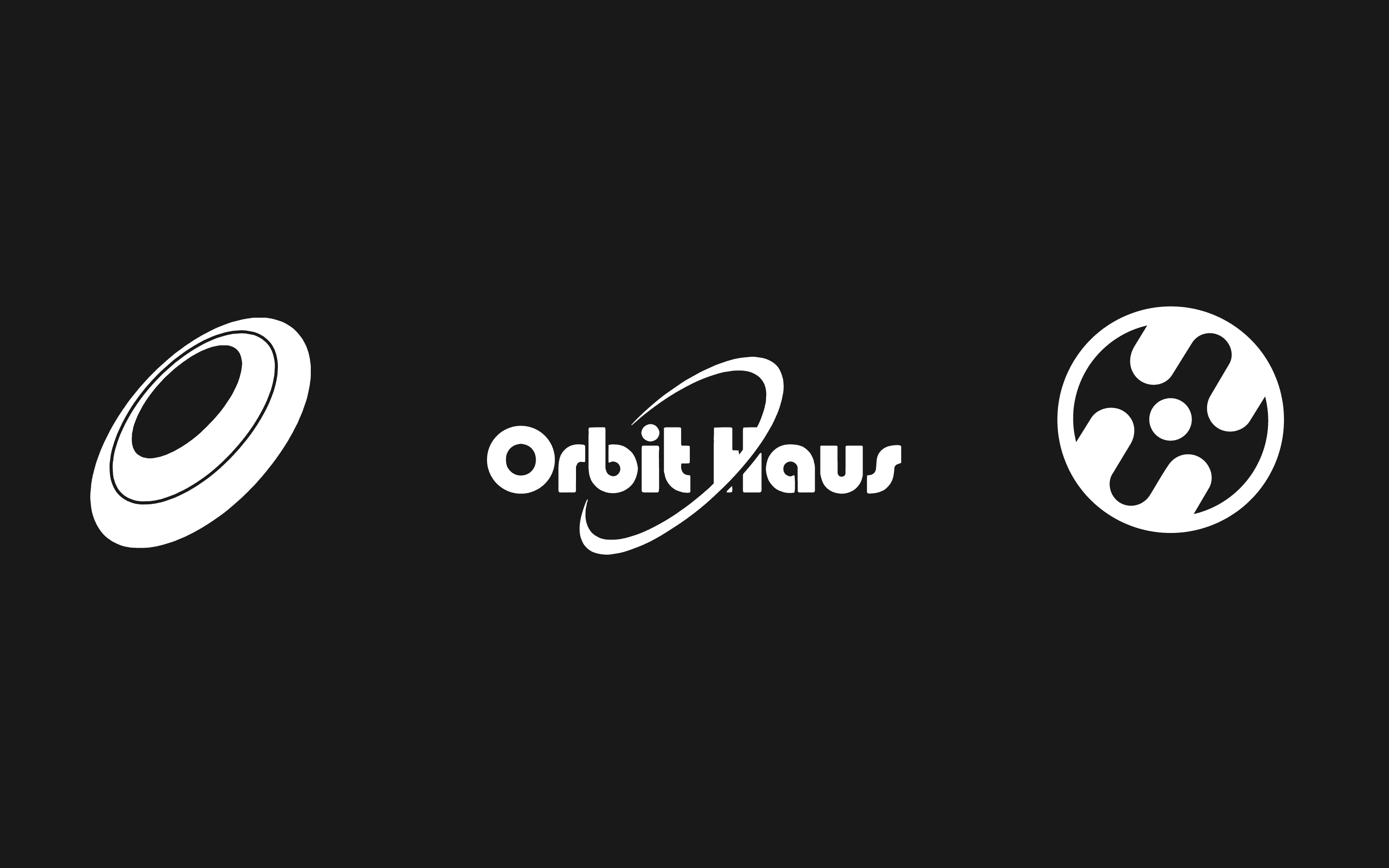
Concept A — The 3D Orbit Ring. A tilted ellipse, lit from above, the letter O reimagined as a planetary ring seen at angle. Functional, scalable, worked as an initial. The tagline I wrote for it was 'an orbit, a path that gives base to many different creative ideas.' It was a fine logo. It also looked like Asics.
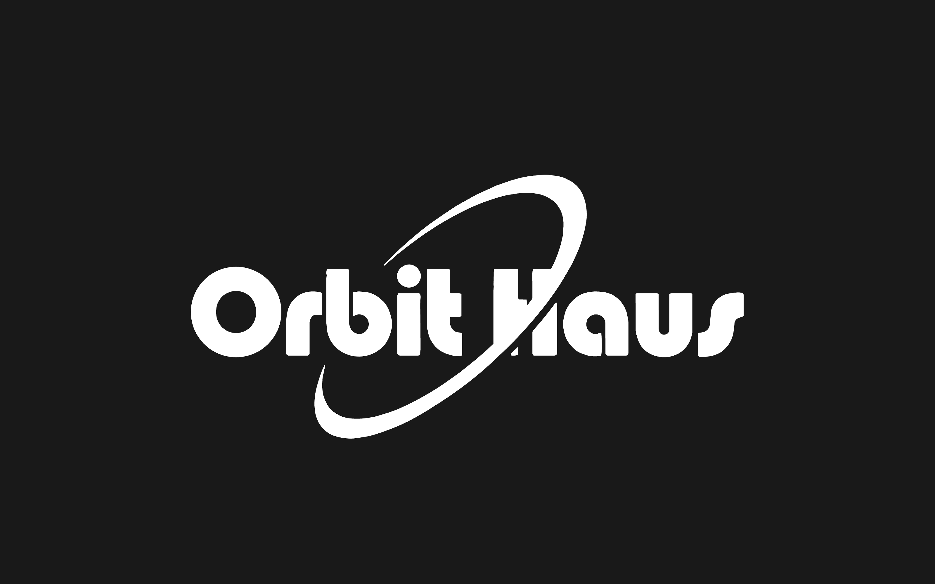
Concept B — Bauhaus Wordmark. Orbit Haus set in a German Bauhaus-era display face, an orbit ring tracing through the H. Every typographic Easter egg I could fit. I loved the craft. The client loved the craft. Then we put it on a 32-pixel app icon and it became a smudge. The wordmark was a poster, not a logo.
Concept C — The Spaceship. A circular mark with three swooping shapes inside, suggesting a ship from above, with a small central core. 'Every idea goes light years beyond at Orbit Haus.' It was the most distinctive of the three. It was also the one most likely to be confused for a Marvel studio.
Round one ended with a quiet realization. *All three concepts said orbit. None of them said haus.*** I had drawn the path and forgotten to draw the building. The whole name's tension was being cut in half. Round two had to find the house.
Round Two — The Hut Shows Up
Second round. Same number of concepts, completely different brief: make the haus visible. I drew houses for two days — pitched roofs, cabin silhouettes, German half-timber, modernist boxes — until something simpler appeared. A hut. The reduction of a house to its essential gesture: a slanted line over a vertical line. The minimum unit of home.
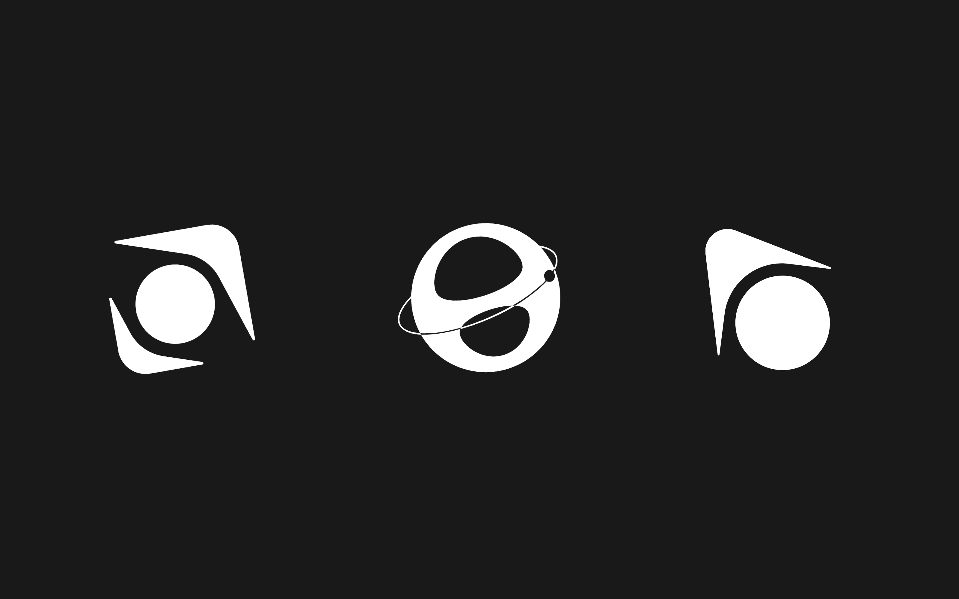
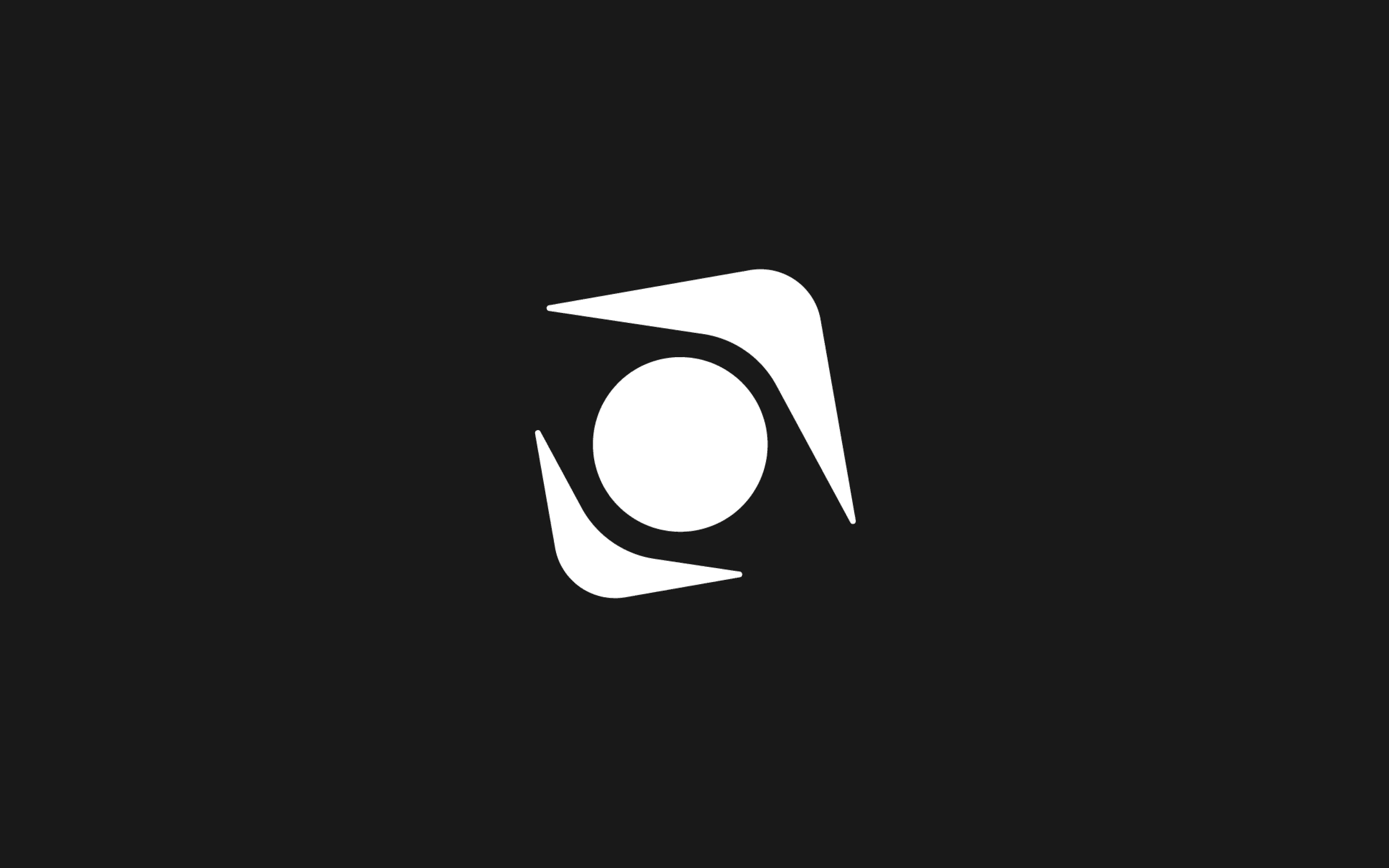
Concept A — Two Huts Revolving. Two hut silhouettes orbiting a central circle, like a planet caught between moons. Two huts depict a house revolving in the orbit of Orbit Haus. Beautiful idea on paper. In execution, it read as a propeller, a shuriken, a pinwheel — anything but a house. The metaphor was too compressed for the form to hold.
Concept B — Planet O+H. A spherical mark, an elliptical orbit ring with a small dot crossing it, internal cuts that spelled O and H as a hidden monogram. The cleverest concept of the round. The two letters were genuinely there if you knew to look. But the cleverness only worked at large size — shrink it, and the letters dissolved into a soccer ball with a halo. A logo that needs a magnifying glass isn't a logo.
Concept C — Hut + Sun. A single hut with a circle directly under it, the sun the haus orbits around. A sun who is the base of a house called Orbit Haus. Other IPs will revolve around it. The simplest of the three. I almost rejected it for being too plain. It was the one closest to right, and I almost missed it.
Round two ended with a clearer answer than round one, but no winner. The hut+sun was the closest to the brand idea, but the geometry was generic — any architecture firm could have shipped it. Round three had to make the hut specific.
Round Three — Almost There
Third round. The brief narrowed to one rule: the hut and the orbit have to be one form, not two stacked shapes. I sketched four directions, each a different way of fusing the two.
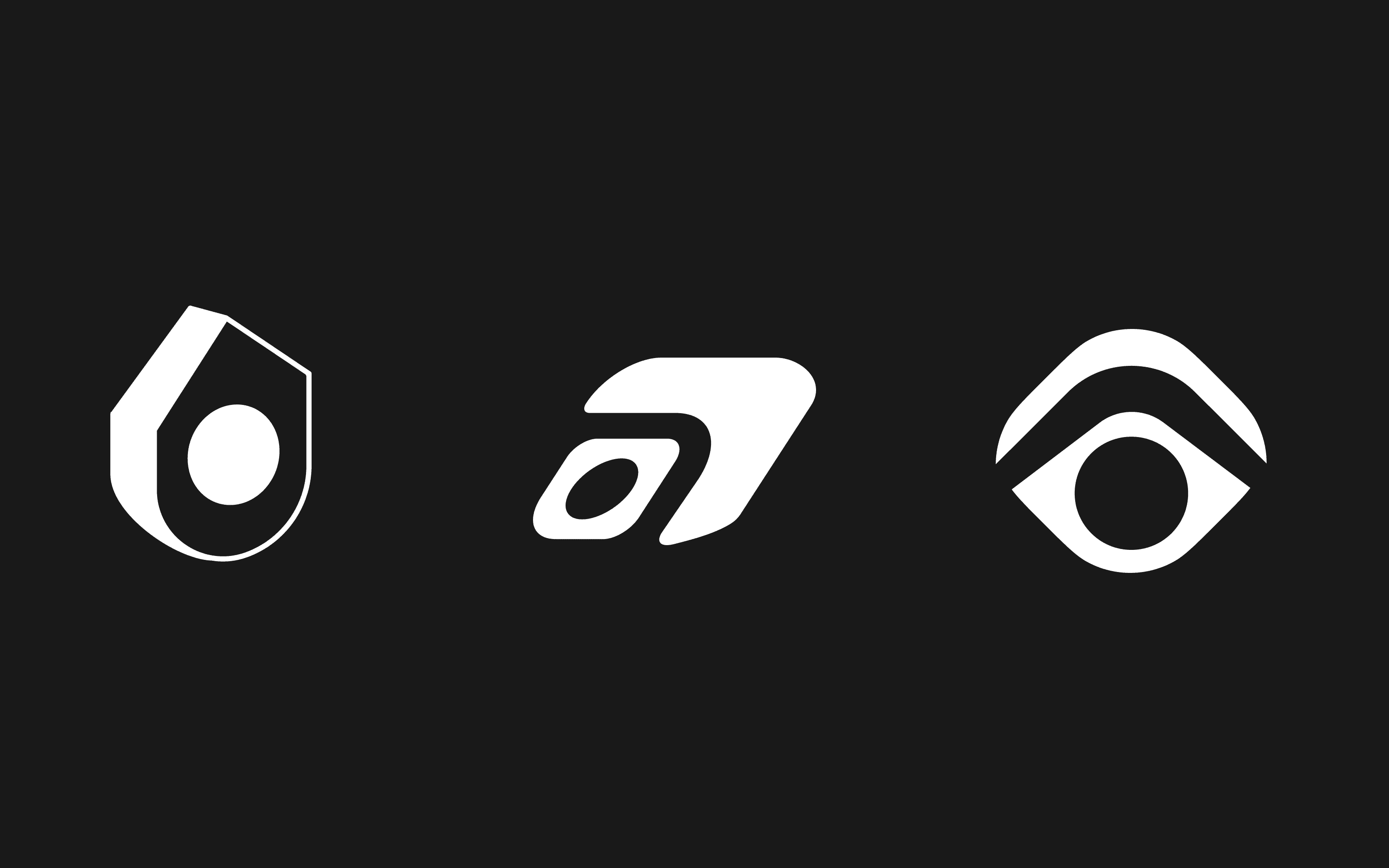
Concept A — House + Black Hole. A pentagonal house silhouette with a black hole at its center. Black hole, start and end of everything. Letter O of Orbit Haus. Conceptually loaded — the agency as the dense gravitational core every IP collapses into. Visually, it was a shield. A tactical-gear shield. A crypto-token shield. Every B2B SaaS in 2024 already had this logo.
Concept B — House + Glowing Center. Same shape as A, with a soft glowing aperture inside instead of a hard circle. The glow softened the shield read but added rendering complexity — gradients in a logo are debt.
Concept C — Hut + h + Sun. A slanted hut silhouette, a small letter 'h' tucked into the negative space of its side wall, a sun beneath. Hut of house, letter h and a semi-orbit, sun around which other IPs will revolve. The cleverest of the four. Three readings in one mark. And like the planet+OH from round two, the cleverness was load-bearing — without all three reads working, the mark fell apart.
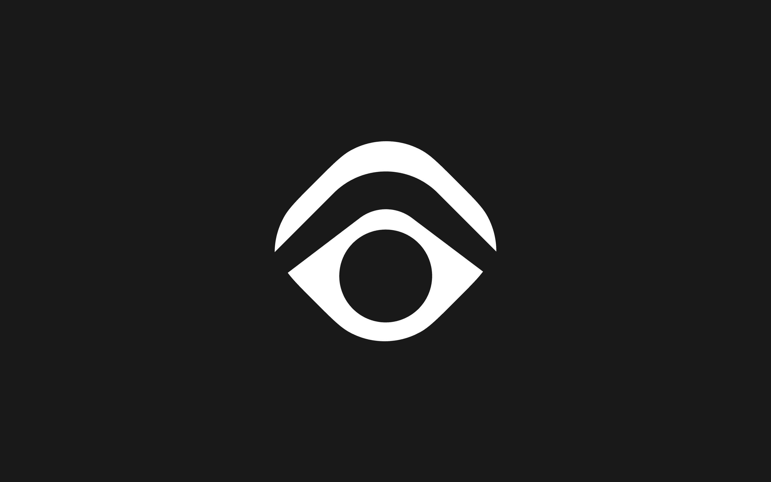
Concept D — Eye-Hut. A hut shape that also read as an eye, with a circular pupil. The 'haus that watches the orbit.' Genuinely uncomfortable. I included it to argue against it.
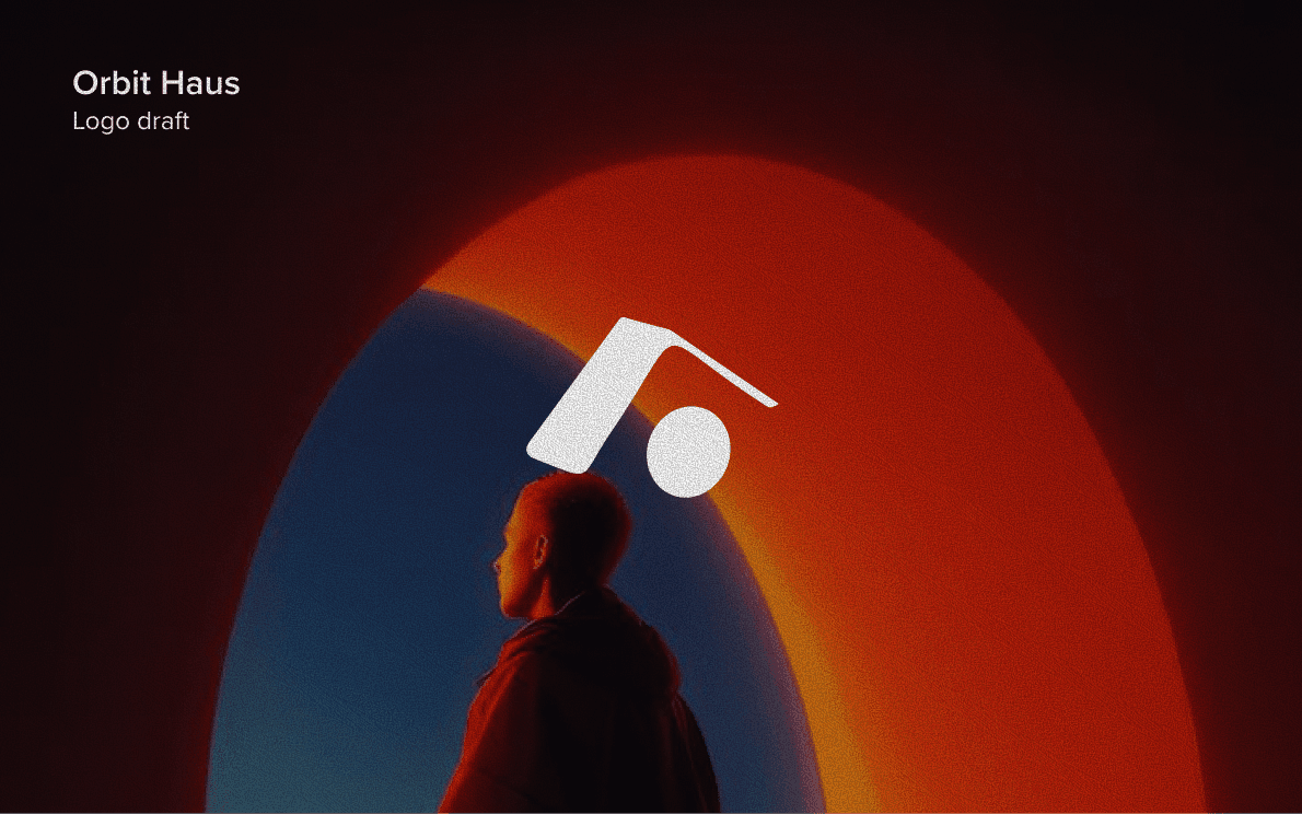
I sat with round three for a weekend. Concept C was the closest, but it was carrying too much — three metaphors fighting for attention inside the same form. The fix wasn't to add more. The fix was to remove the 'h' and let the hut be a hut. A slanted roof, a wall, a circle beneath. Nothing more. The fourth round was a single mark, not a deck — and the client signed it the next morning.
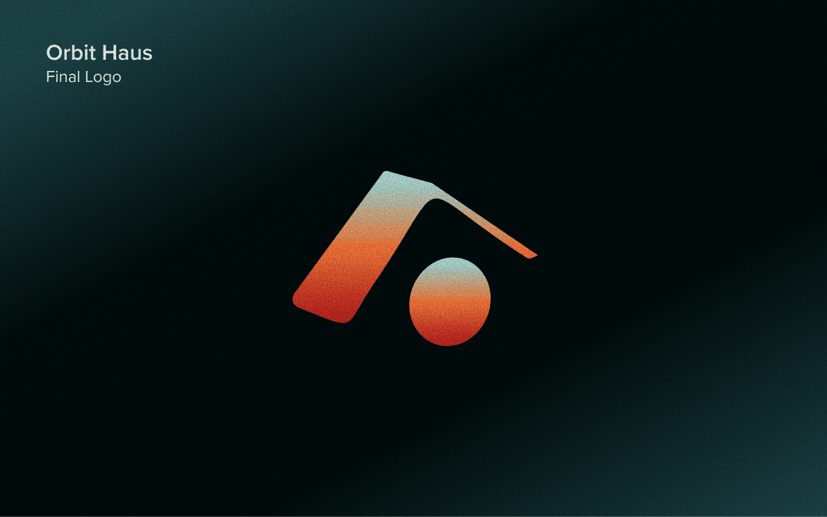
A slanted hut. A circle beneath. The structure and the thing it orbits around, in one form.
The hut tilts forward — about 12 degrees — so it reads as a building leaning into motion, not standing still. The circle sits beneath the hut, not inside it. That placement is the whole idea: the haus is the structure, the orbit is what holds it up. Read it the other way and it works too — the haus rises out of the orbit. The agency and its IPs are the same gesture.
Color, the Long Way Around
Color was the longest phase of the project. I tested eleven palettes across two logo shapes before three colors won. Pink, sage, gradient sunsets, warm orange, cool purple, a deep marine blue, a noisy textured ice. Every palette got the full treatment — flat, gradient, on dark, on light, with grain, without.
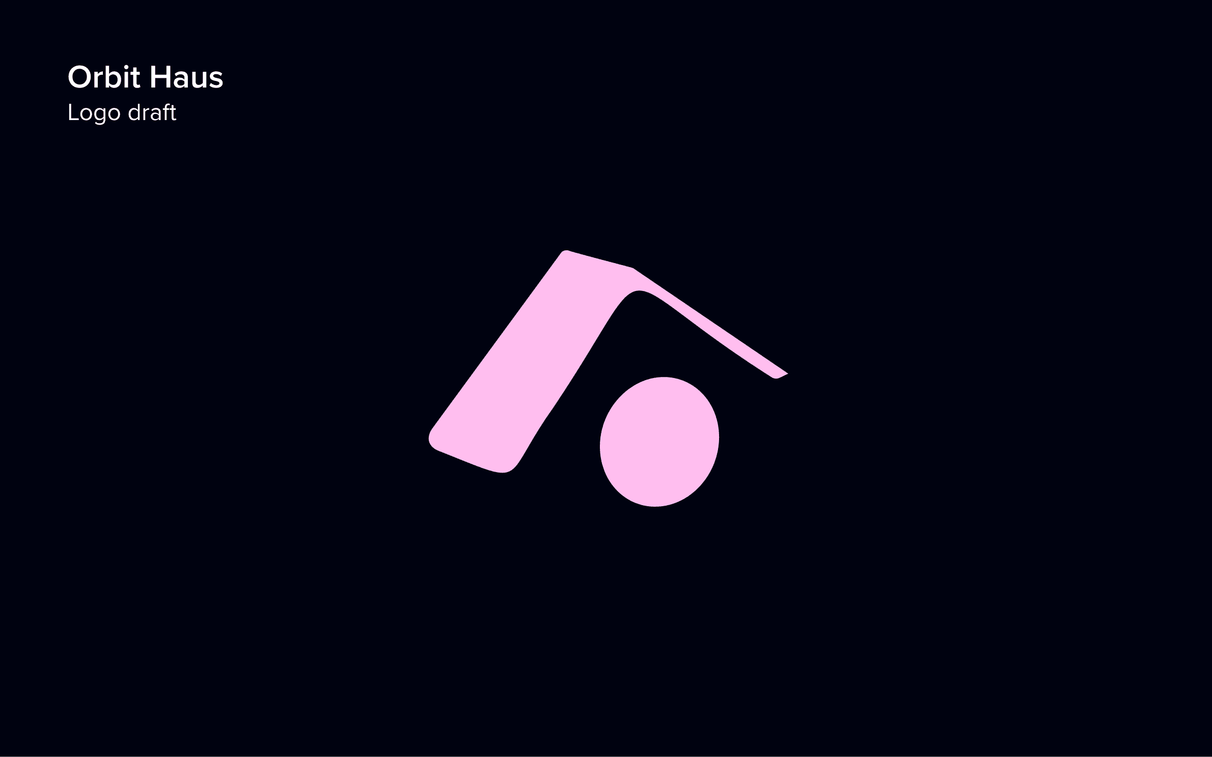
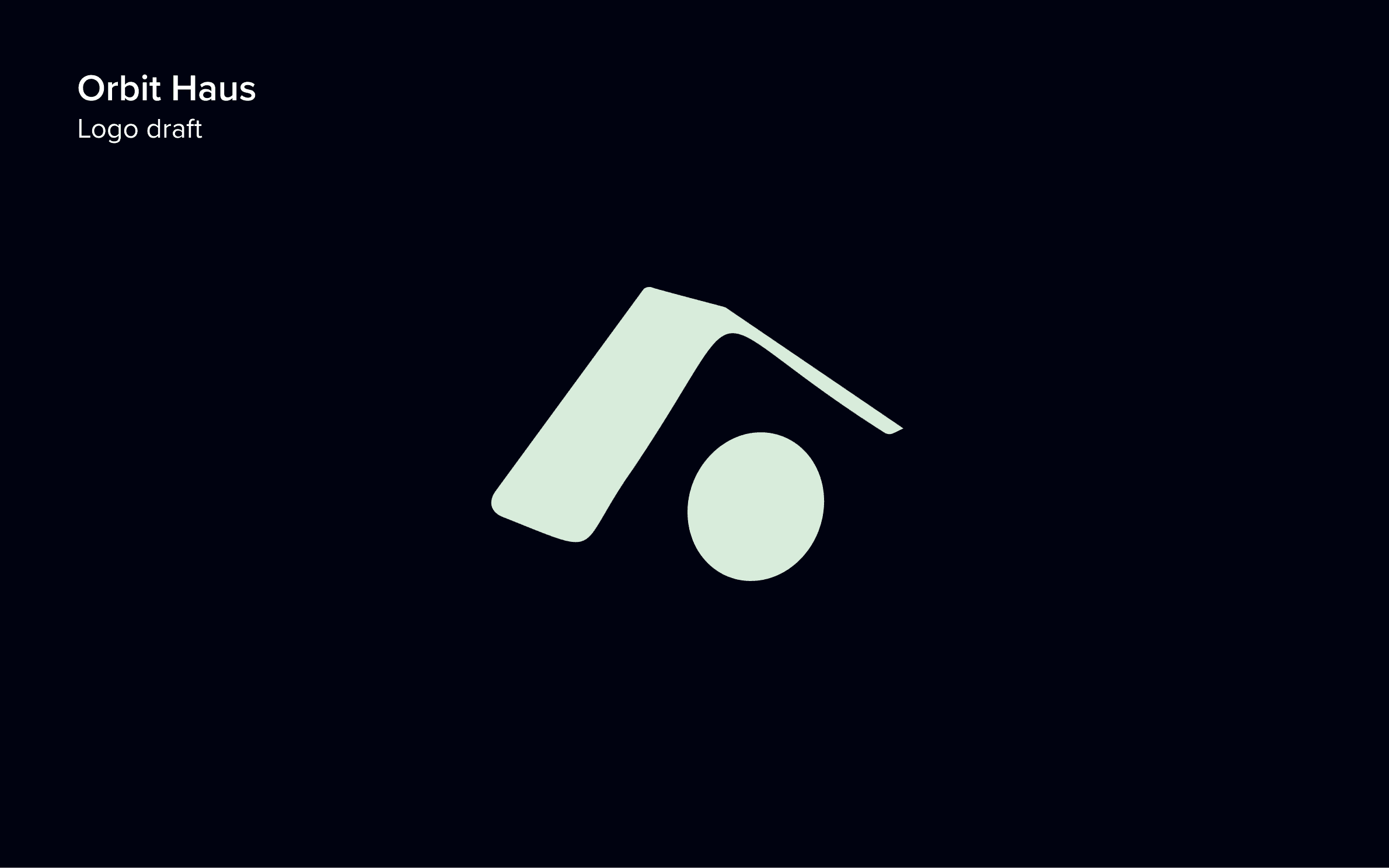
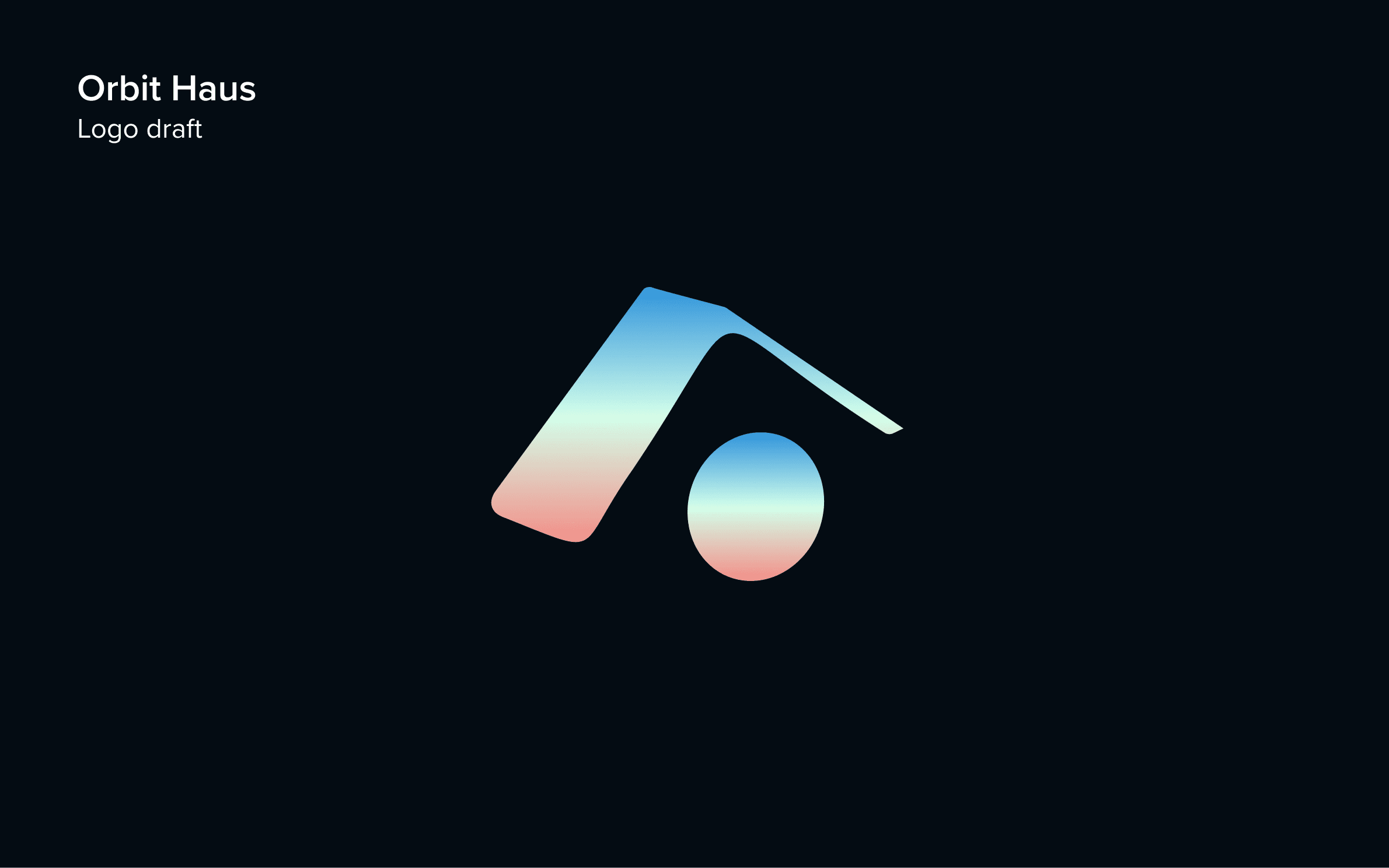
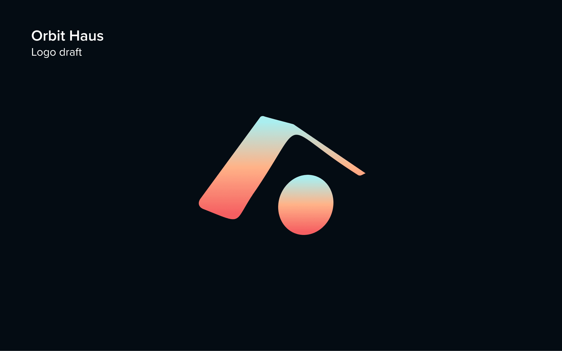
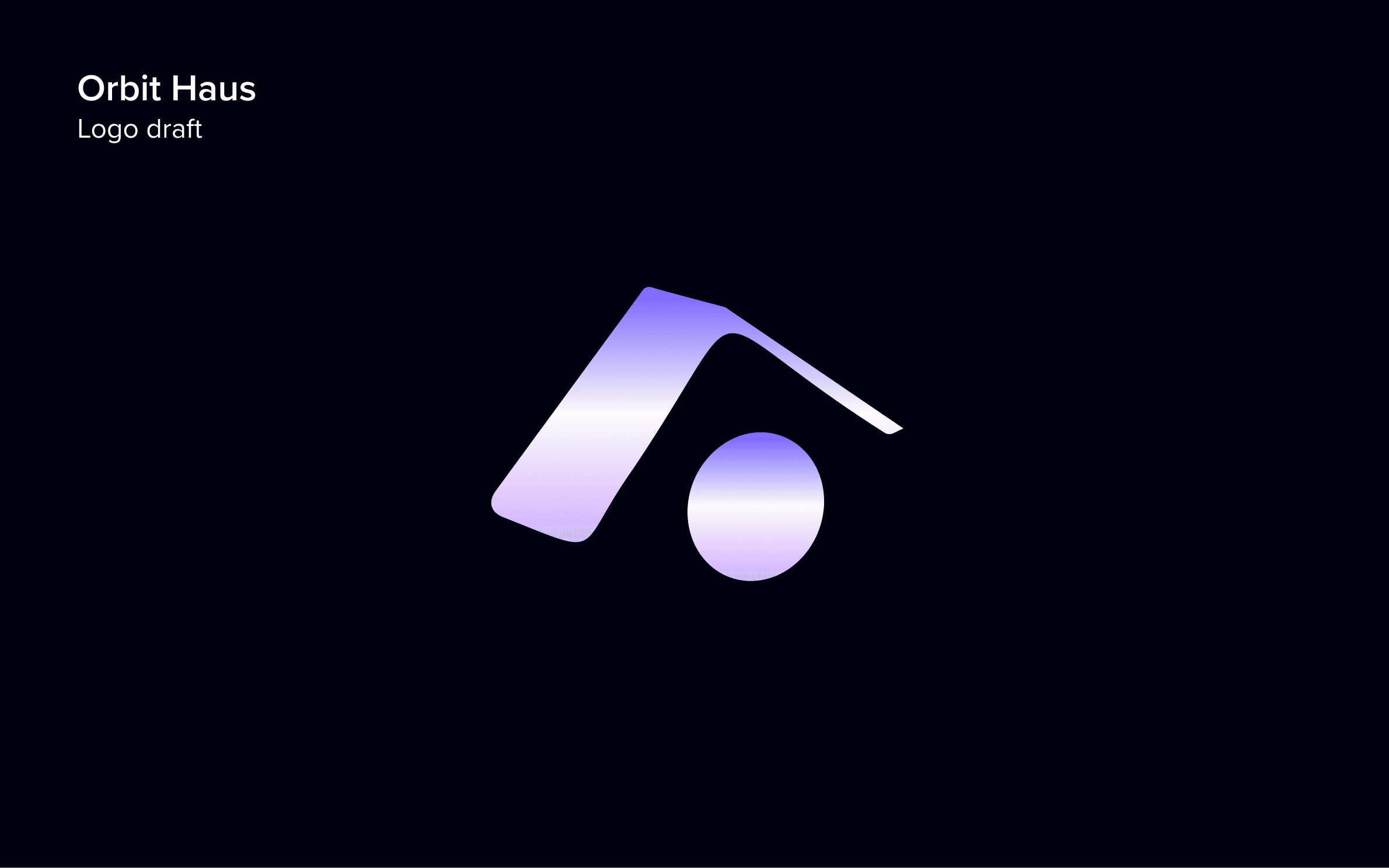
The reason it took eleven was that the direction (Modern/Minimal/Cool) gave us the temperature but not the temperature's specific reading. Cool can be a clinical hospital cool. It can be a Stripe-fintech cool. It can be a Berlin-techno cool. Each of those is the same direction with completely different cultural baggage. I had to find the cool that read as creative infrastructure — premium without being corporate, futurist without being cold.
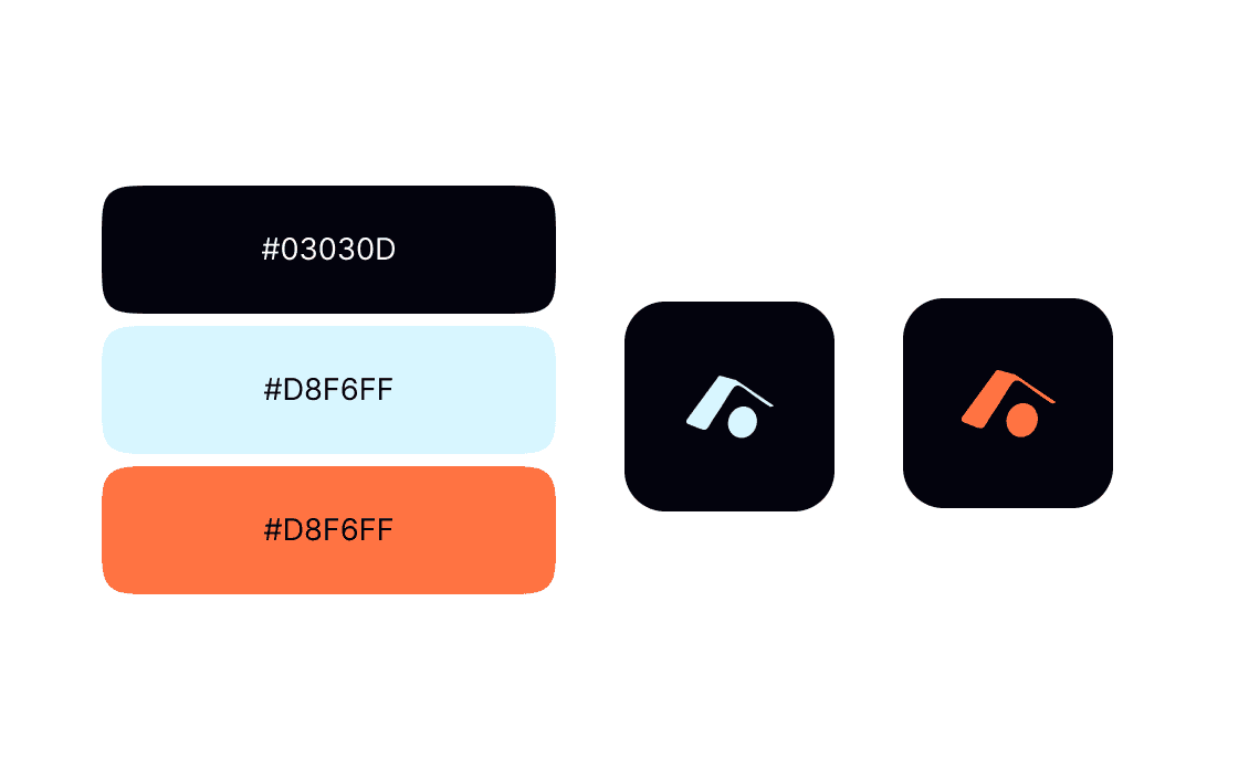
Coal Black (#03030D) as the dominant. Almost pure black, a hint of blue under the surface so it never reads flat. Ice Blue (#D8F6FF) as the primary mark color — pale enough to feel weightless, blue enough to feel deliberate. Solar Orange as the single accent — warmth, motion, the only color in the system, used sparingly enough that every appearance feels like an event.
Two colors would have been too austere — the brand would have looked like a finance app. Four would have undone the whole 'haus is quiet' premise. Three was the minimum that still felt alive. Black for the structure. Ice for the surface. Orange for the moments the brand smiles.
Black is the building. Ice is the air. Orange is the only color in the room — used so rarely that when it shows up, you notice.
The System
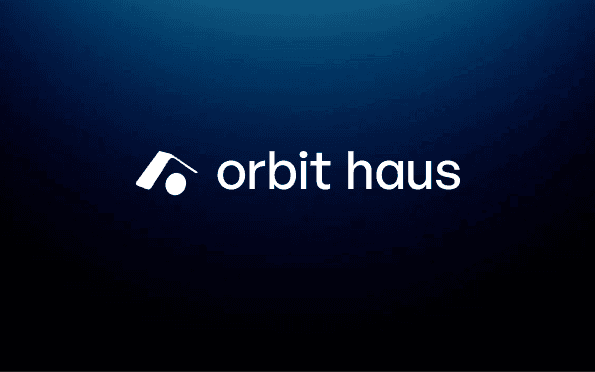
The mark plus orbit haus set in a geometric sans, lowercase by default, optical-corrected so the 'o' and the brandmark agree on what a circle is. Three lockups: brandmark only (favicon, app icon, social avatar), horizontal lockup (headers, signatures, marketing), wordmark only (footers, narrow contexts). The wordmark gets a capitalized variant for formal applications — contracts, deal memos, pitch decks. Every variant tested down to 16 pixels.
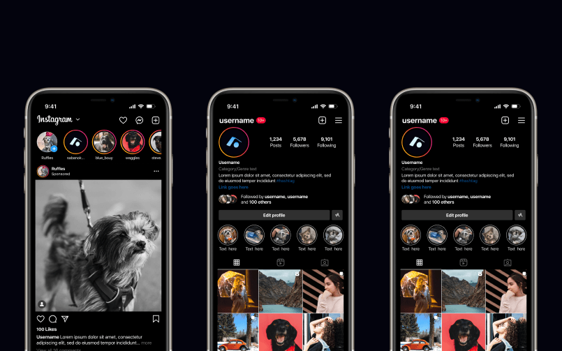
Then social. Orbit Haus's whole product is being on social platforms, so the brand had to launch with Instagram, TikTok, YouTube, and X applications already proved. Profile photo at 110px and at 320px. Story templates with the mark in three positions. Feed grids with the orange accent appearing in every ninth post. The constraint was simple: if the brand can't survive the platforms its creators live on, it isn't a brand for this agency.
A creator agency's brand should look like the building, not the show. The show is the talent. The brand is the door they walk through.